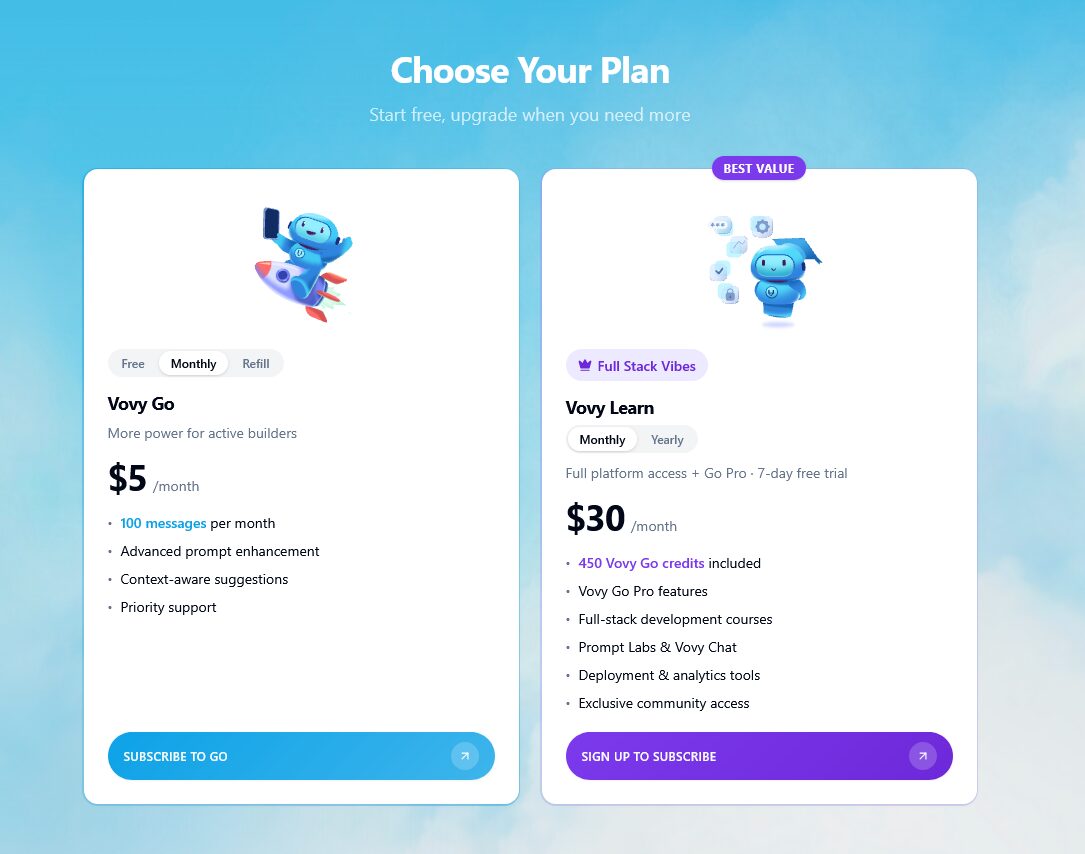
Most of Vovy’s website is blue. Their backgrounds, their graphics, most of their buttons, even some headlines. Yet, for their premium subscription, the button is and card uses purple. Why?
Well in design there’s two principles always at play: contrast and uniformity. If everything is unique, there’s no sense of rhythm and nothing stands out. That’s why we need uniformity.
But contrast draws the eye in and leads visitors to pay more attention to the element that stands out.
By choosing to use an “off-brand” color for their important call-to-action, they basically guarantee that’s where we’ll spend the majority of our time looking.
This has to be coupled with the fact that the premium subscription really is more interesting. You can’t force visitors to pay attention to something less interesting. But when you have something really interesting to show off, let it stand out.