Unsuccessful brands often fail because they do half-measures. They might be tempted to use shortcuts, boilerplate code, templates, or design generic websites. There’s nothing wrong with using tools that speed up our workflow, but we have to go beyond the templates.
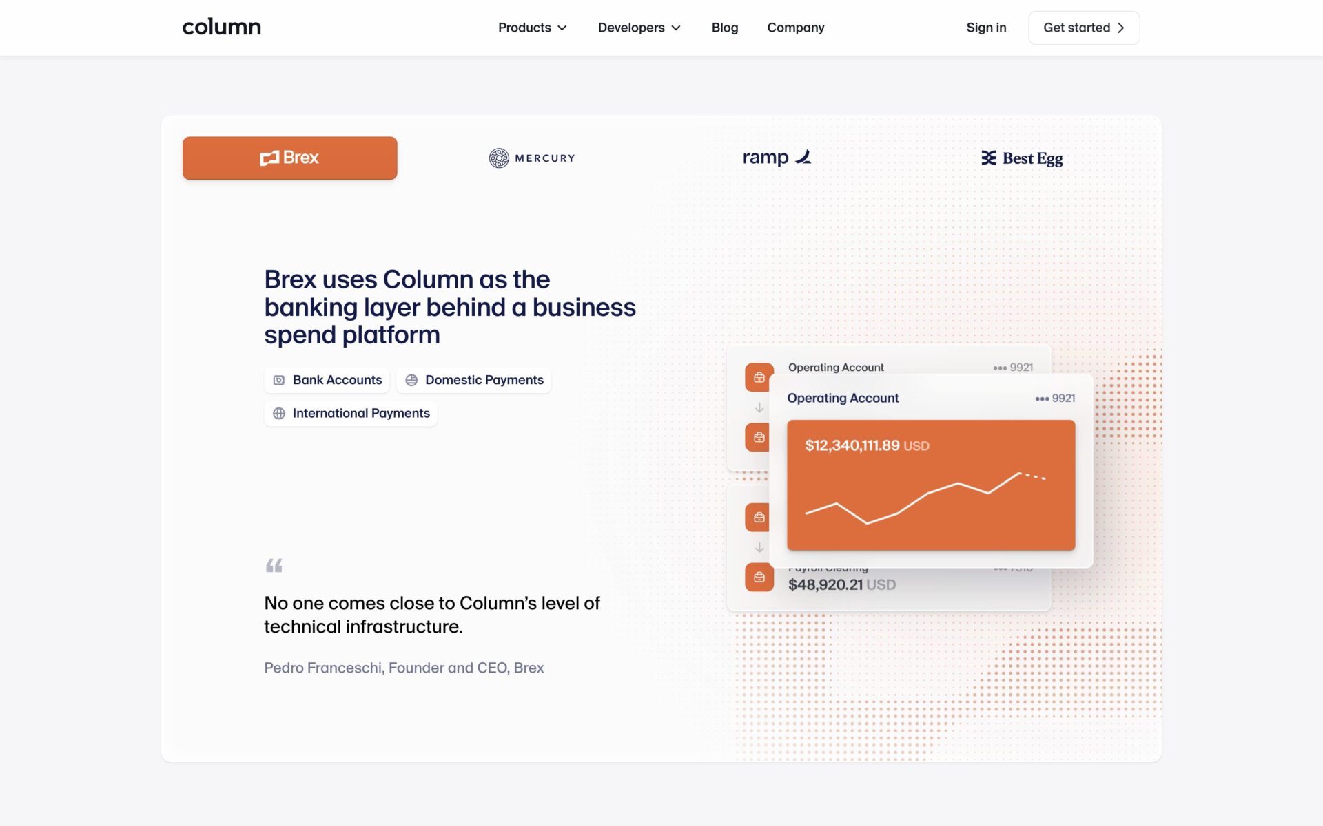
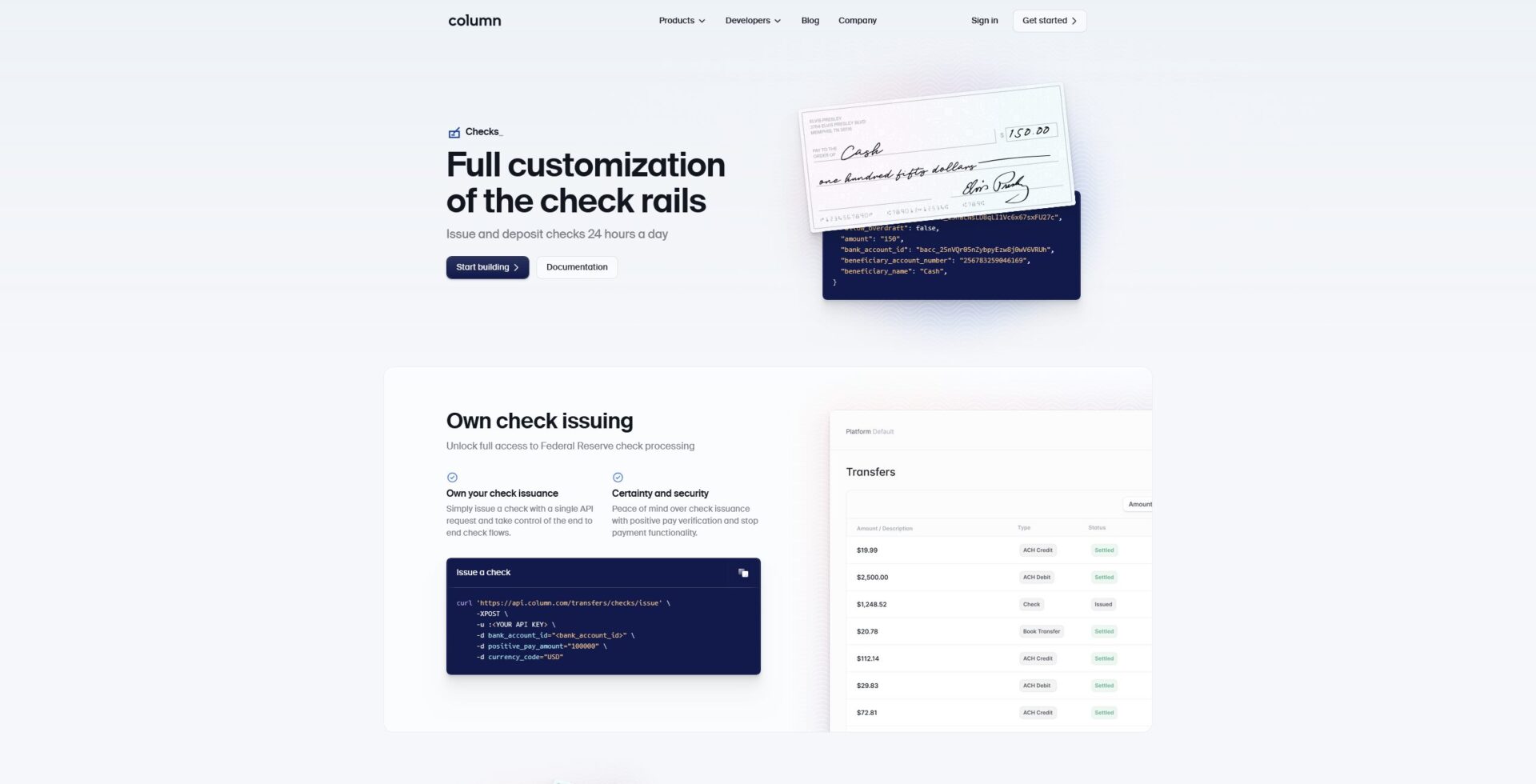
Take a look at this check issuing section from Column. Their branded dark-blue appears three times: once in the main “start building” button and two more times in the code repository graphics. Even the title text is part of the same color palette, a very dark blue.
The corners are rounded in the same everywhere. In the bottom section, in the code snippets, even in the custom check graphic.
The border that surrounds the bottom section is the same border in their “documentation” button.
Branding is in the details and details are everywhere. Your brand has to be ubiquitous throughout your design if it’s going to be effective at conveying a feeling to your visitors.