Have you ever designed something and thought it was a little boring? Chances are it’s because important elements in the design are left with default values. Pages are white by default. Text is black by default. There’s nothing wrong with this if it’s an intention choice, but so often a design feels flat because care hasn’t been made to make it feel unique.
A simple way to fix this is to turn your brand color into a monochromatic color palette. We can do this simply by adding some light or dark to your brand color.
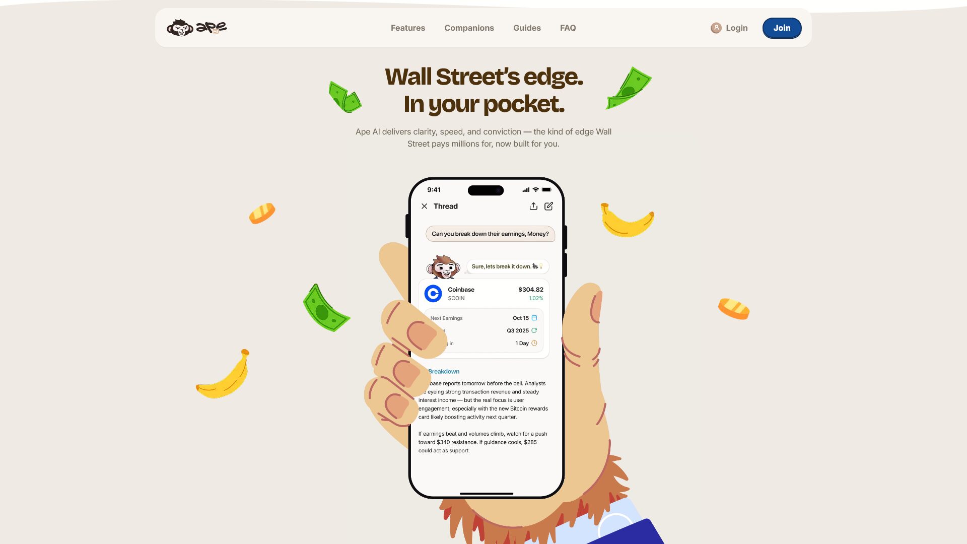
Notice how Ask Ape does it in their main benefit section. The background isn’t white, it’s a light brown. The text isn’t black, it’s a deep brown. Even the navigation background uses a very light shade of brown. This is a subtle way to reinforce your brand and elevate an otherwise generic design.
Does that mean everything has to be one color? No. Ape uses other colors in this section and throughout their website. But by primarily using a simple base color palette, their design becomes more pleasant to look at, easier to navigate, and more interesting.