Opens in a new tab

Category: Design Lessons

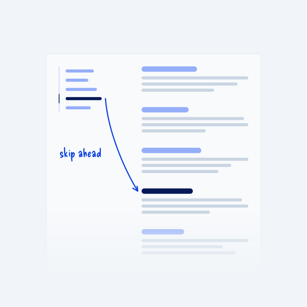
  • A long article with a table of contents on the left. An arrow runs from one highlighted link to its matching section further down the page, labeled skip ahead.

    September 29, 2026
    Long pages, like guides, documentation and policies, are hard to move around by scrolling alone. Readers often need to find…
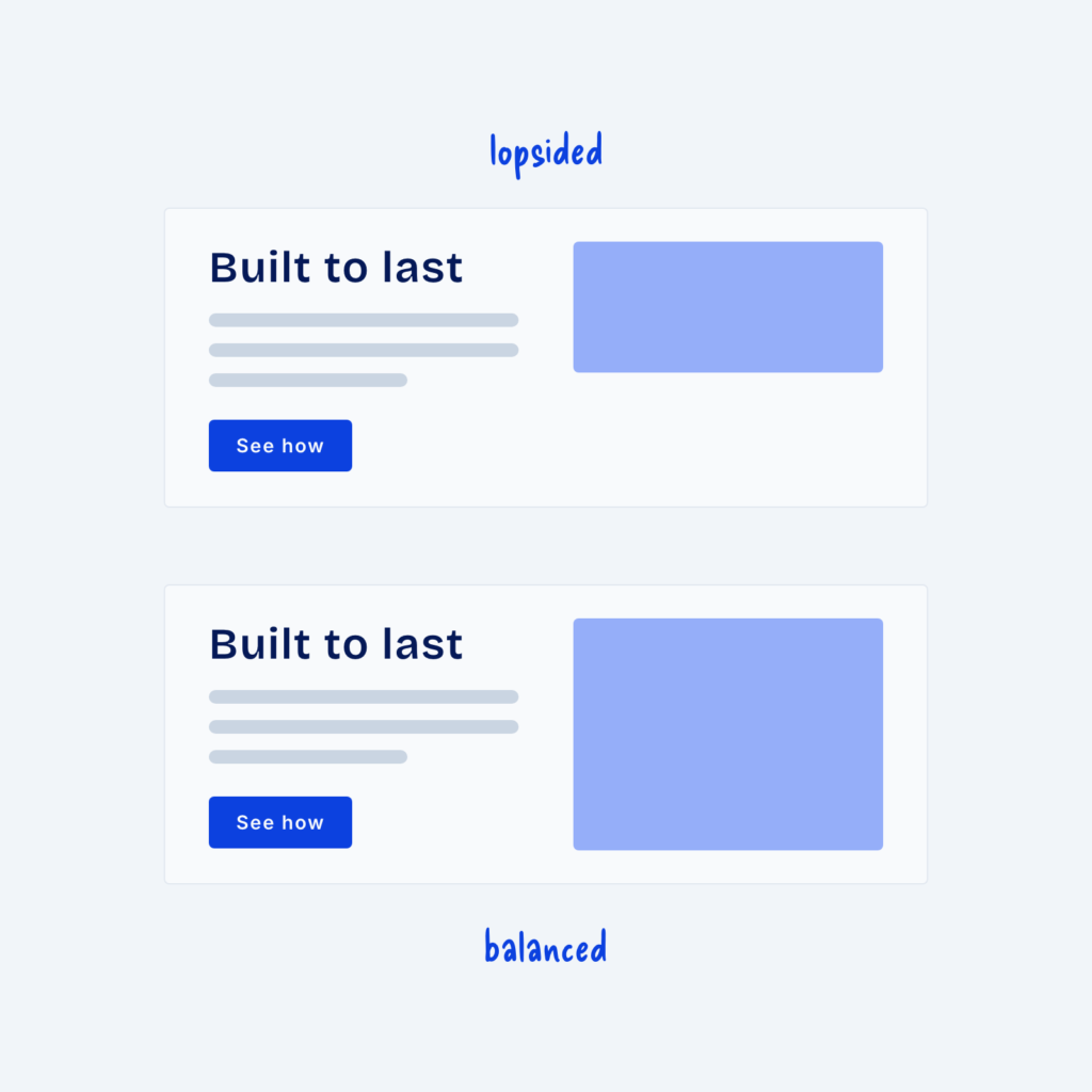
  • Two split sections with the same text. In the top one, labeled lopsided, the image is shorter than the text. In the bottom one, labeled balanced, the image matches the height of the text.

    September 29, 2026
    A split section puts text on one side and an image on the other and it's one of the most…
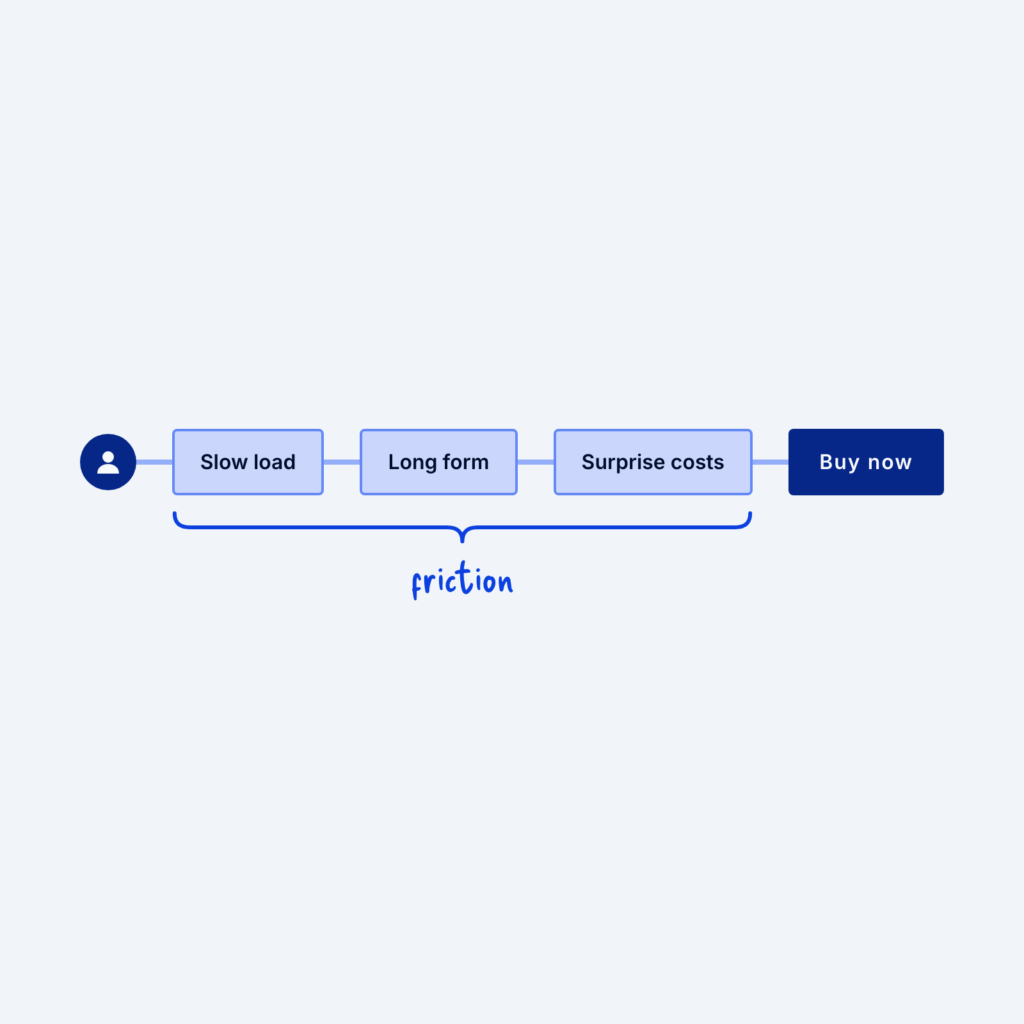
  • A visitor on a path to a Buy now button, blocked by three obstacles labeled Slow load, Long form and Surprise costs, grouped under the word friction.

    September 29, 2026
    When a page isn't converting (turning visitors into customers), it's tempting to add more content instead of cutting. Extra testimonials,…
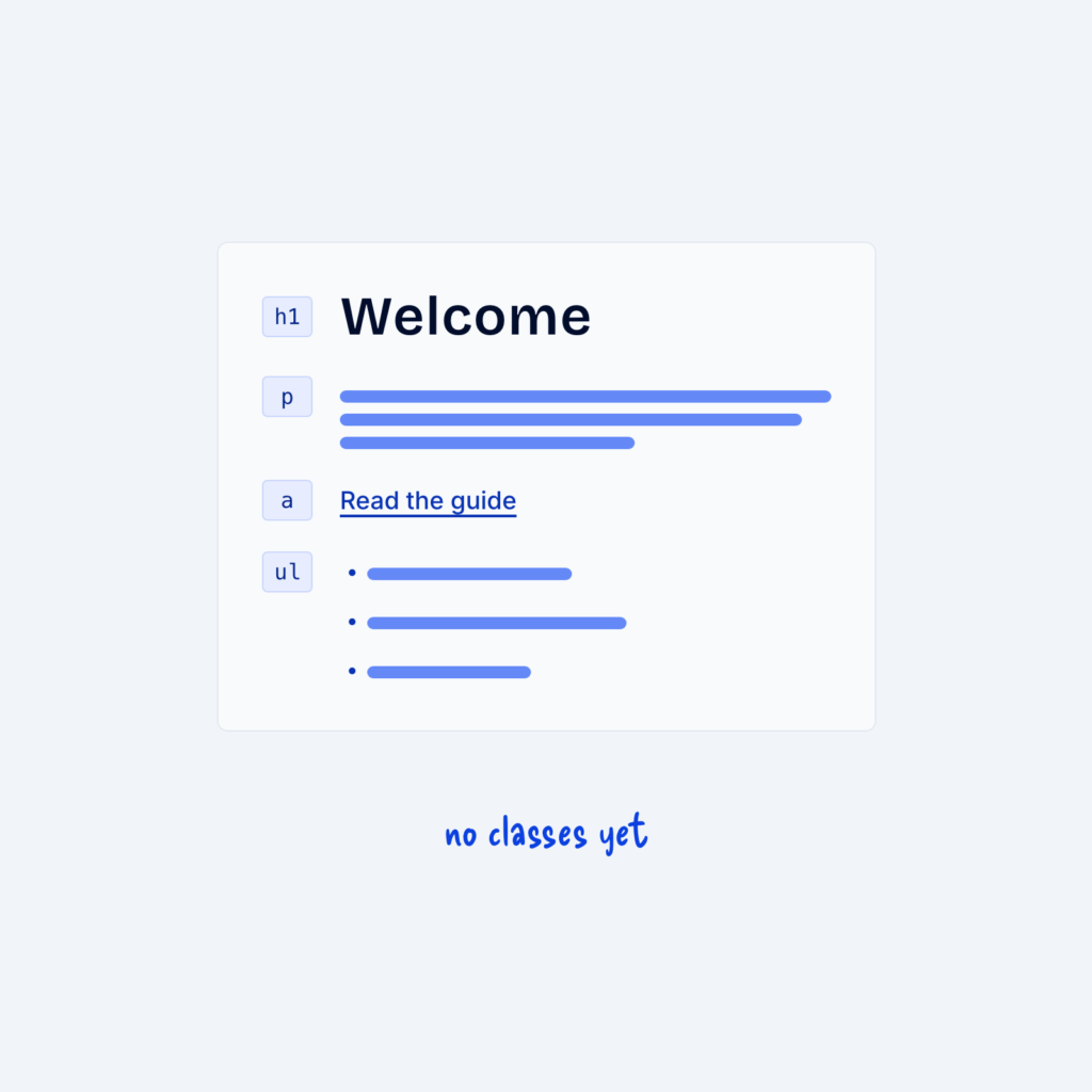
  • A text column with a heading, a paragraph, a link and a list, all styled by default. Each element is marked only with its tag name, like h1 or ul, with the label no classes yet.

    September 29, 2026
    Global styles for body text, headings, links and lists can cover most of a site before you add a single…
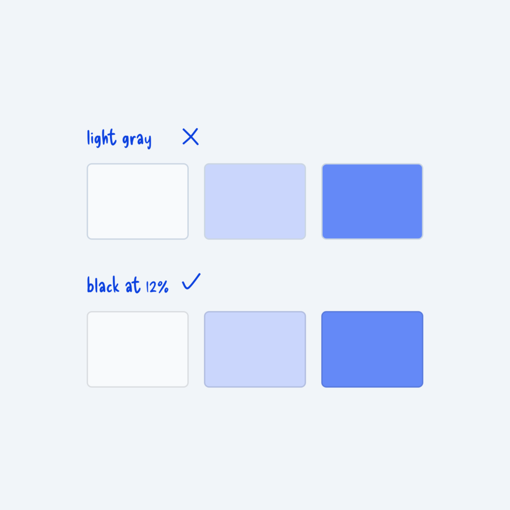
  • Two rows of cards on white, light blue and blue. Light gray borders, marked with an X, stand out on the colored cards. Black borders at 12% opacity, marked with a check, blend in on all three.

    September 29, 2026
    A simple trick I learned when designing borders is to use black at 10 to 15% opacity instead of light…
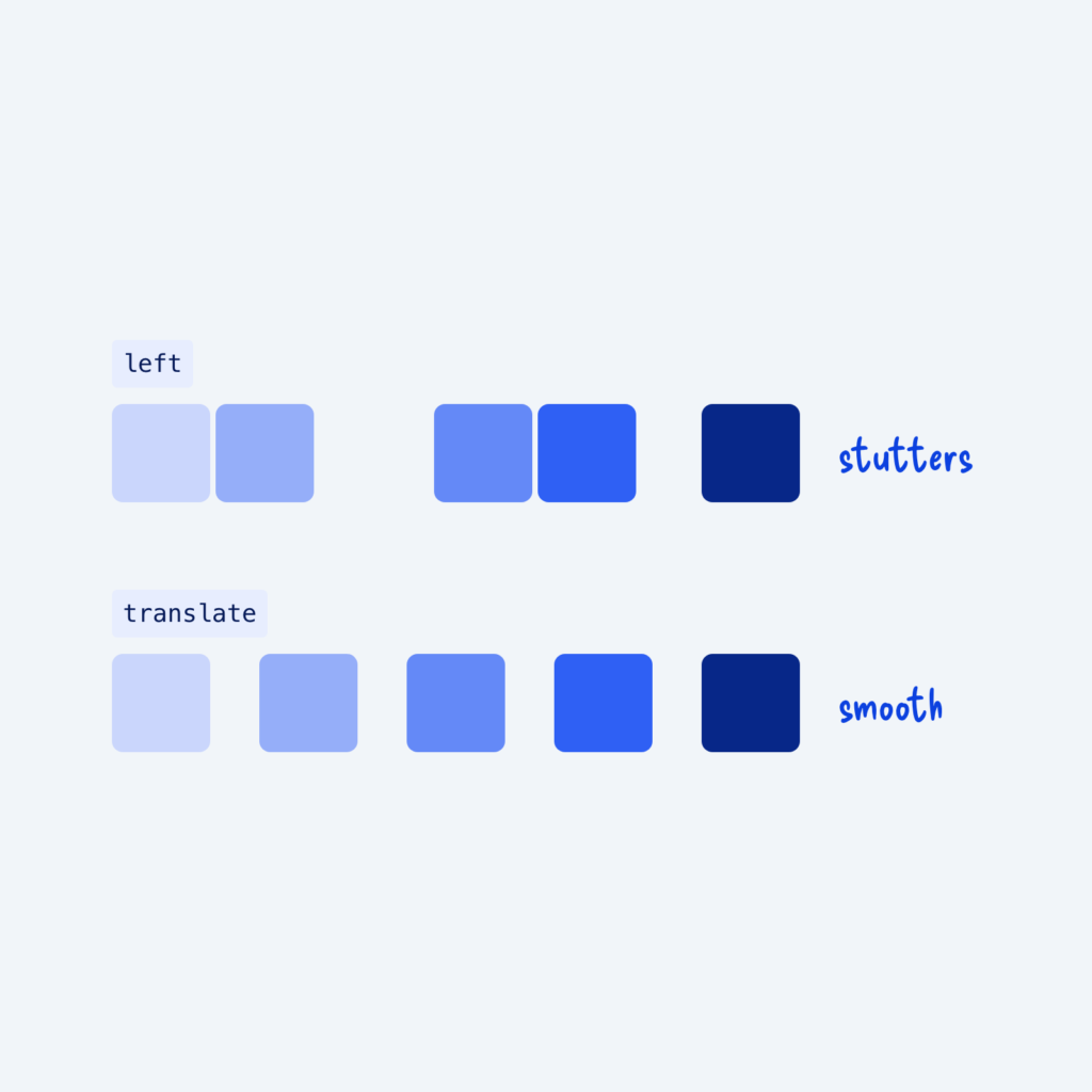
  • Two rows of a card moving right in steps. The row using left has uneven gaps, labeled stutters. The row using translate has even gaps, labeled smooth.

    September 29, 2026
    Some CSS properties are much easier for the browser to animate than others. When you animate properties like width, height,…
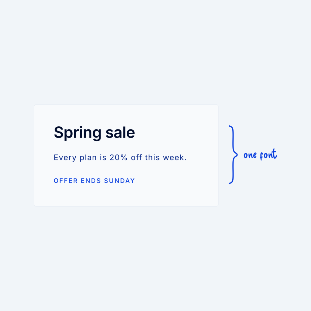
  • A sale card with a bold heading, regular body text and a small uppercase line, all in the same font, labeled one font.

    September 29, 2026
    You don't need two typefaces to create contrast. One font family can do all the work through size, weight, letter…
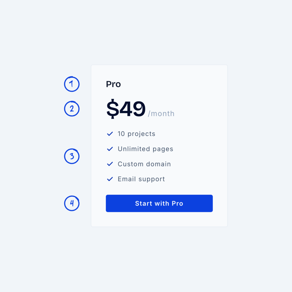
  • A pricing card with the plan name, a large $49 price with a small /month, a short feature list and a button at the bottom, numbered 1 to 4 in reading order.

    September 29, 2026
    A pricing card has one job, which is to help people quickly see what they get and what it costs.…
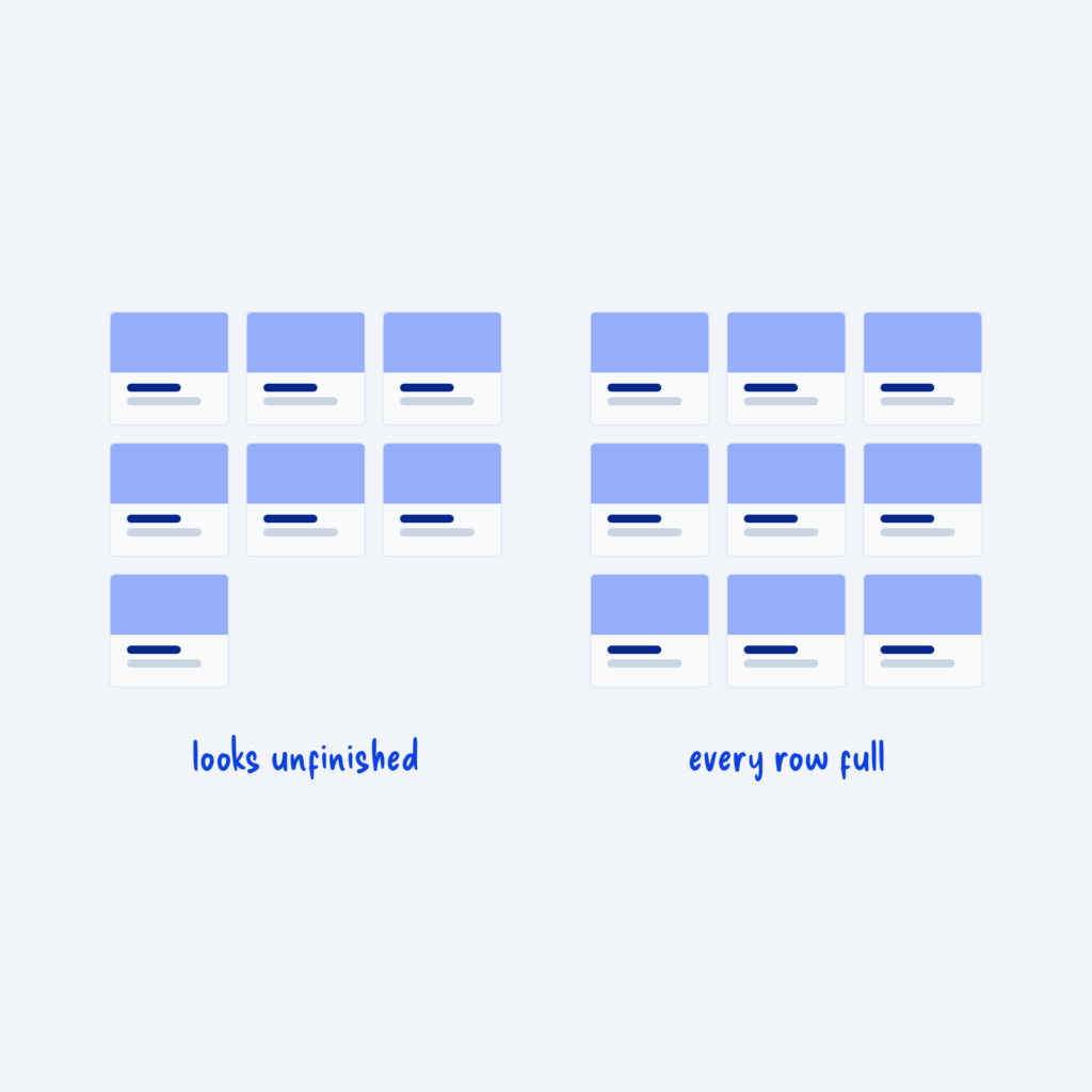
  • Two card grids. The left grid has seven cards, leaving one alone on the last row, labeled looks unfinished. The right grid has nine cards, labeled every row full.

    September 29, 2026
    Grids look best when every row is full. Seven cards in a three-column grid leave one card alone on the…
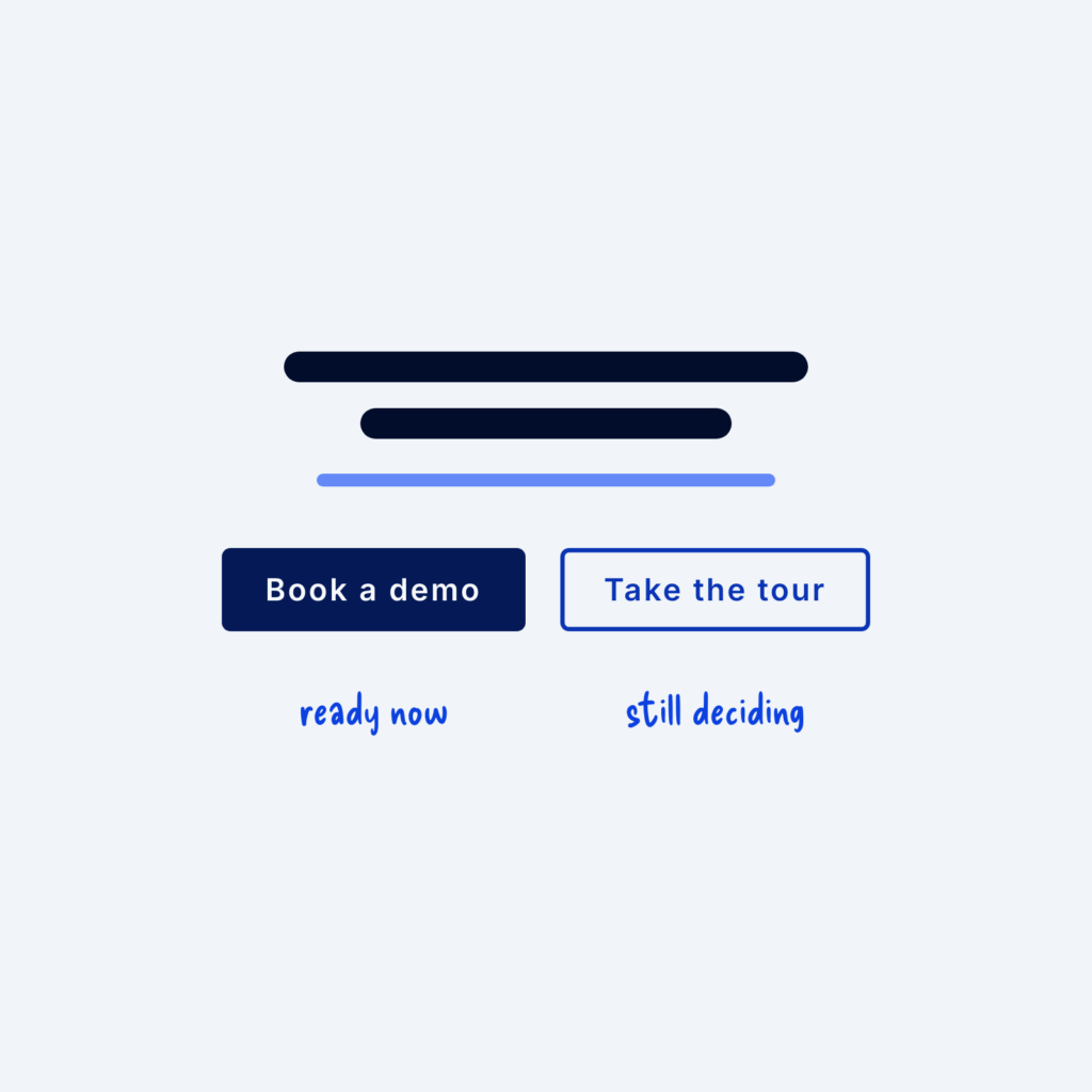
  • Two buttons under a headline: a filled Book a demo button labeled ready now and an outlined Take the tour button labeled still deciding.

    September 29, 2026
    Many visitors (especially first-time visitors) are interested but not ready for a big commitment like booking a sales call. If…
Get Free Design Lessons Every Monday Morning

Three short lessons each Monday on a single design topic. They're written in plain language and give you ideas to use on your next site.

You're in!

Check your inbox for your first email.
Close