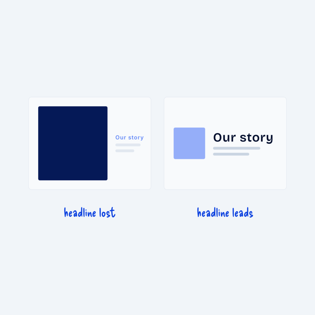

You don’t need two typefaces to create contrast. One font family can do all the work through size, weight, letter case and shade. A large bold heading, regular body text and a small uppercase line all look clearly different, even in the same font.
Many clean sites use a single family in three or four weights. It keeps the page consistent and helps it load faster, since there are fewer font files to download. Most designers who do add a second typeface later often use it for headings only and keep everything else in the main font family.