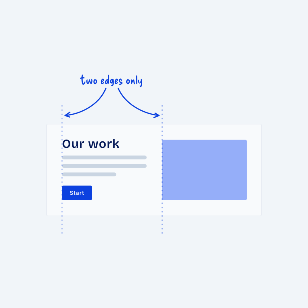
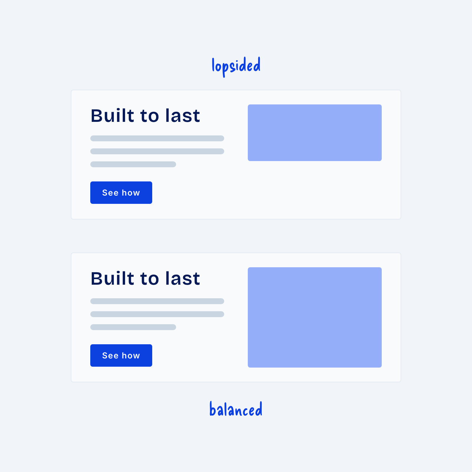
A split section puts text on one side and an image on the other and it’s one of the most common layouts on the web. However, because it’s so common it’s also easy to mess up. When the image is small next to a tall block of text, or the two sides sit at different heights, the section feels lopsided.
That’s why it’s sometimes best to center both sides vertically, so the middle of the text lines up with the middle of the image. Size the image so it’s about as tall as the text beside it. When both columns carry similar weight, the eye moves between them easily.