Opens in a new tab

Category: Design Lessons

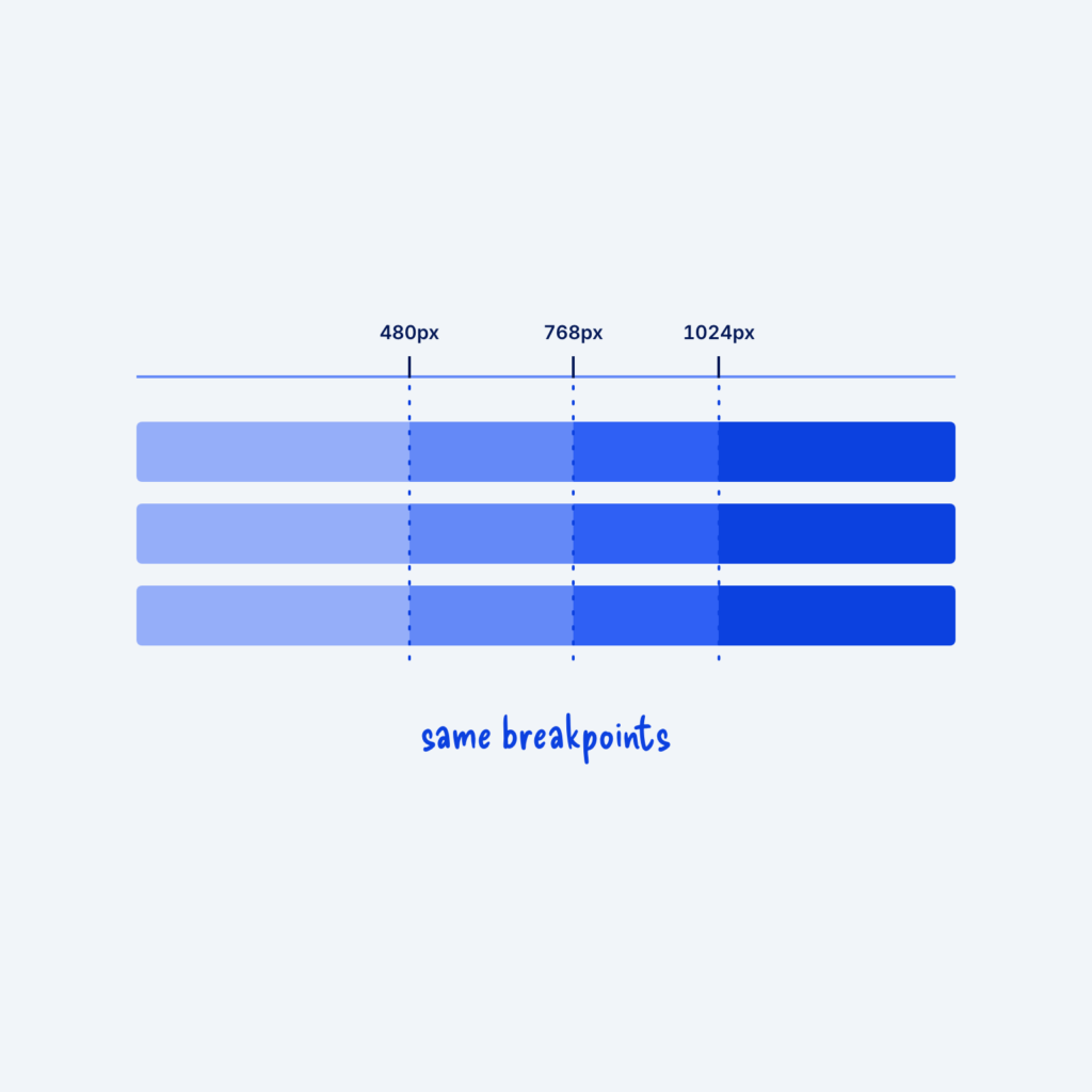
  • A ruler with marks at 480px, 768px and 1024px. Dotted lines drop through three component bars, and every bar changes at the same lines, labeled same breakpoints.

    September 29, 2026
    A breakpoint is the screen width where a layout changes, like a grid dropping from three columns to one. When…
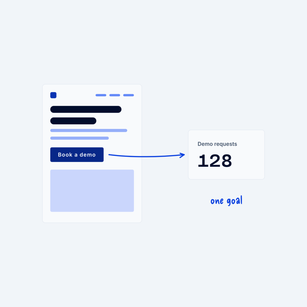
  • A page wireframe with an arrow from its button to a Demo requests counter, labeled one goal.

    September 29, 2026
    It's really hard to improve something you don't measure. If you don't know how many people take the action you…
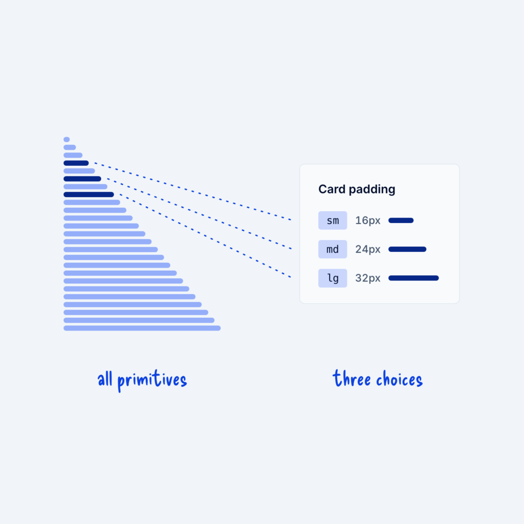
  • A long column of 25 spacing primitives from 4px to 100px. Three are highlighted and lead to a Card padding panel that offers only sm, md and lg.

    September 29, 2026
    Most design systems start with a long list of raw values, called primitives. Your spacing primitives might run from 4px…
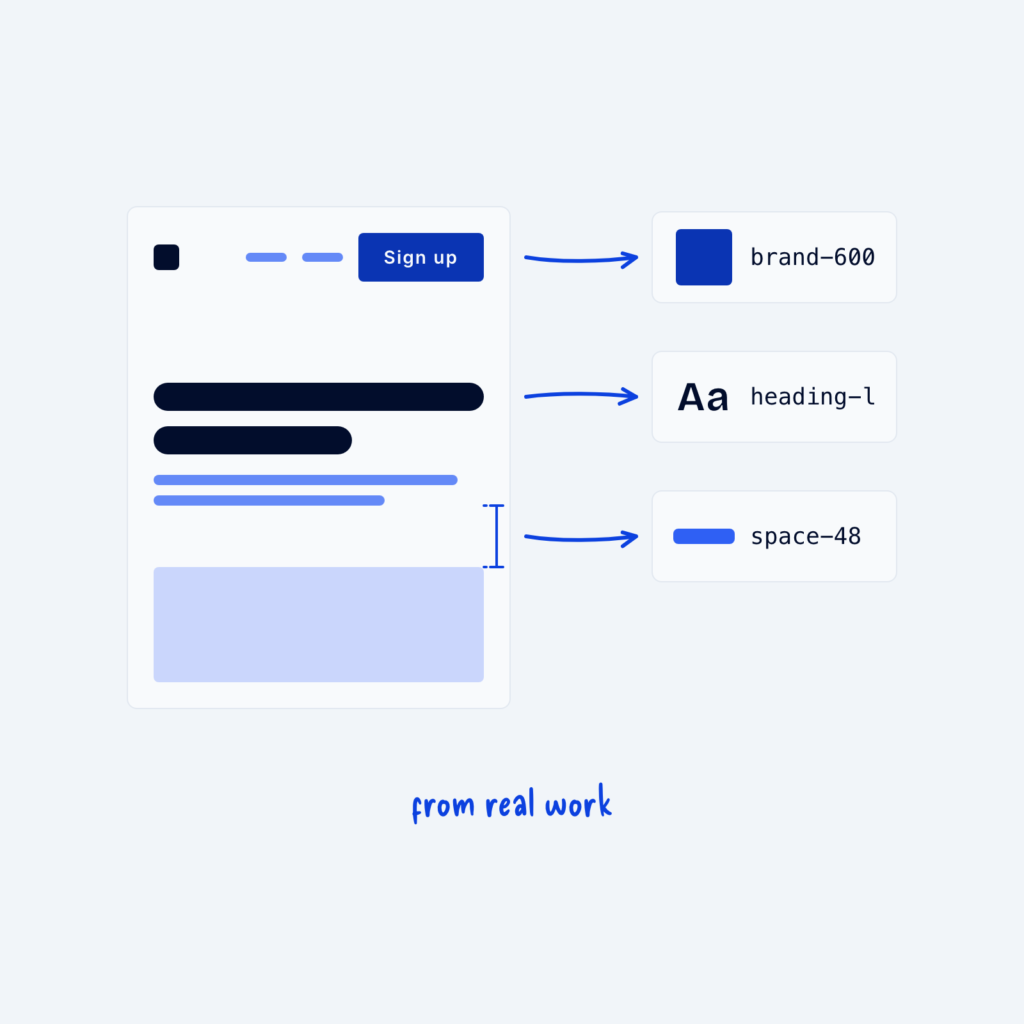
  • A page wireframe with arrows from its button, heading and a gap to three tokens: brand-600, heading-l and space-48, labeled from real work.

    September 29, 2026
    It can be tempting to design a complete system before building any pages, with every color shade, font size and…
Get Free Design Lessons Every Monday Morning

Three short lessons each Monday on a single design topic. They're written in plain language and give you ideas to use on your next site.

You're in!

Check your inbox for your first email.
Close