Opens in a new tab

Category: Design Lessons

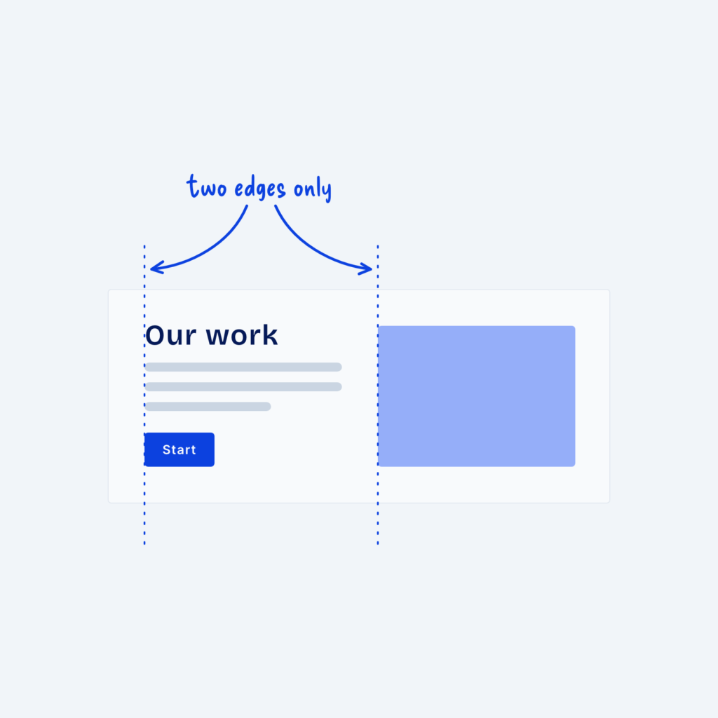
  • A split section where the heading, text lines and button share one left edge and the image starts on a second edge, with dotted guide lines labeled two edges only.

    September 29, 2026
    When visitors look at a section, their eyes follow invisible lines along the edges of things. Where a heading starts,…
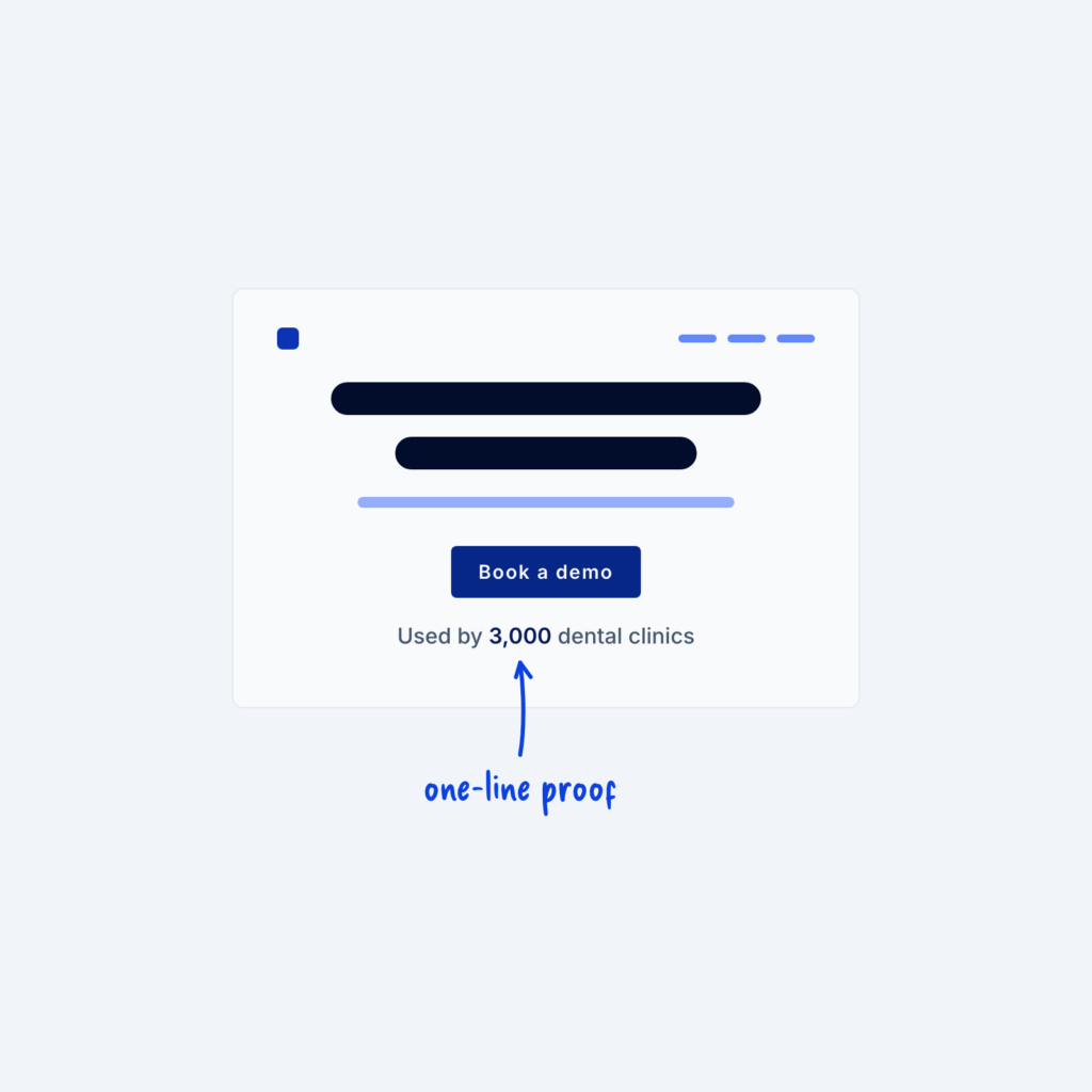
  • A hero wireframe with one line under the button that reads Used by 3,000 dental clinics, with an arrow to the number labeled one-line proof.

    September 29, 2026
    Building trust, especially close to CTAs, is super important for increasing your conversion rate on a marketing website. A short…
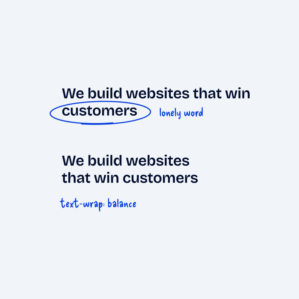
  • The same headline shown twice. The top version leaves the word customers alone on the second line, labeled lonely word. The bottom version splits into two even lines, labeled text-wrap: balance.

    September 29, 2026
    Headlines that wrap onto a second line often leave a single short word hanging out on its own. It unbalances…
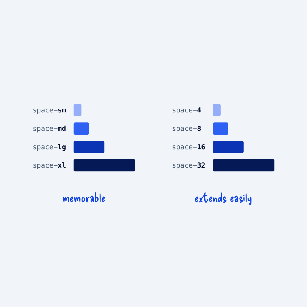
  • Two identical sets of spacing bars. The left set is named space-sm to space-xl, labeled memorable. The right set is named space-4 to space-32, labeled extends easily.

    September 29, 2026
    Tokens are the reusable values in your design system, and each one needs a name. For sizes, there are two…
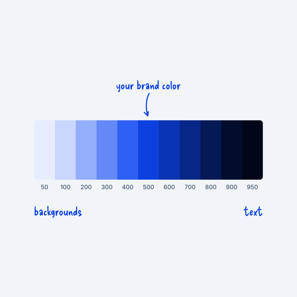
  • A strip of eleven shades of one blue, numbered 50 to 950, with an arrow to the 500 step labeled your brand color. The light end is labeled backgrounds and the dark end text.

    September 29, 2026
    A single brand color rarely covers everything a website needs. You'll usually want a very light version for backgrounds, a…
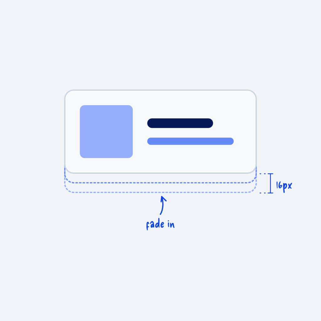
  • A card in its final position with two faint dashed outlines just below it, showing it moved up 16px as it faded in.

    September 29, 2026
    When an element slides in from far away, like a card flying up from the bottom of the screen, people…
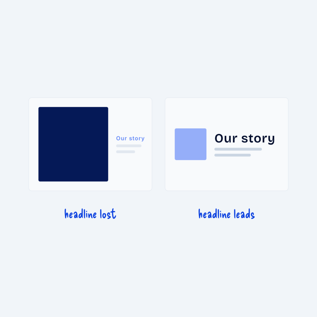
  • Two cards. On the left, a large dark image overpowers a small, pale Our story headline, labeled headline lost. On the right, a small light image sits beside a large, dark headline, labeled headline leads.

    September 29, 2026
    Images carry a lot of visual weight. A large, high-contrast image pulls the eye even when it's only decoration. Next…
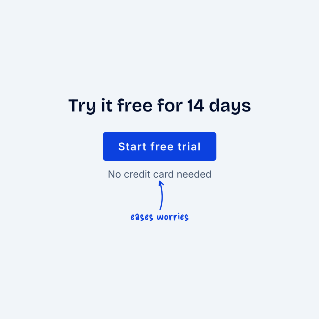
  • A call to action with the heading Try it free for 14 days and a Start free trial button. A small line under the button reads No credit card needed, labeled eases worries.

    September 29, 2026
    Right before they click, people often hesitate. They might wonder whether they'll be charged, whether they can cancel or whether…
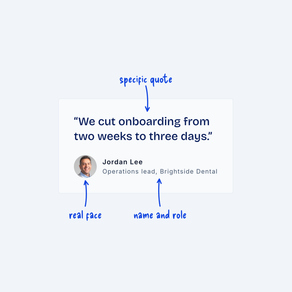
  • A testimonial card with the quote We cut onboarding from two weeks to three days, a small headshot, a name and a role. Labels point out the specific quote, the real face and the name and role.

    September 29, 2026
    A testimonial is only as believable as the details it contains. A quote with no name, or a name with…
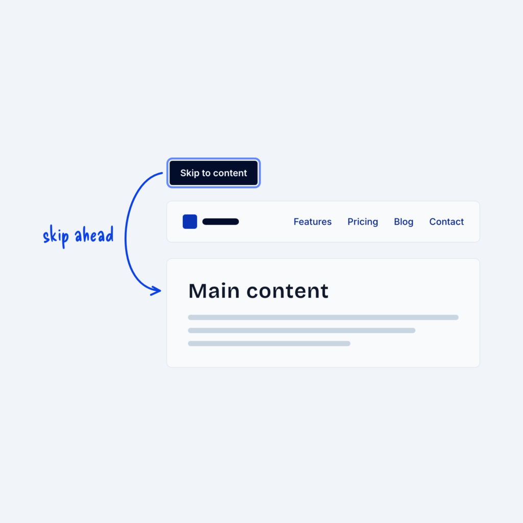
  • A focused Skip to content link above a site header. An arrow curves around the header to the Main content heading, labeled skip ahead.

    September 29, 2026
    People who use a keyboard move through a page by pressing Tab, one link at a time. Without a shortcut,…
Get Free Design Lessons Every Monday Morning

Three short lessons each Monday on a single design topic. They're written in plain language and give you ideas to use on your next site.

You're in!

Check your inbox for your first email.
Close