When visitors look at a section, their eyes follow invisible lines along the edges of things. Where a heading starts, where a paragraph starts, or where an image begins. Every element that starts in a new place adds one more line to follow. Too many starting points can make a section look busy, even when each piece is well designed on its own.
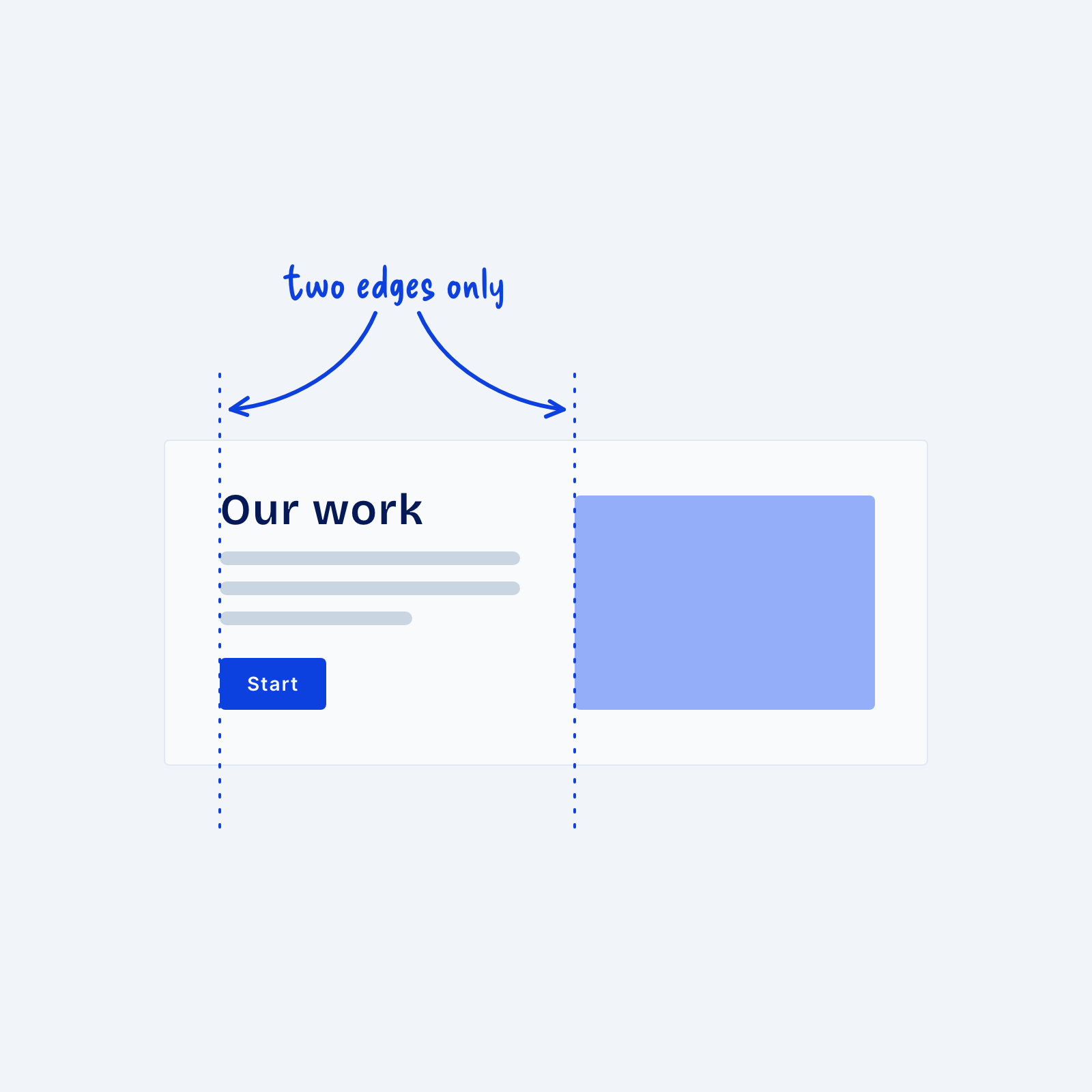
To fix this, pick two or three edges and line everything up on them. For example, in a split section, the heading, paragraph and button can all start on one left edge, and the image can start on a second edge. Check carefully for unwanted margin, padding or alignment (center-aligned text, for example) that could be making your layout look messy.