Opens in a new tab

Balance big images against text

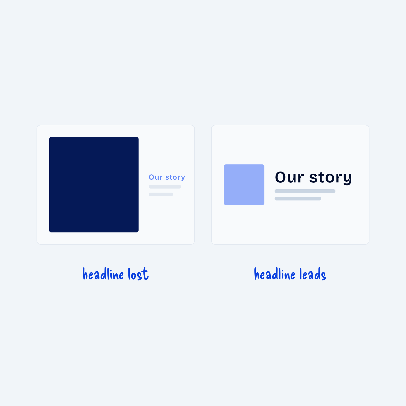
Two cards. On the left, a large dark image overpowers a small, pale Our story headline, labeled headline lost. On the right, a small light image sits beside a large, dark headline, labeled headline leads.

Images carry a lot of visual weight. A large, high-contrast image pulls the eye even when it’s only decoration. Next to a small, light headline, the image overpowers it and visitors may miss the message entirely.

Before you place an image and a headline together, decide which one should lead. If the headline matters more, make the image smaller, lighter or lower in contrast, and give the headline more size and weight. If the image is the point, like a product photo, let it lead and keep the text beside it short.

Get Free Design Lessons Every Monday Morning

Get Free Design Lessons Every Monday Morning

Three short lessons each Monday on a single design topic. They're written in plain language and give you ideas to use on your next site.

You're in!

Check your inbox for your first email.
Close