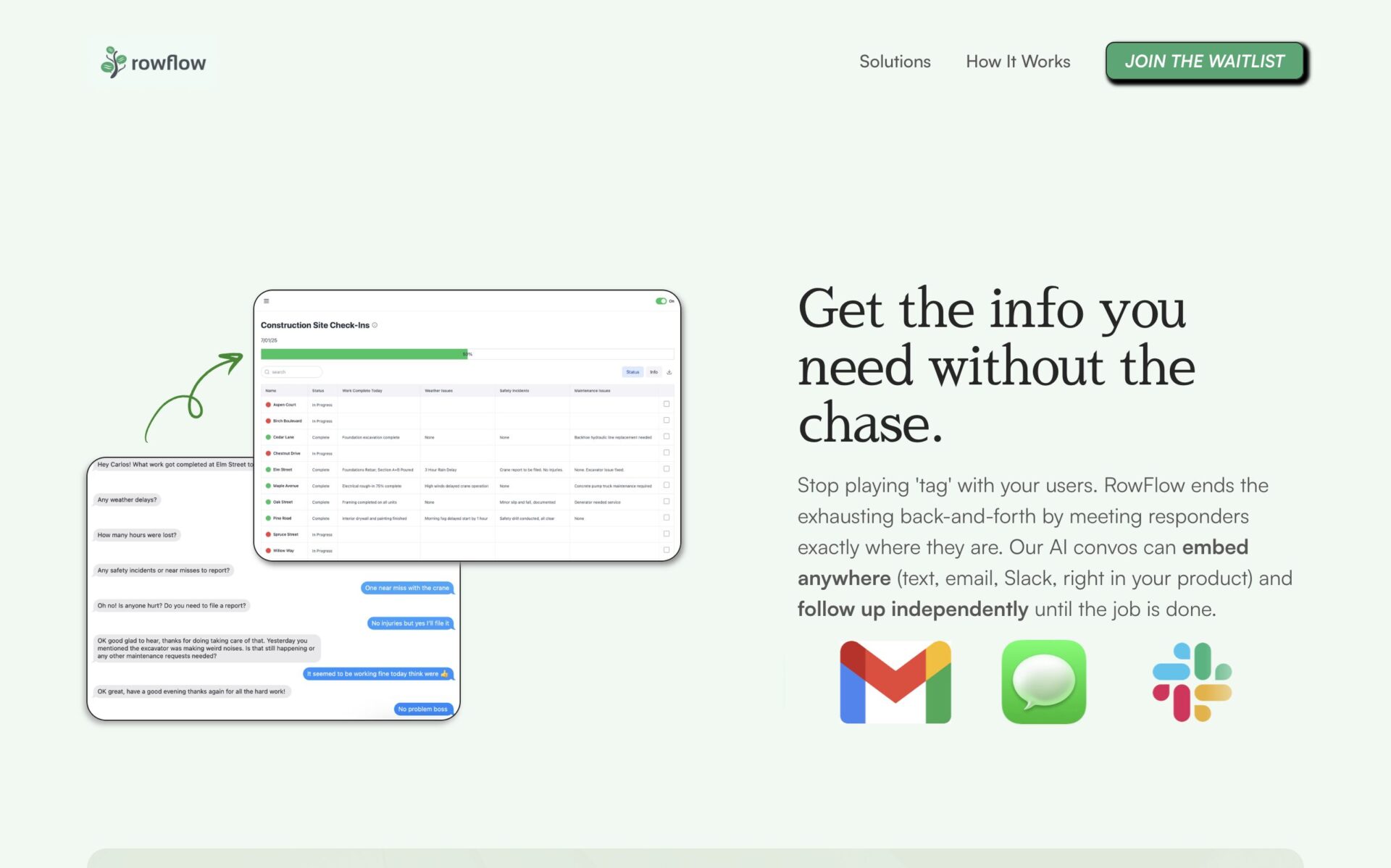
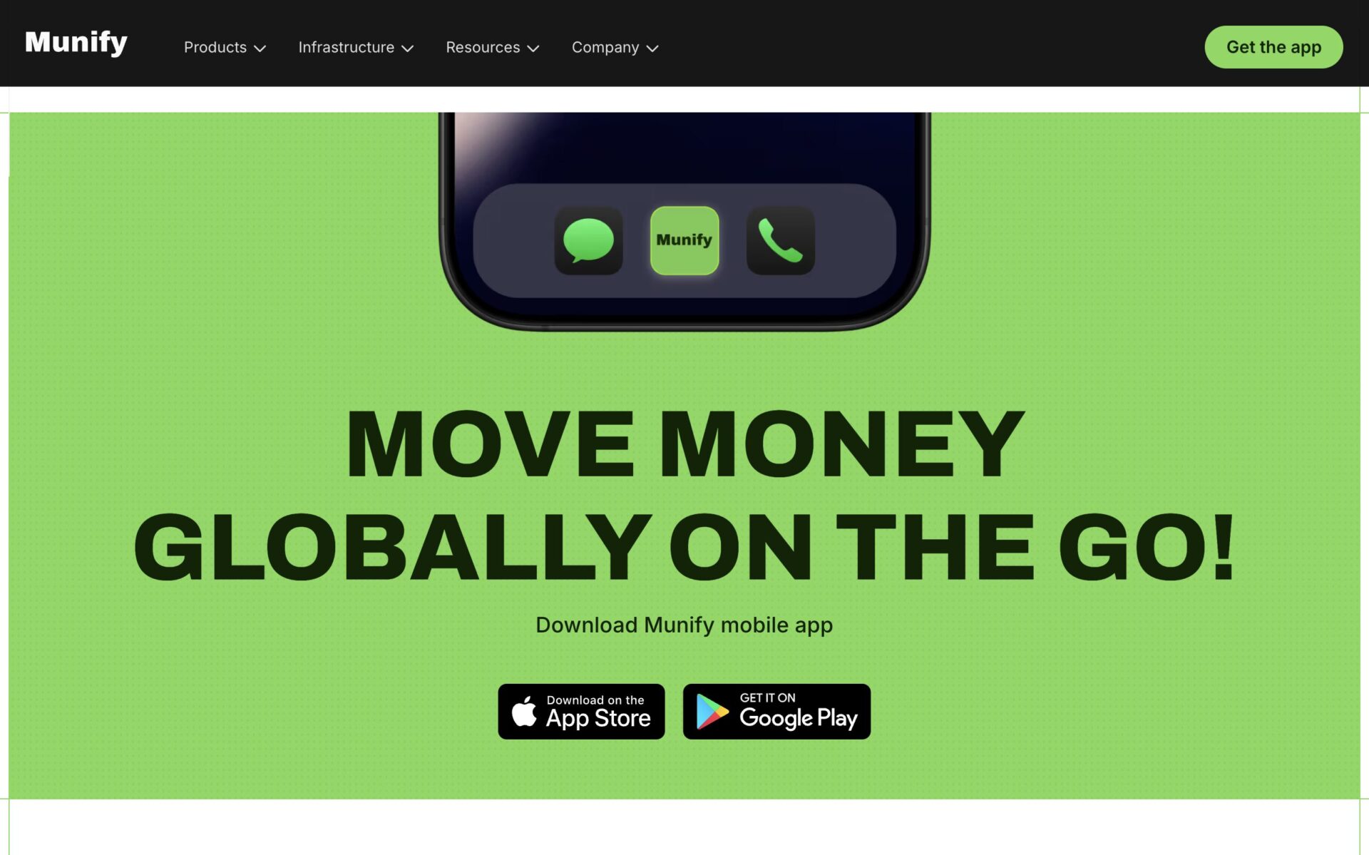
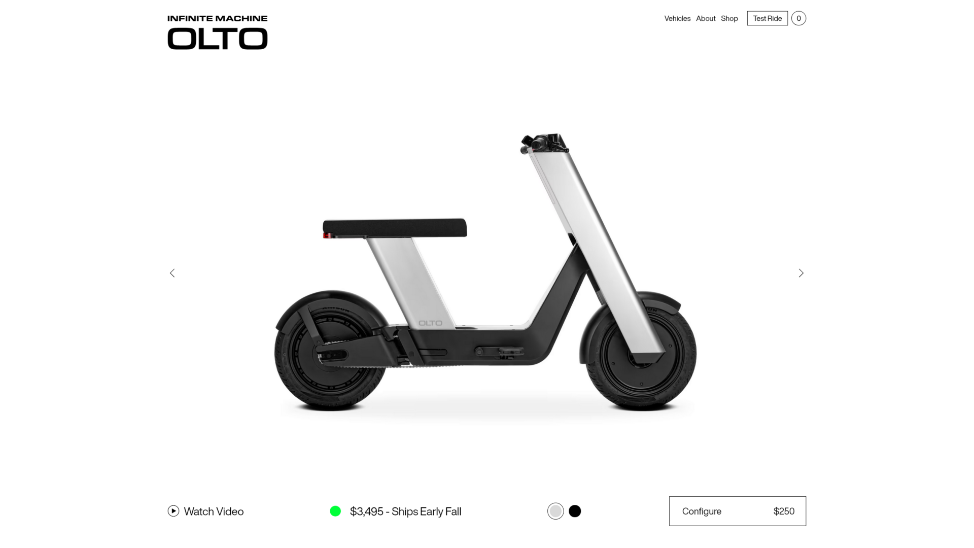
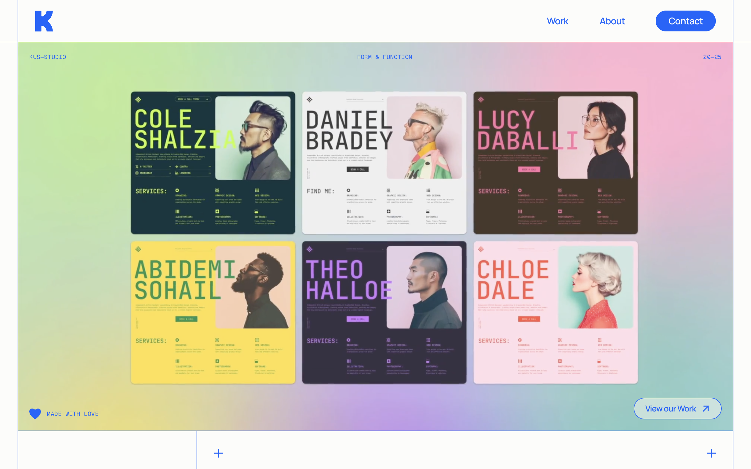
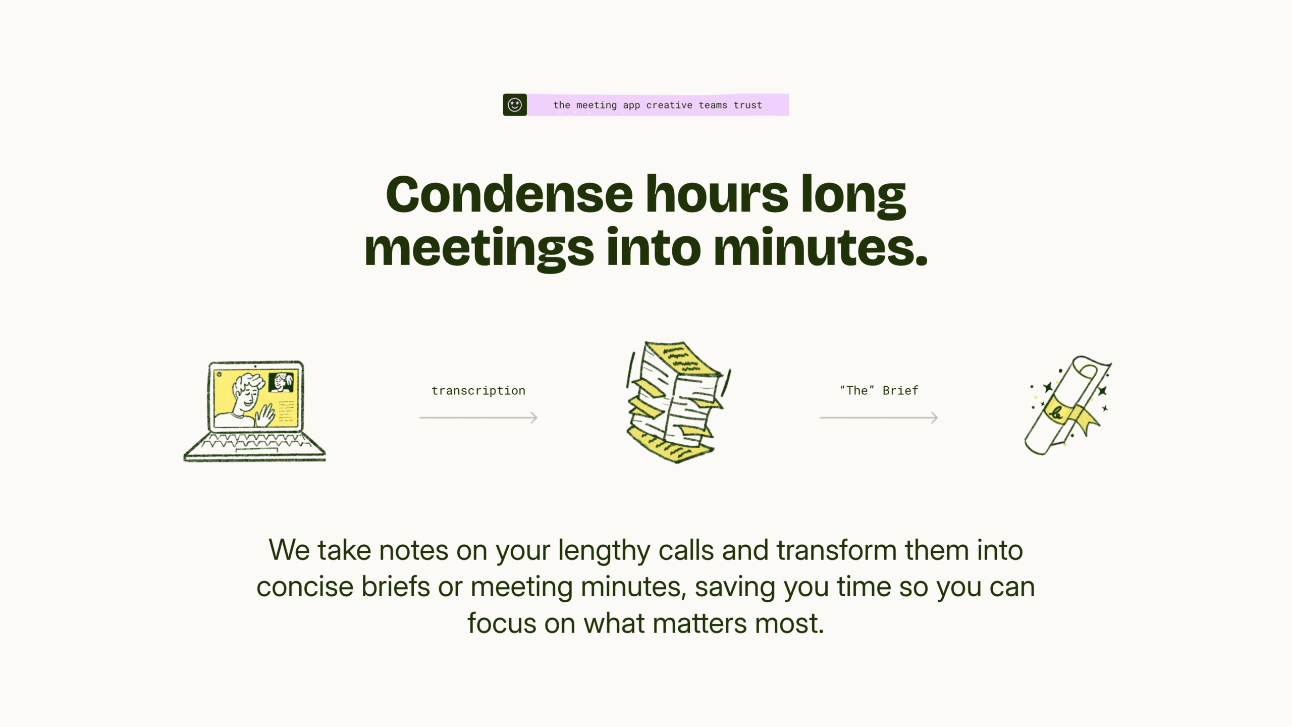
The “Hero” is the first section on your website. This is by far the most important section to optimize. If you’re going to put your attention towards anything on your website, it should be the hero section. Let’s take a look at a great hero section from granola.ai to see what we can learn.
Granola does a few things really well. In fact, this hero section can act as a general model for your own website. But, like all models, you shouldn’t copy them one-to-one. Instead, learn the principles of the model so you can apply it effectively to any design.
Your headline speaks to your target audience using simple language – It all begins with the headline. Your target audience should immediately see themselves in your headline. Avoid distancing, verbose, and unclear language. Ideally you sell something you can describe. Ideally you sell to a certain demographic. Simply tell that demographic what you sell. If you can speak to their pain, that’s even better. They know you’re someone who cares about helping them, because you’re speaking to a problem they’re currently facing.
Your subtitle identifies or expands on the main benefit – Once you’ve identified your audience and their pain, present a solution. It doesn’t have to be too detailed, it just has to draw them in. Show them why they should care. If you’ve identified the main benefit in your headline, expand on it in your subtitle. Give them a reason to scroll.
Your call-to-action directs visitors to the next logical step – Now that you’ve got a visitor’s interest, direct them deeper into your funnel. For Granola that’s directing visitors to a download. But for you it could be directing visitors to learn more or to sign up to test it out for free. For services it’s often asking users to fill out a contact form. Whatever it is, you have to be direct. Granola doesn’t just write “Download”, they write “Download for Mac”. Don’t write “Contact Us” write “Get An Estimate In 5 Minutes”. Don’t write “sign up” write “Join the community”. Be specific, let visitors know what your call-to-action does.
Your graphic shows the “Activation Point” – There’s a term in customer success called the “activation point”, also called the “aha moment”. This is the moment the user understands the value of your product or service. This is the moment they become “activated”, meaning they’re much more likely to stay with you for a long time. Your graphic should showcase this moment. Granola shows how a few simple notes from a transcribed meeting turn into an entire notebook of actionable next steps. Whatever your “aha moment” is, show visitors early so they can visualize getting value from your business.


