Opens in a new tab

Category: Design Lessons

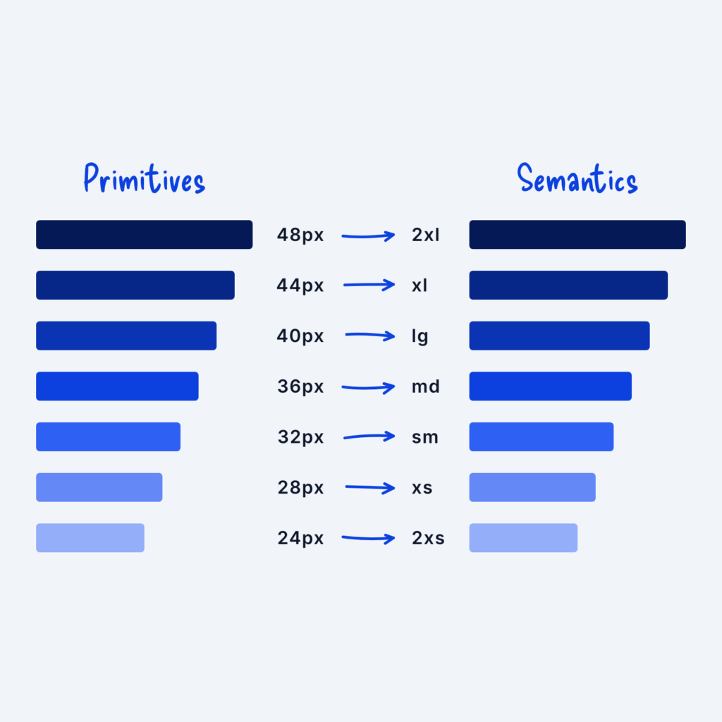
  • Two columns of bars. Primitive values from 24px to 48px on the left each point with an arrow to a semantic name on the right, from 2xs to 2xl.

    September 29, 2026
    When we create a scaling system, we start by defining the raw values (4px, 8px, 12px, etc.) and then give…
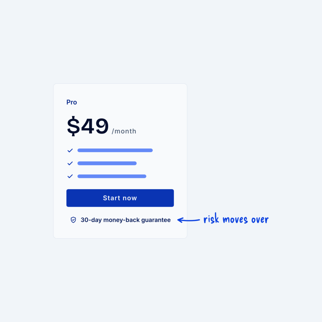
  • A pricing card with a line under the button that reads 30-day money-back guarantee, with an arrow labeled risk moves over.

    September 29, 2026
    Every purchase carries some risk for the buyer. They might pay and find the product isn't right for them, or…
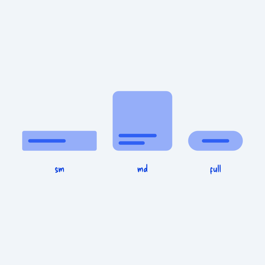
  • An input, a card and a pill button in a row with small, medium and fully rounded corners, labeled sm, md and full.

    September 29, 2026
    Corner radius is how rounded an element's corners are. When every component gets its own value, like 5px on buttons,…
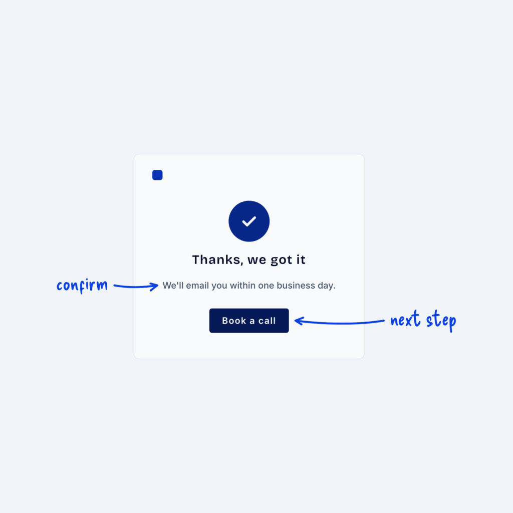
  • A thank-you page with a check mark, a short confirmation line and a single Book a call button, labeled confirm and next step.

    September 29, 2026
    Someone who has just submitted a form is paying close attention to whatever comes next. The “thank you page” is…
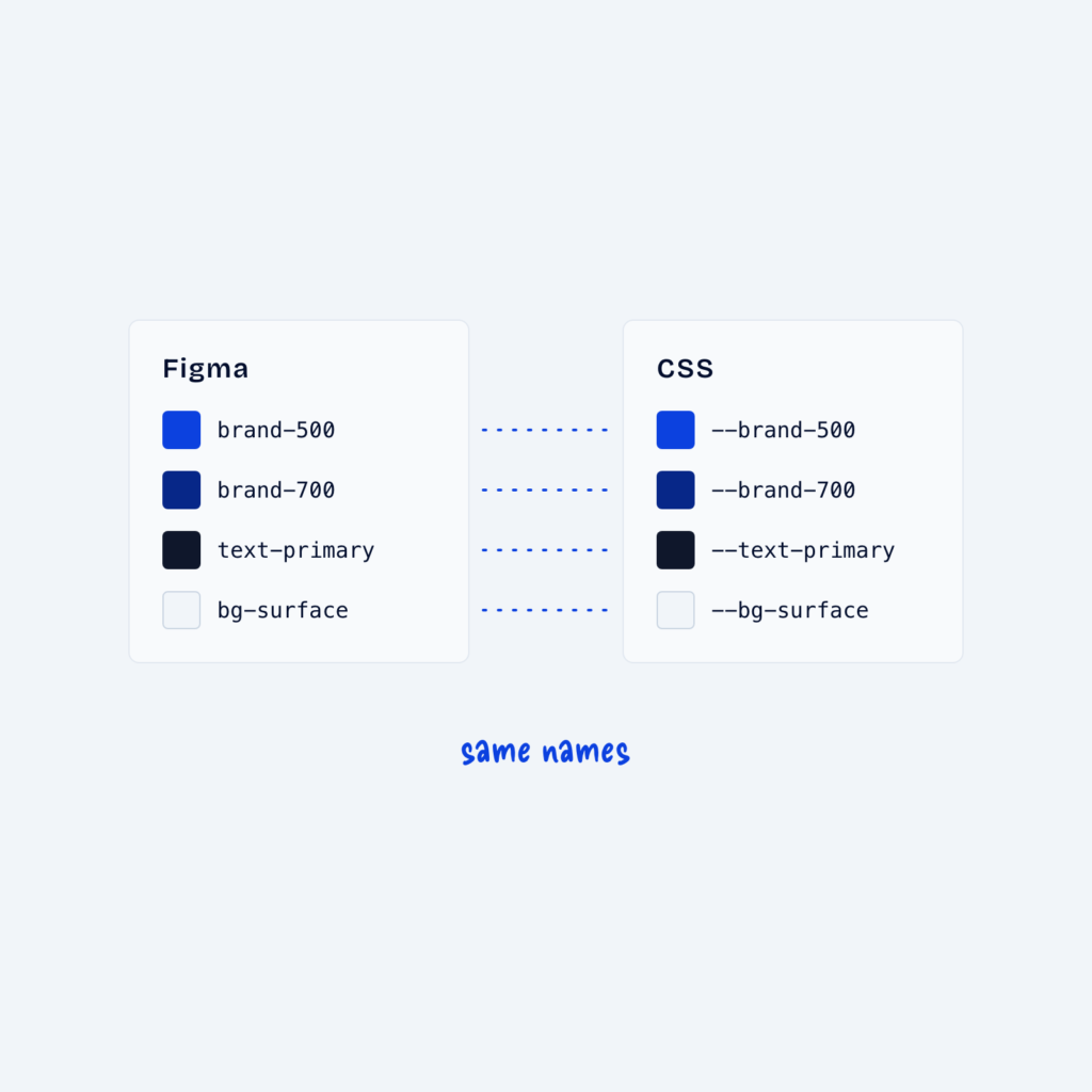
  • Two panels, Figma and CSS, listing the same four token names, with dotted lines joining each matching pair, labeled same names.

    September 29, 2026
    Many designers keep tokens in two places: as variables in a design tool like Figma, and as CSS variables on…
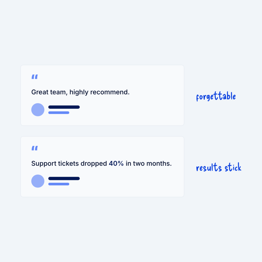
  • Two testimonial cards. The vague one, Great team, highly recommend, is labeled forgettable. The one that reads Support tickets dropped 40% in two months is labeled results stick.

    September 29, 2026
    A testimonial like "Great team, highly recommend" is pleasant to read, but it's also not particularly memorable. It could describe…
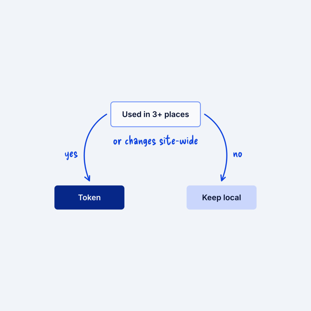
  • A small flowchart that asks whether a value is used in 3+ places or changes site-wide. Yes leads to Token and no leads to Keep local.

    September 29, 2026
    Tokens, the named values in your design system, are useful, but turning every number into one can make a system…
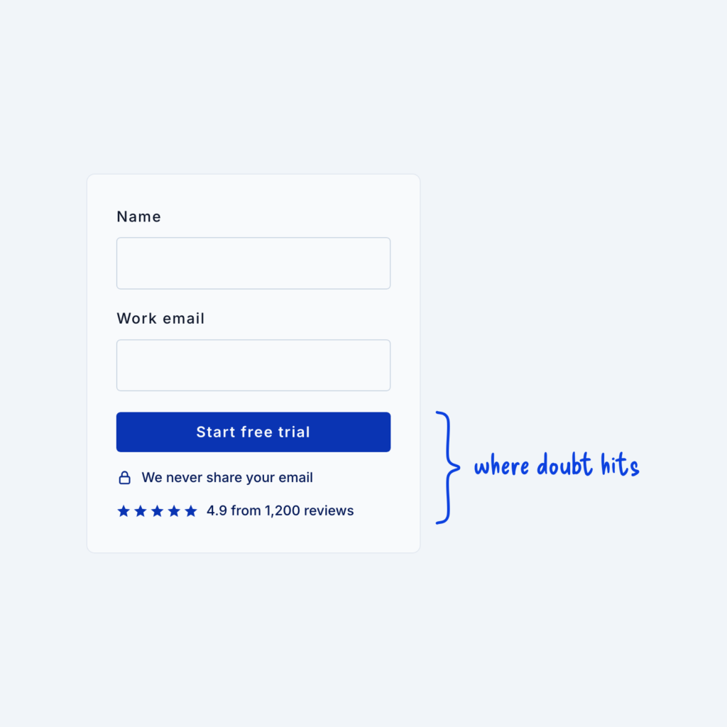
  • A form card with two trust lines right under its button, a lock with We never share your email and a five-star rating, labeled where doubt hits.

    September 29, 2026
    People tend to hesitate most right before they commit, like when they're about to submit a form or enter their…
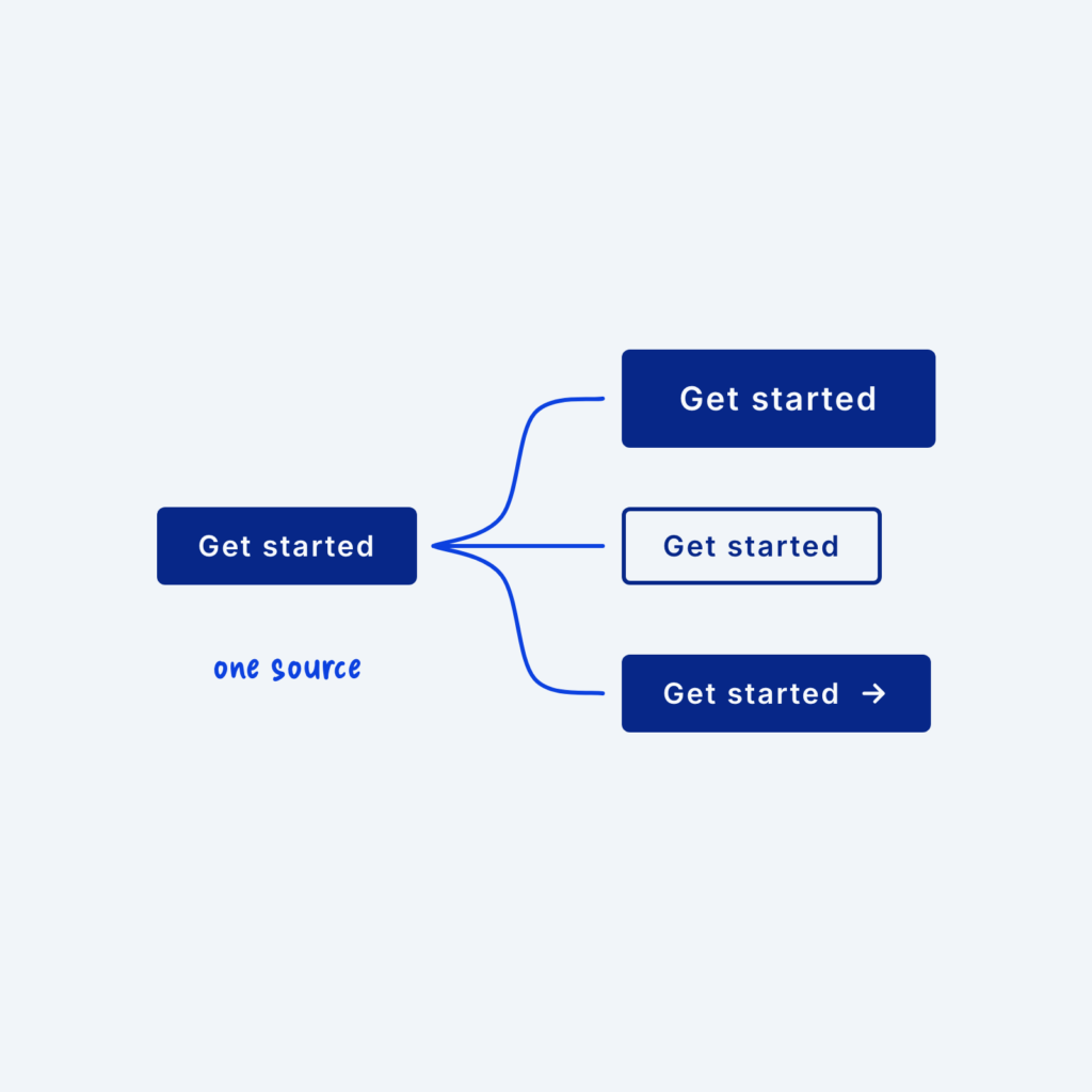
  • One base button with lines branching to three variants that share its label: a large one, an outlined one and one with an icon, labeled one source.

    September 29, 2026
    A button often needs to appear in a few forms, like a large version for the hero section, an outlined…
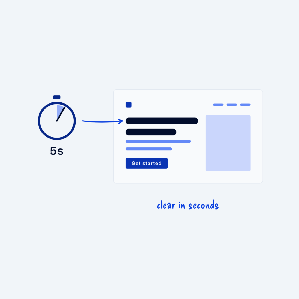
  • A hero wireframe next to a stopwatch showing 5s, with an arrow to the headline labeled clear in seconds.

    September 29, 2026
    Most visitors decide within a few seconds whether a page is worth their time. A five-second test checks whether your…
Get Free Design Lessons Every Monday Morning

Three short lessons each Monday on a single design topic. They're written in plain language and give you ideas to use on your next site.

You're in!

Check your inbox for your first email.
Close