Opens in a new tab

Category: Layout

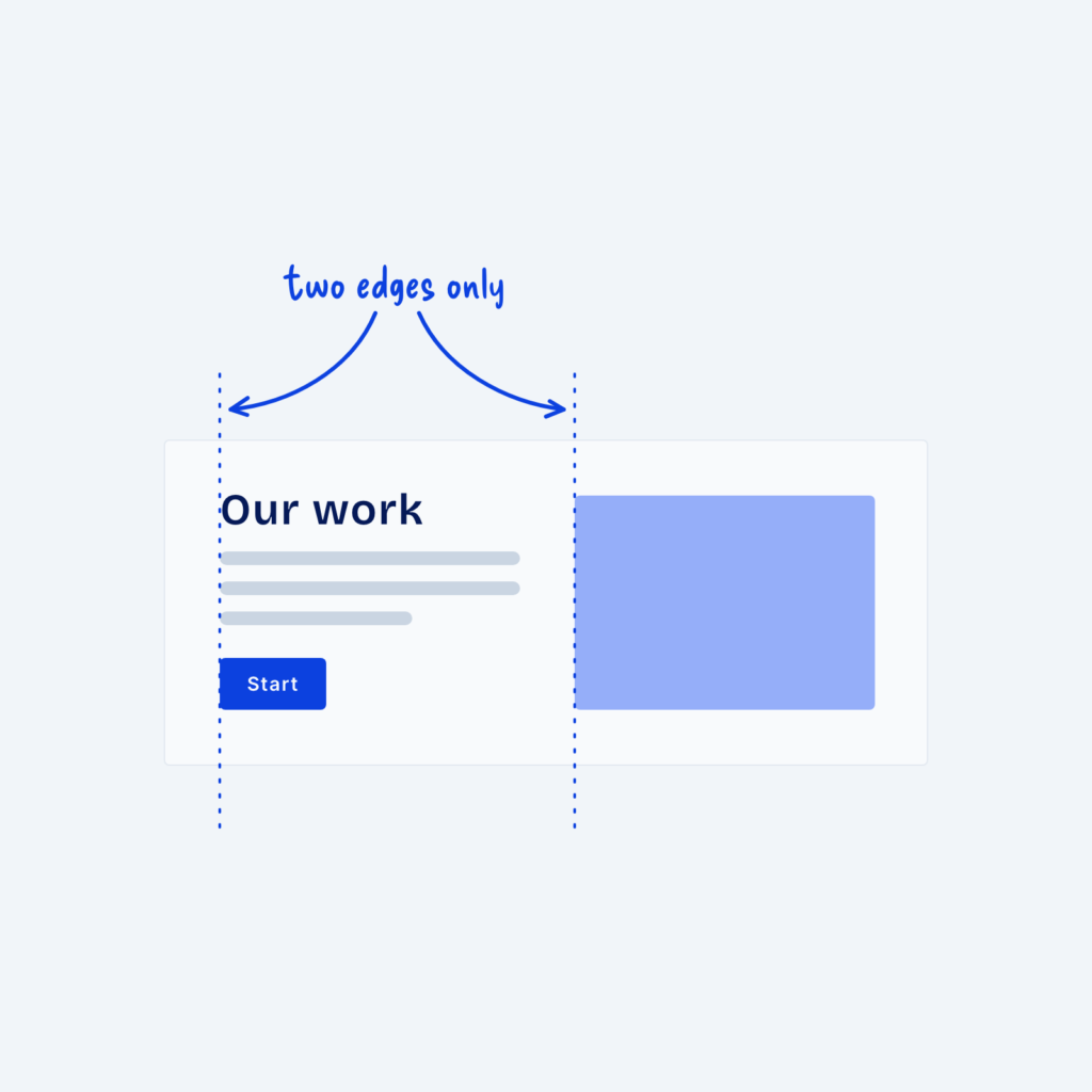
  • A split section where the heading, text lines and button share one left edge and the image starts on a second edge, with dotted guide lines labeled two edges only.

    September 29, 2026
    When visitors look at a section, their eyes follow invisible lines along the edges of things. Where a heading starts,…
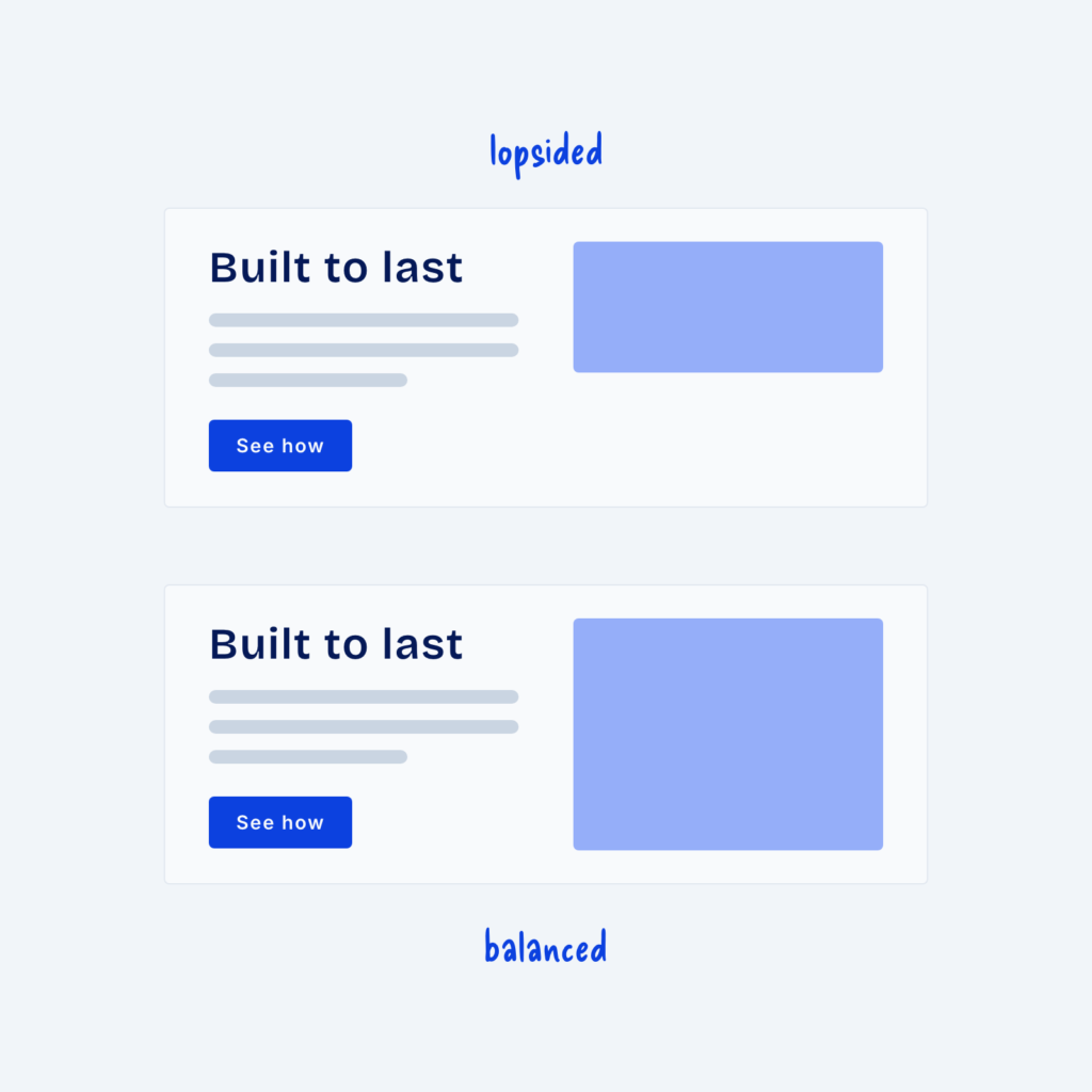
  • Two split sections with the same text. In the top one, labeled lopsided, the image is shorter than the text. In the bottom one, labeled balanced, the image matches the height of the text.

    September 29, 2026
    A split section puts text on one side and an image on the other and it's one of the most…
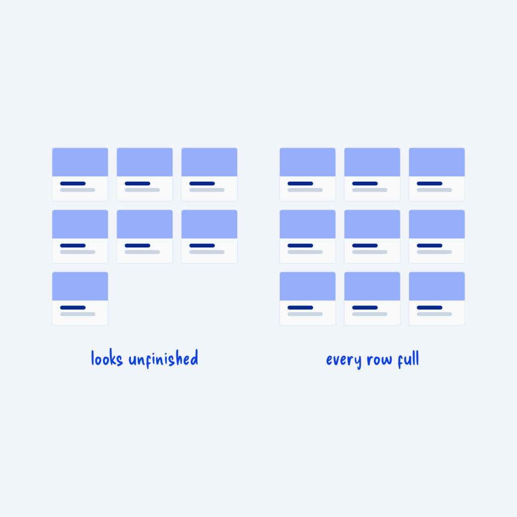
  • Two card grids. The left grid has seven cards, leaving one alone on the last row, labeled looks unfinished. The right grid has nine cards, labeled every row full.

    September 29, 2026
    Grids look best when every row is full. Seven cards in a three-column grid leave one card alone on the…
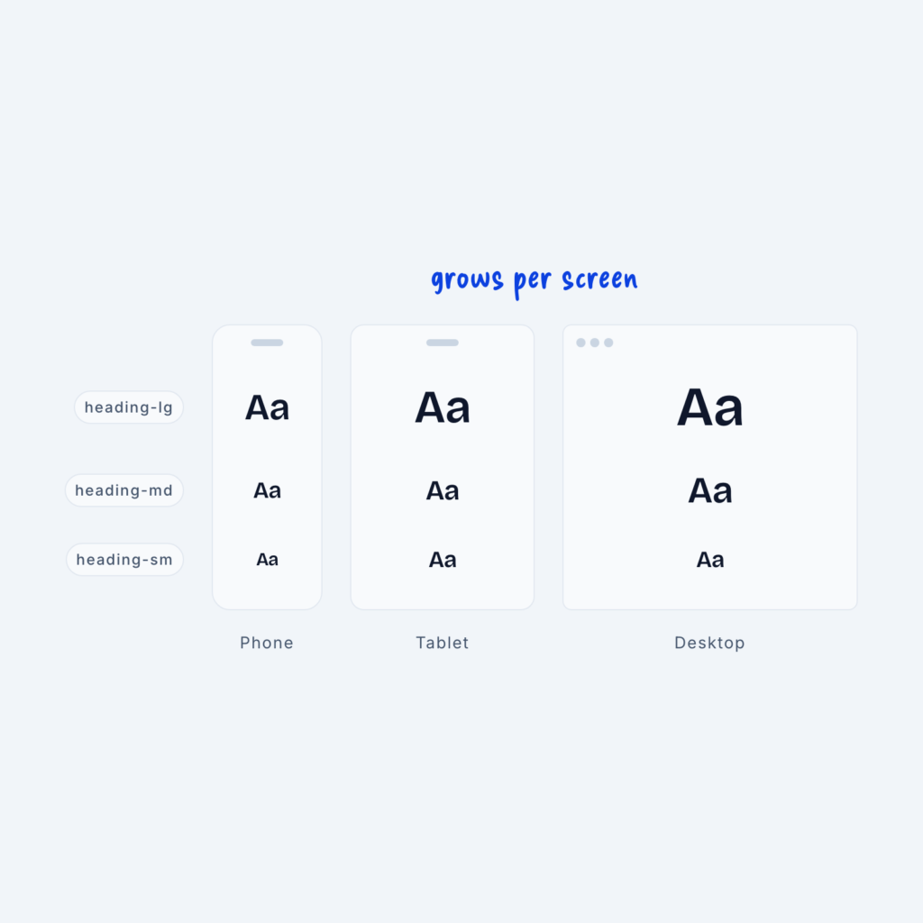
  • Phone, tablet and desktop screens each showing the tokens heading-lg, heading-md and heading-sm. The same token gets larger on each bigger screen, labeled grows per screen.

    September 29, 2026
    We create sizing systems by attaching semantic names (small, medium, and large) to primitive values (4px, 12px, 16px). But there’s…
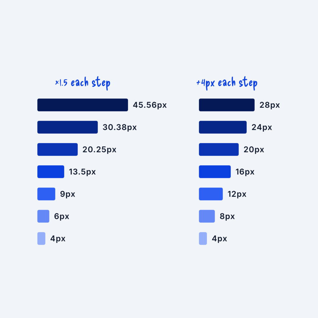
  • Two spacing scales shown as stacked bars. The left scale multiplies by 1.5 each step, from 4px to 45.56px. The right scale adds 4px each step, from 4px to 28px.

    September 29, 2026
    An easy way to make your website’s layout more consistent is to apply one set of spacing rules to every…
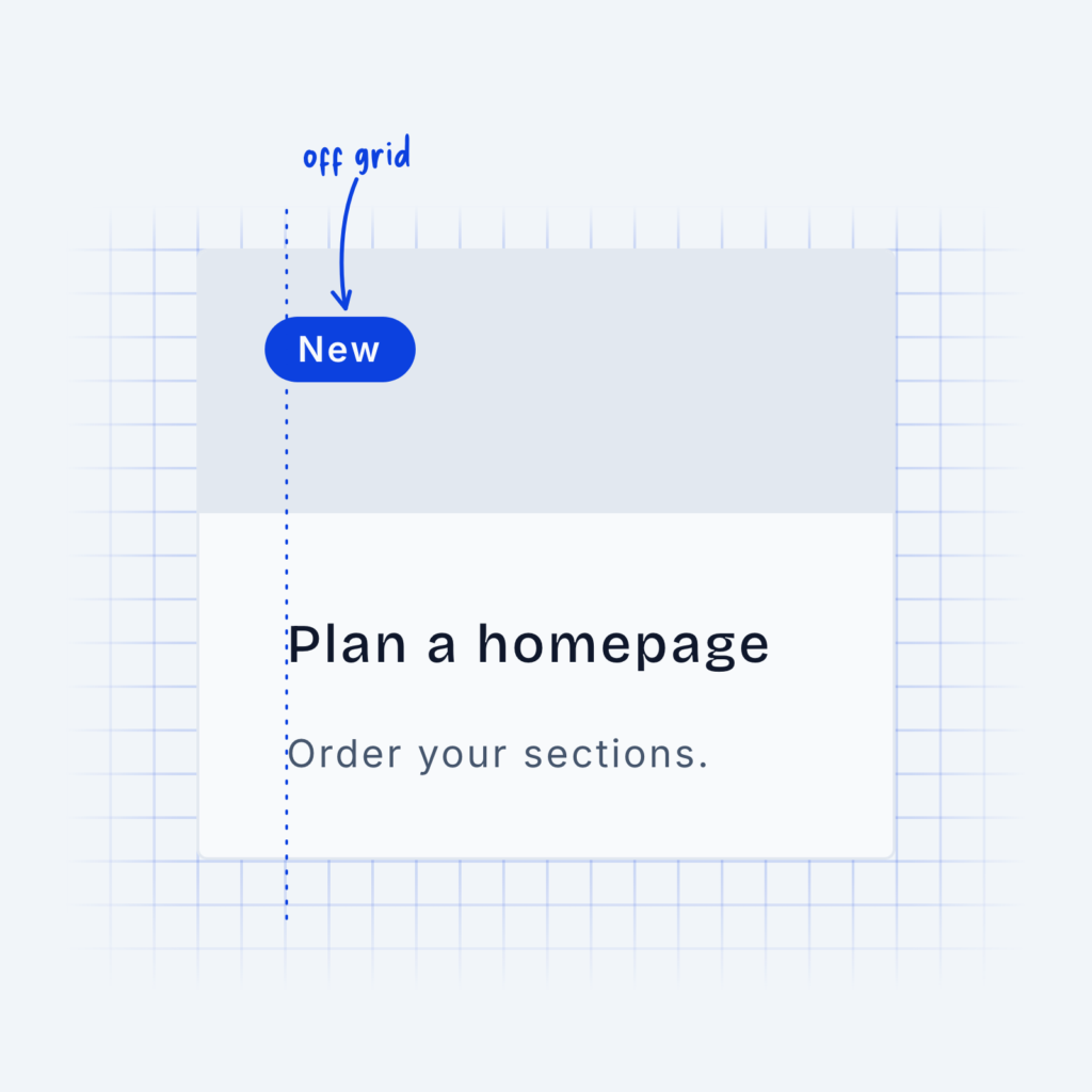
  • A card on a background grid. The heading and text line up with the grid, while a small New badge sits off the grid line, labeled off grid.

    September 29, 2026
    To keep everything in your design visually consistent, it can often be helpful to use grids. A grid will tell…
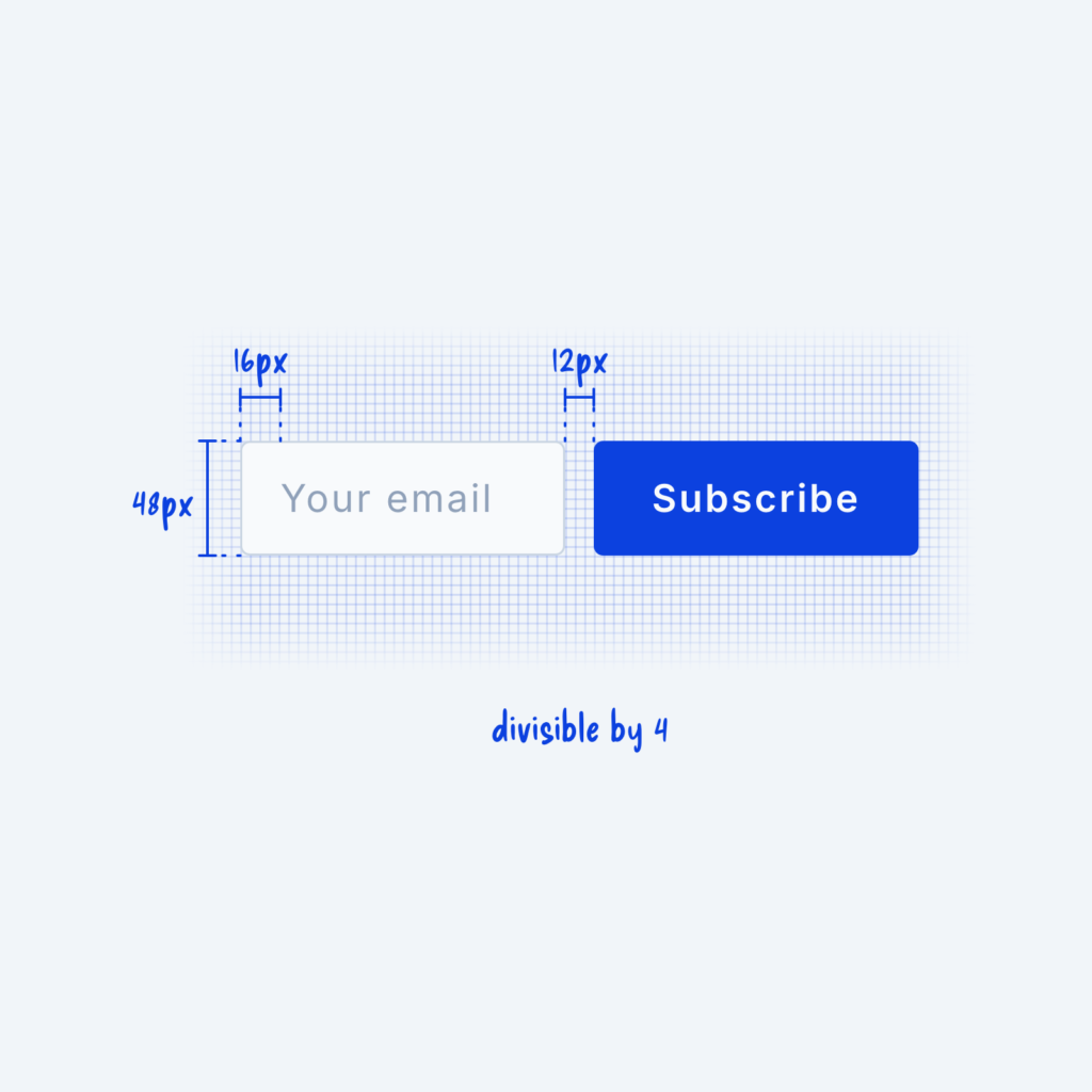
  • An email field and a Subscribe button on a fine grid, measured at 48px tall with 16px padding and a 12px gap, labeled divisible by 4.

    September 29, 2026
    The 4px rule is a simple spacing system that says everything in your design should be divisible by 4px. Every…
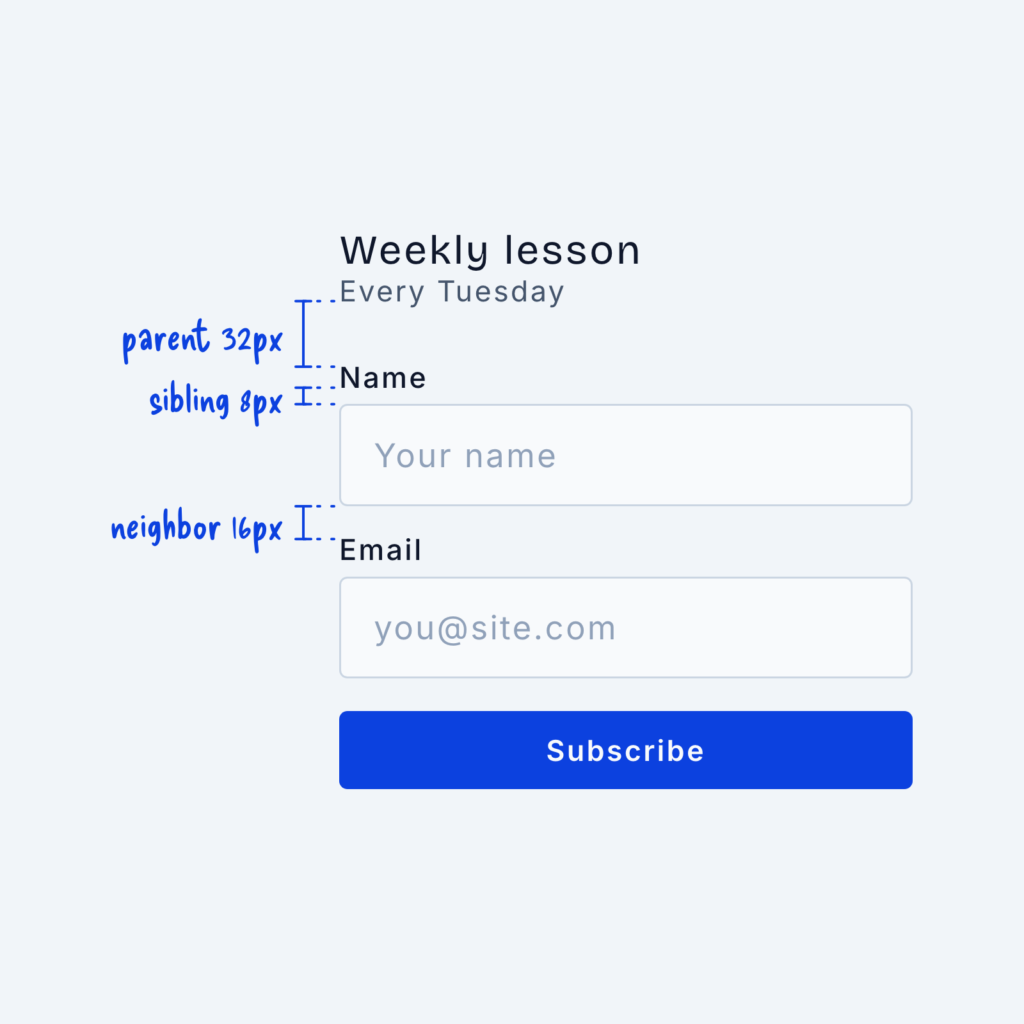
  • A signup form with spacing labels: parent 32px between the heading and the first field, sibling 8px between a label and its input, and neighbor 16px between two fields.

    September 29, 2026
    When you design a website, the spacing between two elements tells the visitor how closely related they are to one…
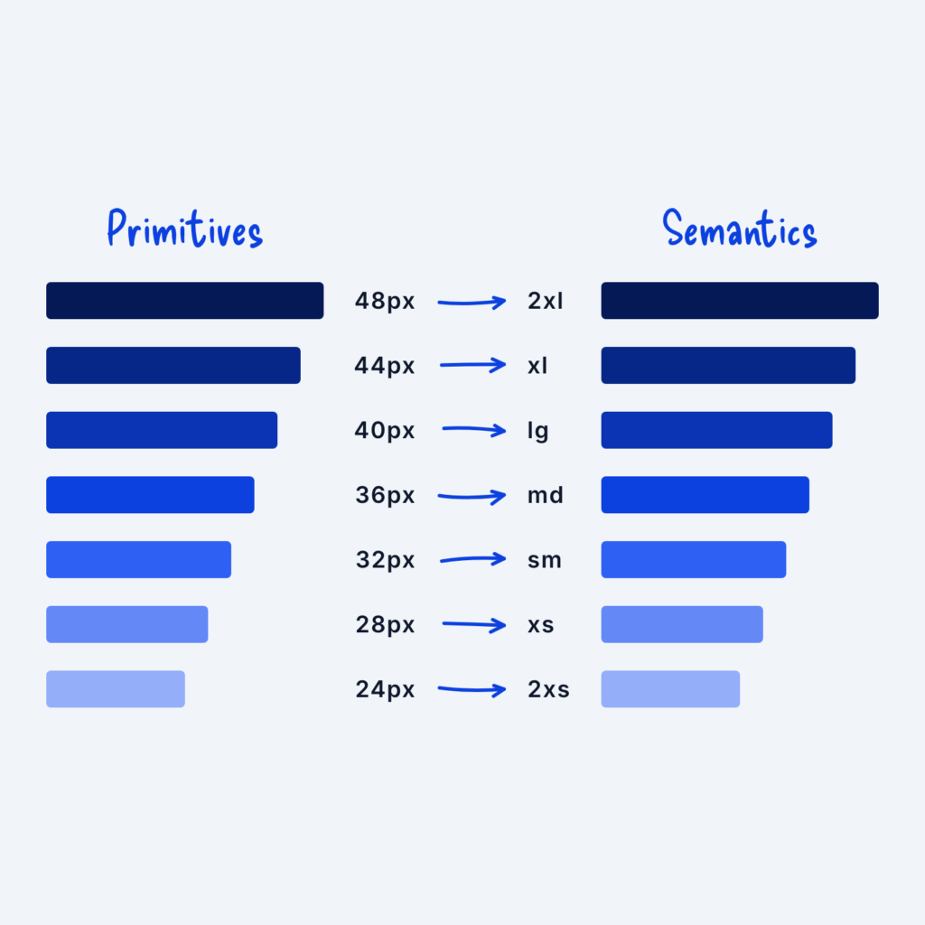
  • Two columns of bars. Primitive values from 24px to 48px on the left each point with an arrow to a semantic name on the right, from 2xs to 2xl.

    September 29, 2026
    When we create a scaling system, we start by defining the raw values (4px, 8px, 12px, etc.) and then give…
Get Free Design Lessons Every Monday Morning

Three short lessons each Monday on a single design topic. They're written in plain language and give you ideas to use on your next site.

You're in!

Check your inbox for your first email.
Close