
The 4px rule is a simple spacing system that says everything in your design should be divisible by 4px. Every element, every padding, every margin, and every spacing or sizing value should be divisible by 4.
This isn’t an unbreakable rule or something designers need to do, but it is helpful for setting up simple design systems quickly. And “4 pixels” is a bit of a misnomer, because in modern web design almost everything uses “rem” values, where 1rem usually equals 16px. So really, it should be called the “0.25rem rule,” which is less catchy.
There are a few key advantages to this system, and a few disadvantages. Let’s look at both.
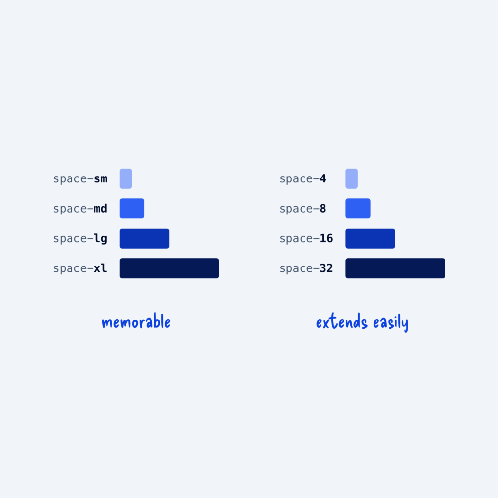
The first advantage is that it’s dead simple to remember. To generate a new size, all you have to do is count up or down by 4. If “medium padding” is 16px, then small padding would be 12px and large padding would be 20px.
The second advantage is that it’s highly divisible without giving you too many options. A 2px system would be even more divisible. But once you have to think about whether something should have 28px of padding or 30px, it becomes difficult to make a choice. With the 4px rule, it’s usually obvious how large an element or property should be, and there’s a clear difference to the visitor between, say, 4px of padding and 8px.
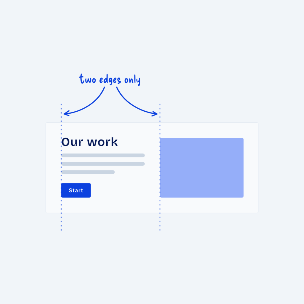
The third advantage is that it keeps the entire layout visually consistent. You can break the whole website down into 4×4 squares, and everything should fit neatly on that grid. This makes your website easier to scan and layouts easier to build.
There are two main disadvantages to the 4px rule, however. First, it’s not, strictly speaking, responsive. Responsive design is when elements scale smoothly as the viewport (the browser window) changes size. For example, a desktop layout that scales down proportionally to look similar on a laptop is responsive.
The 4px rule is adaptive. Since we count in increments of 4, there’s no way for a design to be 15% smaller on a display that’s 15% smaller. To do that, we’d need a CSS clamp() function tied to the viewport width. Instead, with the 4px rule, the layout adapts to the closest breakpoint. In 95% of cases, this is good enough, and we can set a tighter max-width at each breakpoint so no layout gets lost in the margins. However, in the smaller share of cases where responsiveness matters more than a perfectly clean layout (web app design, for example), the 4px rule generally isn’t the best option.
The second downside to the 4px rule is that it gives you a worse sense of scale. Most sizing systems scale by some percentage, say 150%. If your smallest size is 4px, then your next size would be 6px, then 9px, etc. This is useful for typography, because we almost always want a clear difference between headings and paragraphs. If our paragraphs are 16px, a 20px heading might not stand out like a 28px or 32px heading. We can get around this, of course, by skipping some steps in our utility classes and creating custom type scales that still follow the 4px rule. But the in-between options are always still there in our primitive tokens.
Even with these disadvantages, the 4px rule is still a great starter setup for most projects. Some of the best ready-made design systems in the world, such as Untitled UI, use this spacing system.