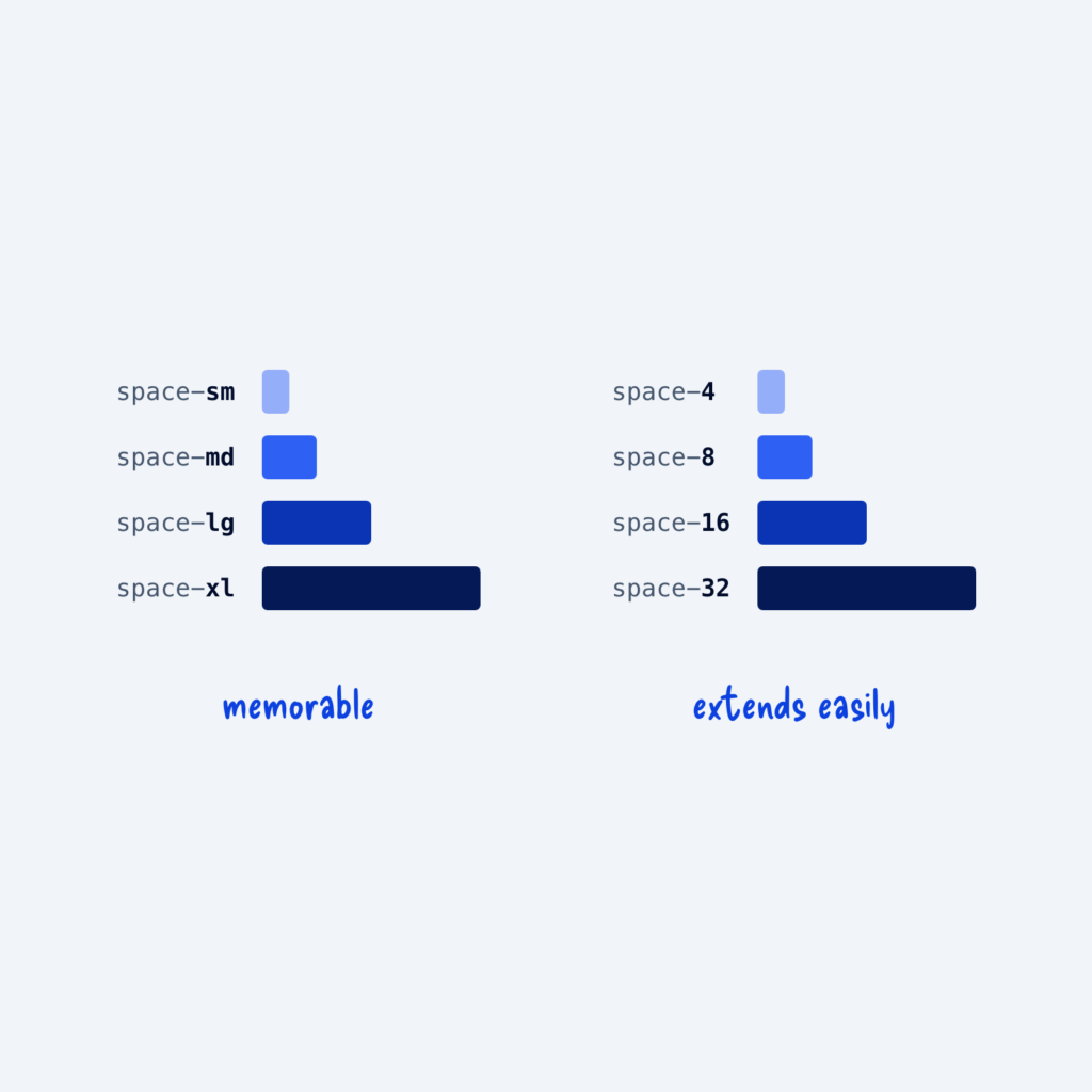
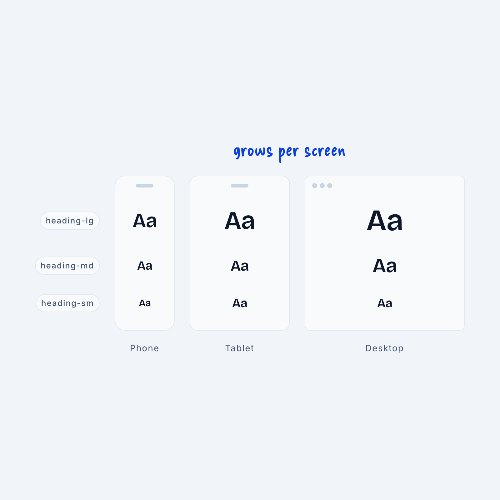
We create sizing systems by attaching semantic names (small, medium, and large) to primitive values (4px, 12px, 16px). But there’s no rule that says one name must only have one value. In fact, it’s common for web designers to attach multiple values to a single size depending on the viewport width (the width of the browser window).
As an example, most headlines are much smaller on mobile than they are on desktop. At different breakpoints, or common screen sizes, the same semantic size often maps to a different value to account for the size of the viewport.
If we imagine our semantic scale of small, medium, and large as a line, we can imagine the different values they have across screen sizes as a rectangle. This is what a “two-dimensional scale” is. One dimension is the semantic name, and the other is the set of primitive values that name translates to across screen sizes.
This is most often used in “adaptive design.” Adaptive design is when the layout changes at set breakpoints. For example, every screen size below 768px might use smaller primitive values for the same semantic scale. The advantage of this is that it’s much easier to get pixel-perfect layouts. If your entire design is divisible by 4px across every screen size, your layout will look clean.
But this method has a disadvantage as well. Since size is not computed as a percentage of viewport width, the design might look slightly too large or too small from screen to screen. After all, we’re only designing for a few breakpoints when thousands of different screen sizes exist. That’s why some designers opt for a “responsive design” setup, where the size of every element is calculated based on the actual viewport width of the user.
This keeps the design’s proportions the same from screen to screen, but it can often result in fractional pixel sizes or sizing systems that are hard to understand. For example, a headline using a two-dimensional scale will be 64px, whereas on a responsive scale it might be 65.3px.
Generally, a two-dimensional scale works well for smaller projects, and a responsive scale is easier to maintain for larger ones.