Opens in a new tab

Category: Conversion

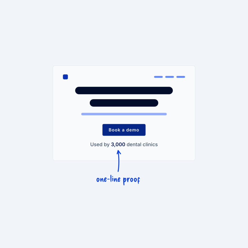
  • A hero wireframe with one line under the button that reads Used by 3,000 dental clinics, with an arrow to the number labeled one-line proof.

    September 29, 2026
    Building trust, especially close to CTAs, is super important for increasing your conversion rate on a marketing website. A short…
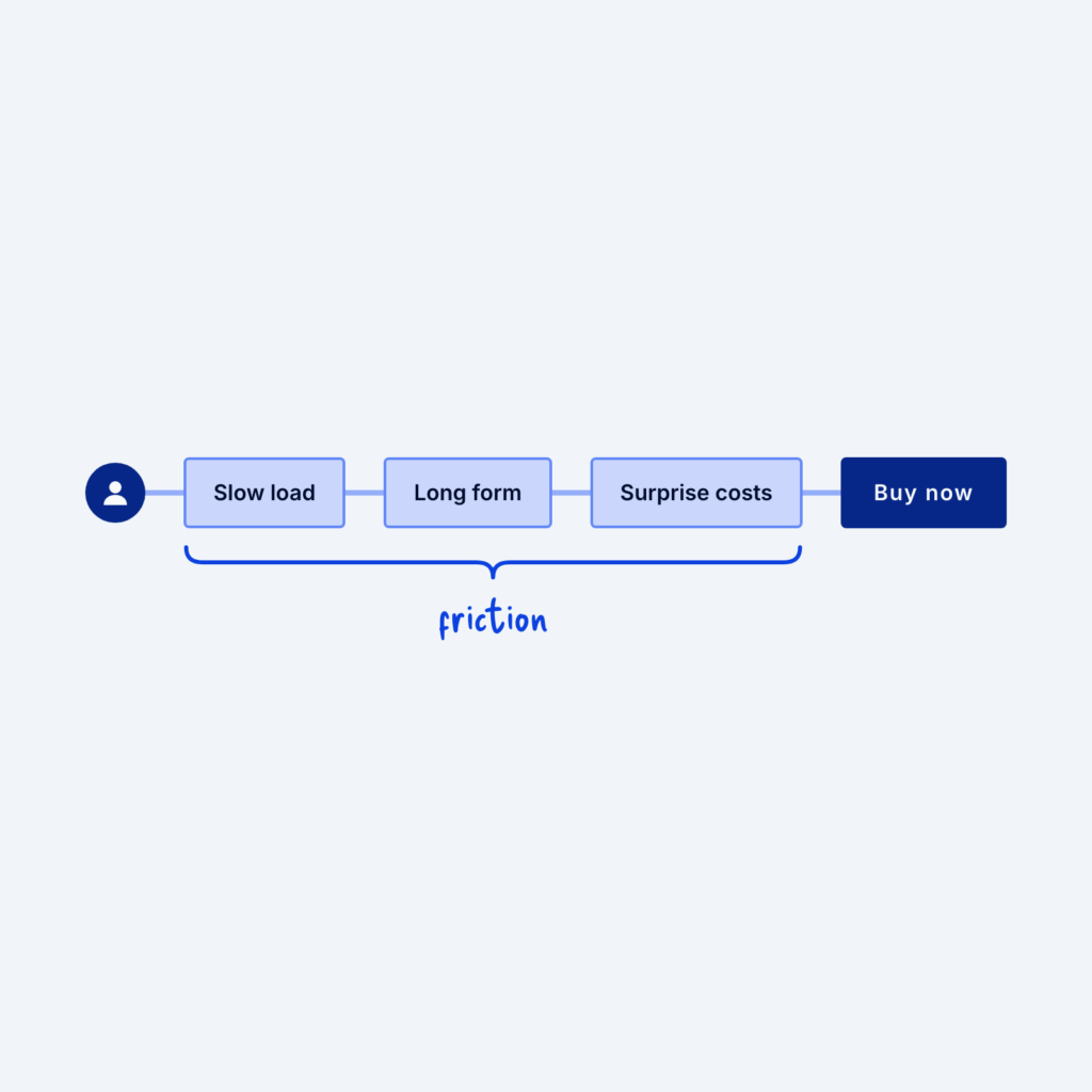
  • A visitor on a path to a Buy now button, blocked by three obstacles labeled Slow load, Long form and Surprise costs, grouped under the word friction.

    September 29, 2026
    When a page isn't converting (turning visitors into customers), it's tempting to add more content instead of cutting. Extra testimonials,…
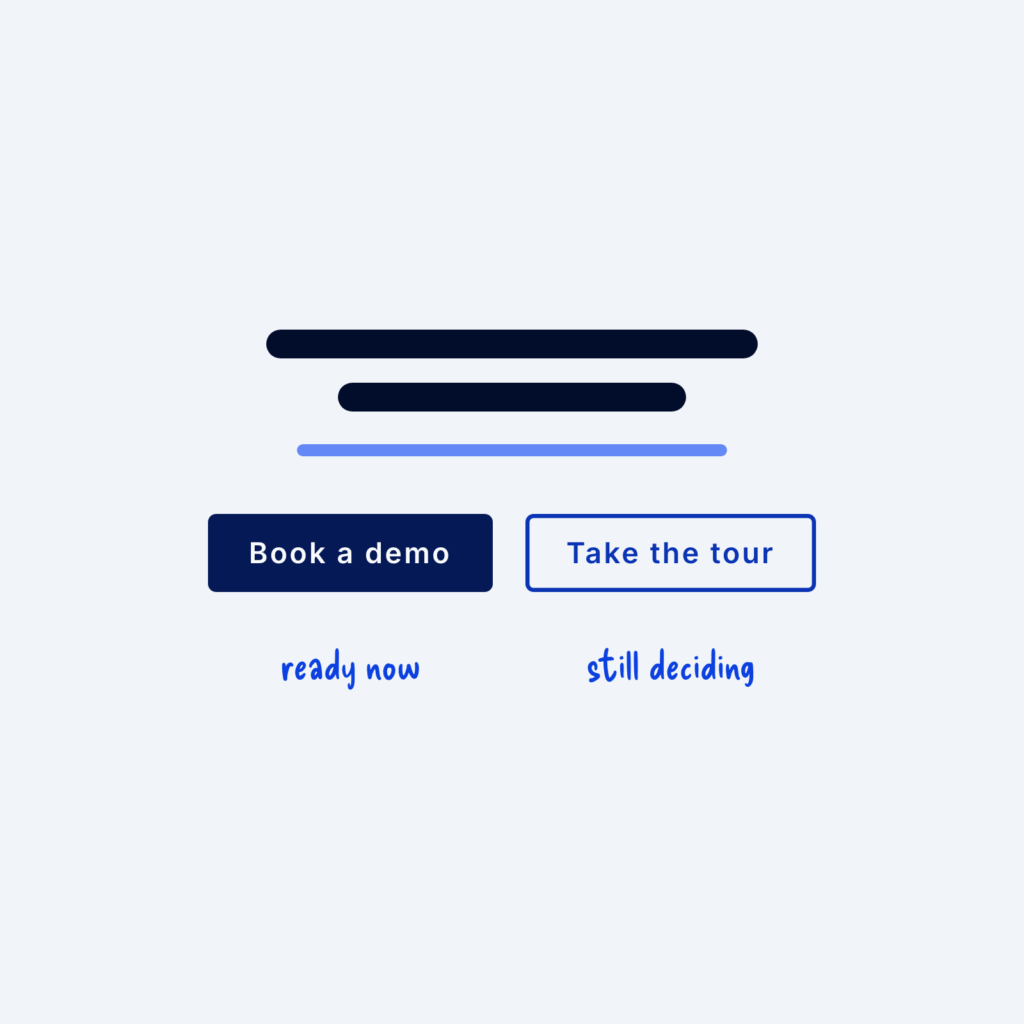
  • Two buttons under a headline: a filled Book a demo button labeled ready now and an outlined Take the tour button labeled still deciding.

    September 29, 2026
    Many visitors (especially first-time visitors) are interested but not ready for a big commitment like booking a sales call. If…
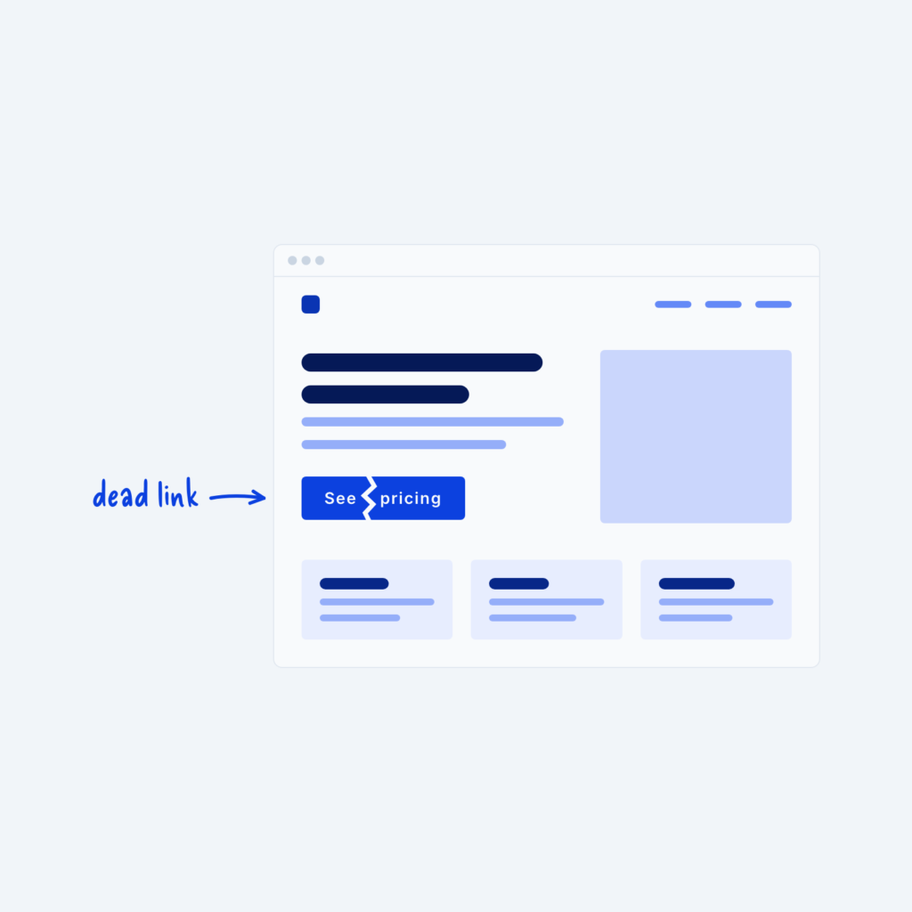
  • A website wireframe in a browser window with a crack through the See pricing button, labeled dead link.

    September 29, 2026
    When you launch your website, you might be tempted to install analytics software and try to get a lot of…
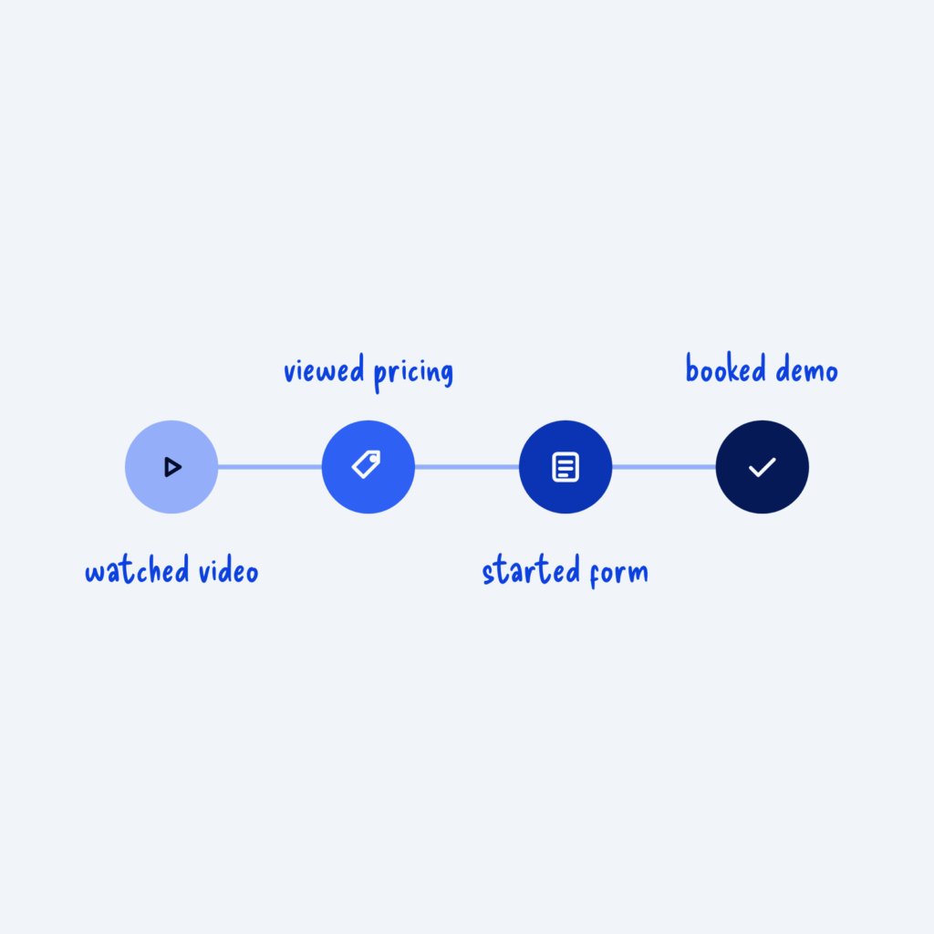
  • Four connected steps that darken from left to right, labeled watched video, viewed pricing, started form and booked demo.

    September 29, 2026
    Most visitors won't buy or sign up on their first visit. They often come back several times, look around and…
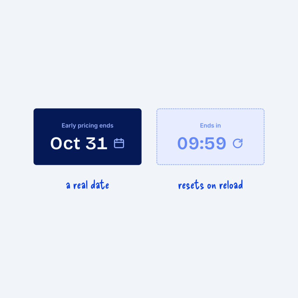
  • Two cards. A solid one reads Early pricing ends Oct 31, labeled a real date. A faded one shows a 09:59 countdown with a reset arrow, labeled resets on reload.

    September 29, 2026
    Urgency can push people to act. A countdown timer or a label that says "only 2 left" gives people a…
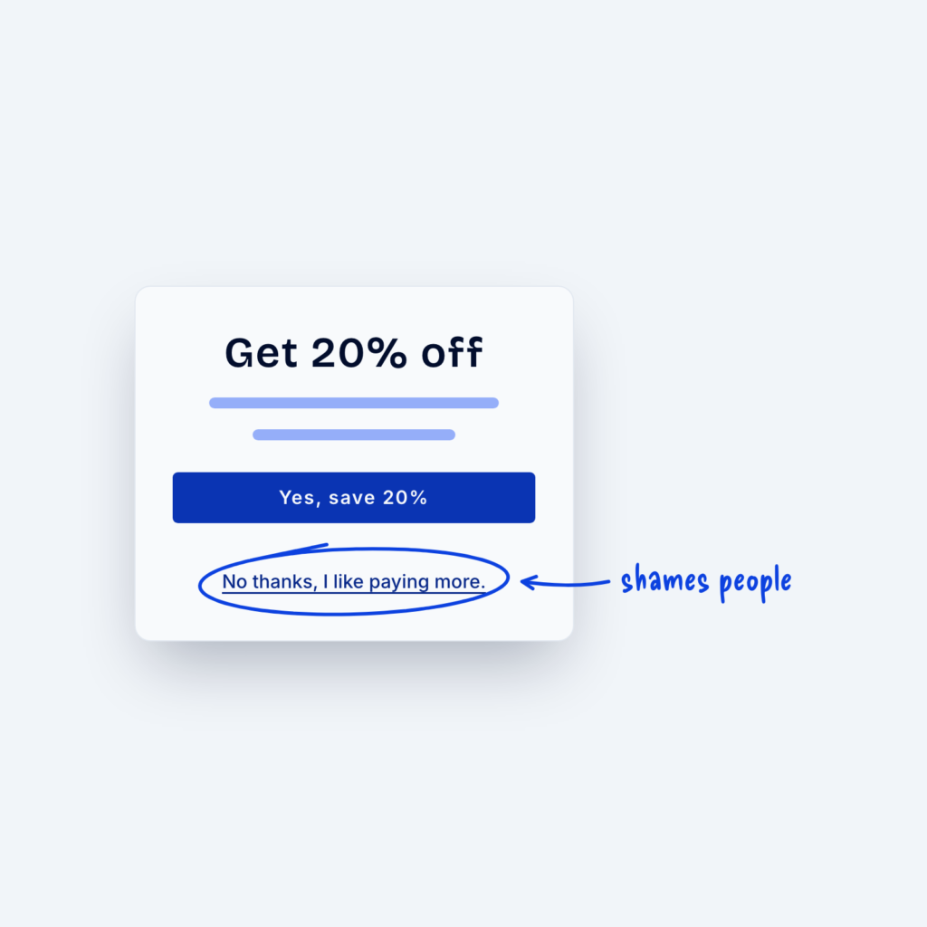
  • A popup with a Yes, save 20% button and a circled link below it that reads No thanks, I like paying more, labeled shames people.

    September 29, 2026
    “Dark patterns” are basically design tricks that lead people to do things they otherwise wouldn’t do. Common examples include pre-checked…
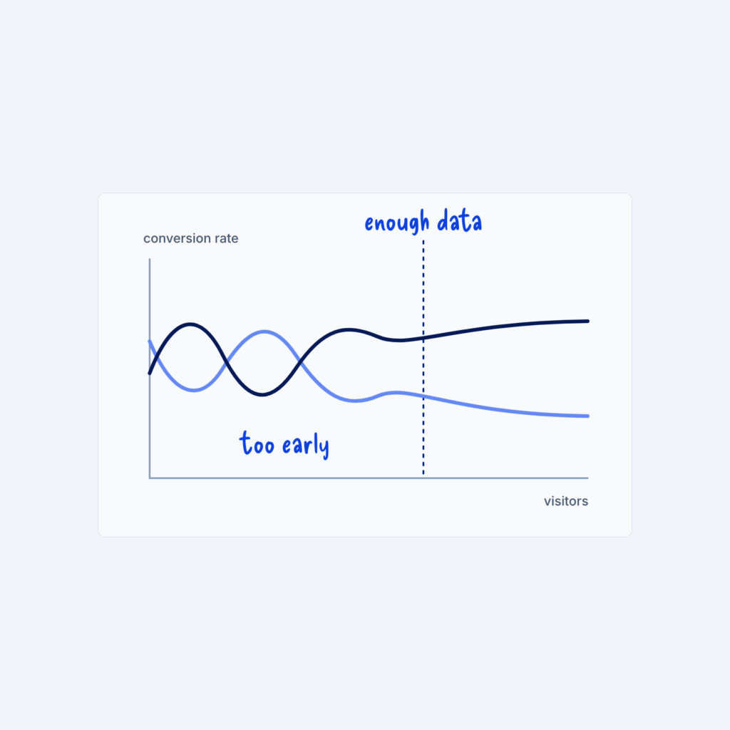
  • A line chart of conversion rate against visitors. Two lines cross back and forth early on, labeled too early, then settle apart after a dotted line labeled enough data.

    September 29, 2026
    In the first few days of an A/B test, where different visitors see two versions of a page, the results…
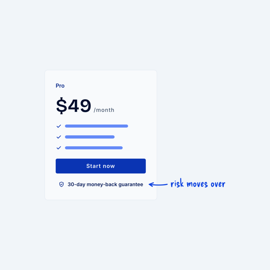
  • A pricing card with a line under the button that reads 30-day money-back guarantee, with an arrow labeled risk moves over.

    September 29, 2026
    Every purchase carries some risk for the buyer. They might pay and find the product isn't right for them, or…
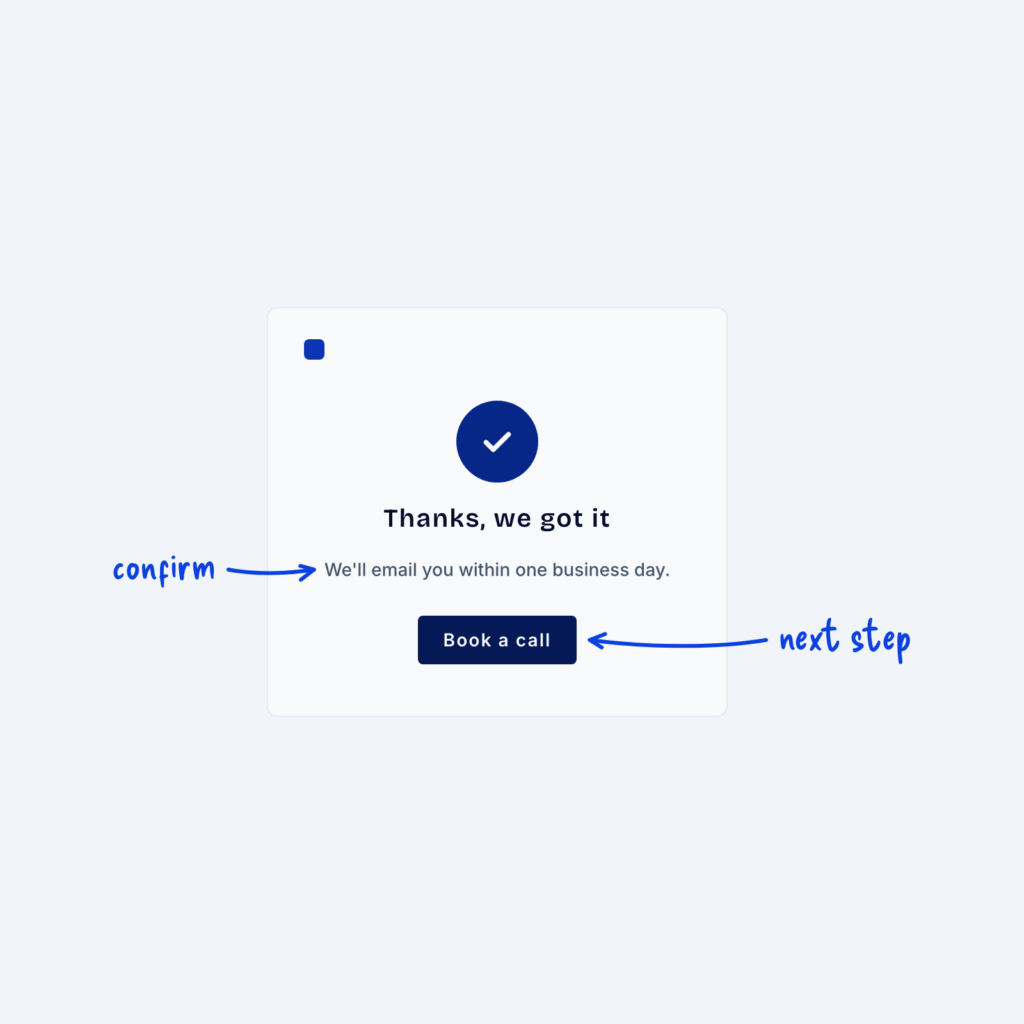
  • A thank-you page with a check mark, a short confirmation line and a single Book a call button, labeled confirm and next step.

    September 29, 2026
    Someone who has just submitted a form is paying close attention to whatever comes next. The “thank you page” is…
Get Free Design Lessons Every Monday Morning

Three short lessons each Monday on a single design topic. They're written in plain language and give you ideas to use on your next site.

You're in!

Check your inbox for your first email.
Close