Opens in a new tab

Author: DesignSpo.co

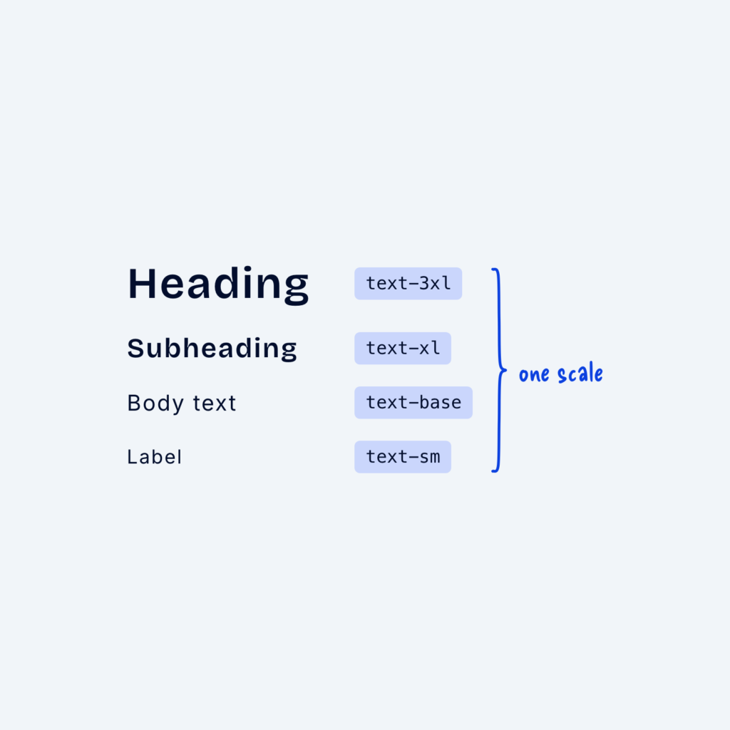
  • Four lines of sample text from large to small, named text-3xl, text-xl, text-base and text-sm, grouped by a brace labeled one scale.

    September 29, 2026
    When font sizes are chosen by eye on each page, they slowly drift apart. One page uses 17px for body…
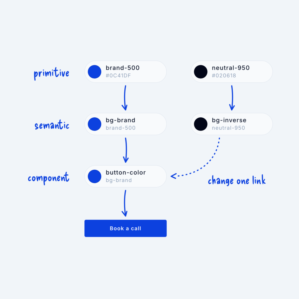
  • A chain of color tokens. The primitive brand-500 feeds the semantic bg-brand, which feeds the component token button-color on a Book a call button. A dotted arrow from bg-inverse shows the button can change by switching one link.

    September 29, 2026
    Most of the time, we stop using our design system because it stops working. I know I’ve been in situations…
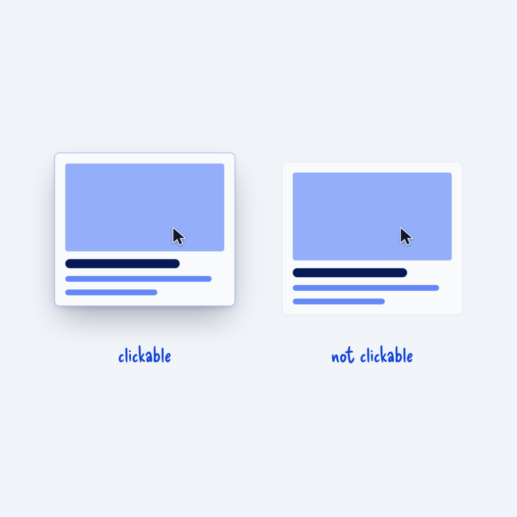
  • Two identical cards with a cursor over each. The clickable card lifts with a shadow, while the card that is not clickable stays flat.

    September 29, 2026
    Hover interactions are the key way you tell visitors that an element is clickable. People have learned it from years…
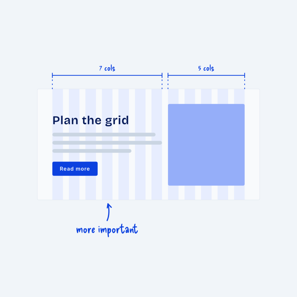
  • A split section on a 12-column grid. The text side spans seven columns, labeled more important, and the image spans five.

    September 29, 2026
    If you’re building a marketing page for a website, chances are you’ll use a two-column layout with text on one…
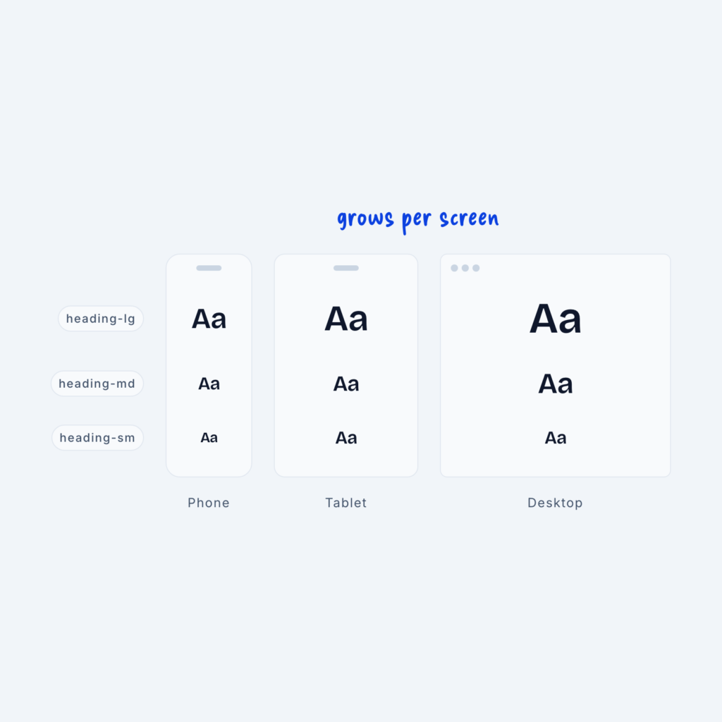
  • Phone, tablet and desktop screens each showing the tokens heading-lg, heading-md and heading-sm. The same token gets larger on each bigger screen, labeled grows per screen.

    September 29, 2026
    We create sizing systems by attaching semantic names (small, medium, and large) to primitive values (4px, 12px, 16px). But there’s…
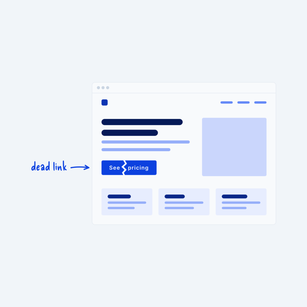
  • A website wireframe in a browser window with a crack through the See pricing button, labeled dead link.

    September 29, 2026
    When you launch your website, you might be tempted to install analytics software and try to get a lot of…
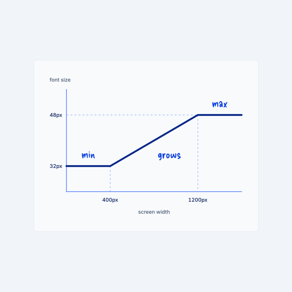
  • A line chart of font size against screen width. The line stays at 32px, grows between 400px and 1200px, then stays at 48px, labeled min, grows and max.

    September 29, 2026
    Most sites change font sizes at a few fixed screen widths, so a heading might jump from 32px to 48px…
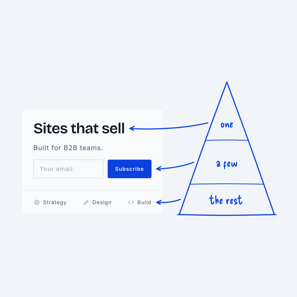
  • A hero section next to a pyramid. The headline points to the top tier labeled one, the signup form to the middle tier labeled a few, and the small menu links to the base labeled the rest.

    September 29, 2026
    When we talk about hierarchy in design, we often use the analogy of a pyramid. But why? Well, because the…
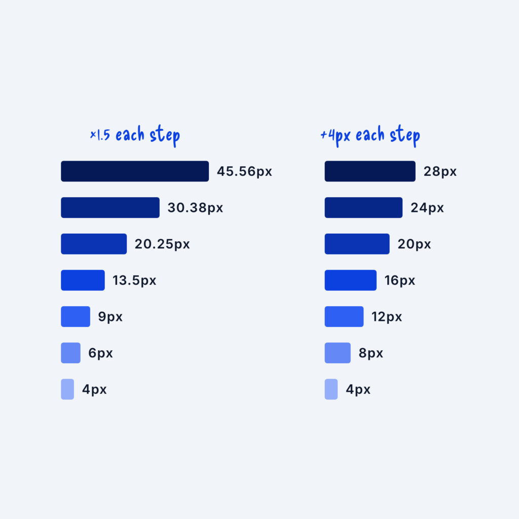
  • Two spacing scales shown as stacked bars. The left scale multiplies by 1.5 each step, from 4px to 45.56px. The right scale adds 4px each step, from 4px to 28px.

    September 29, 2026
    An easy way to make your website’s layout more consistent is to apply one set of spacing rules to every…
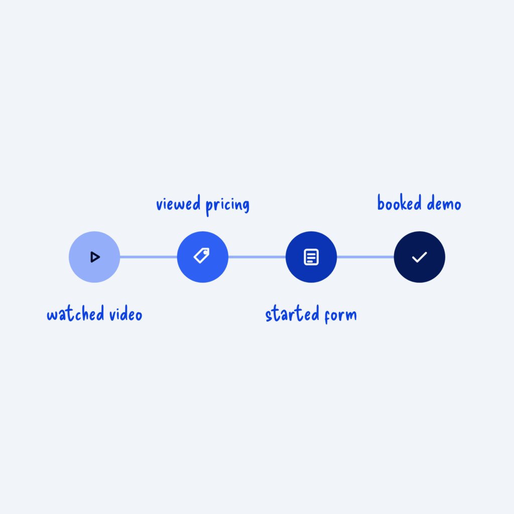
  • Four connected steps that darken from left to right, labeled watched video, viewed pricing, started form and booked demo.

    September 29, 2026
    Most visitors won't buy or sign up on their first visit. They often come back several times, look around and…
Get Free Design Lessons Every Monday Morning

Three short lessons each Monday on a single design topic. They're written in plain language and give you ideas to use on your next site.

You're in!

Check your inbox for your first email.
Close