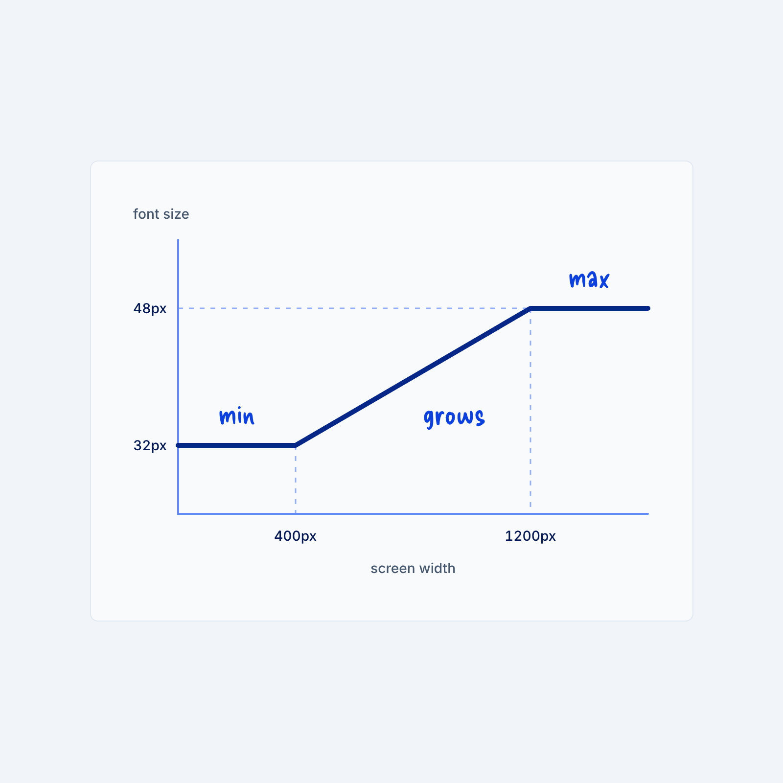
Most sites change font sizes at a few fixed screen widths, so a heading might jump from 32px to 48px the moment the screen crosses one of those widths. This is usually done with media queries and it’s a perfectly fine way of building a basic type system. A fluid type scale, however, works differently. The text grows a little at a time as the screen gets wider, so it looks right at every size in between, too.
The CSS function clamp() makes this possible. It takes three values: a minimum size, a preferred size tied to the screen width (using the vw unit, where 1vw is 1% of the screen width), and a maximum size. For example, clamp(2rem, 1.5rem + 2vw, 3rem) never goes below 32px or above 48px, and it scales smoothly in between. You can build each step of your type scale this way and store the steps as variables, so every heading uses the same fluid sizes.
The advantage of this is that it keeps your styles limited. You don’t need a new style (done through media queries) for each breakpoint. The disadvantage is that they will usually look less clean because they almost always calculate odd, indivisible numbers. A heading might be 33.4px for example, instead of 32px.