Opens in a new tab

Author: DesignSpo.co

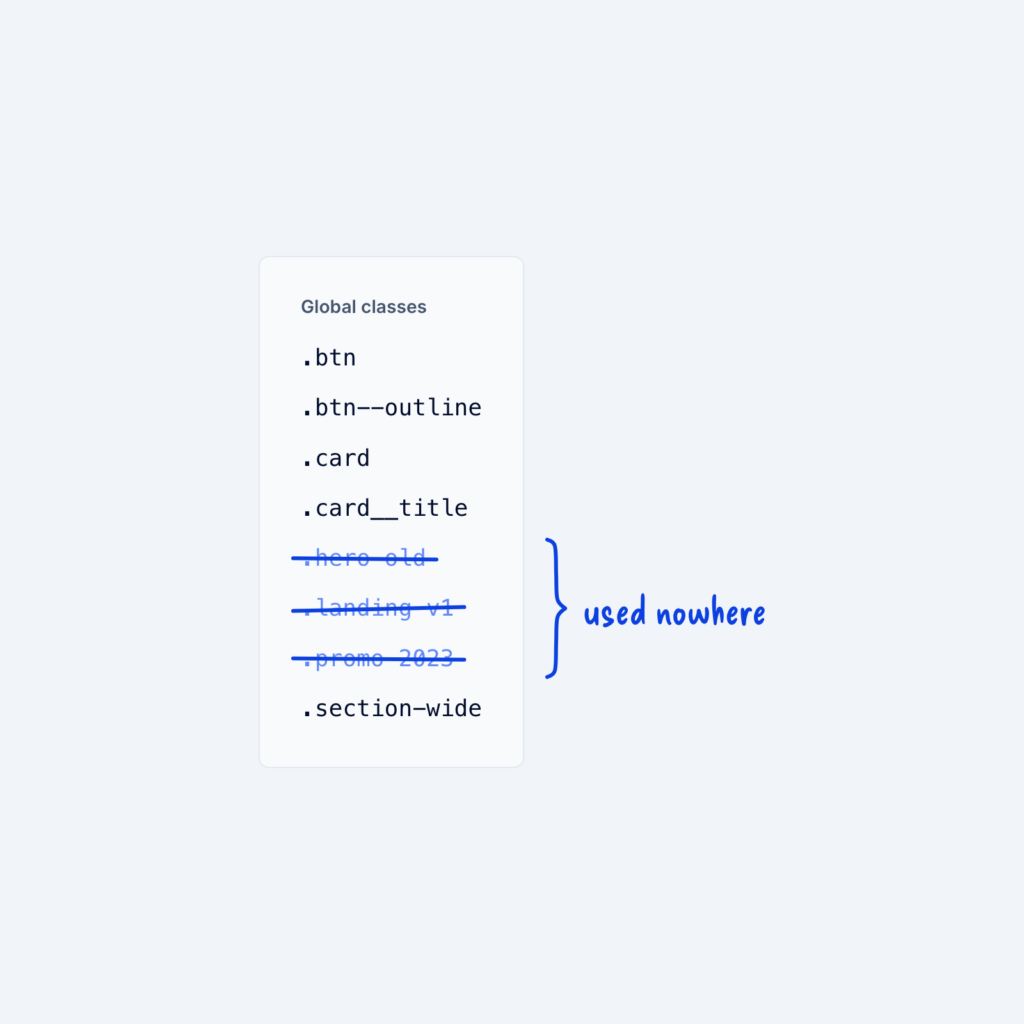
  • A Global classes panel listing eight class names, with three of them crossed out and grouped by a brace labeled used nowhere.

    September 29, 2026
    Over time, classes pile up from old sections, experiments, and pages that no longer exist. Each unused class makes the…
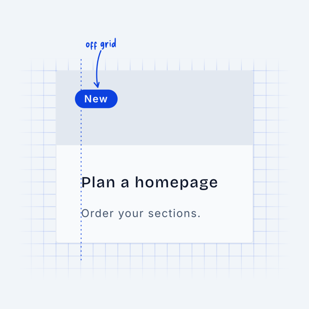
  • A card on a background grid. The heading and text line up with the grid, while a small New badge sits off the grid line, labeled off grid.

    September 29, 2026
    To keep everything in your design visually consistent, it can often be helpful to use grids. A grid will tell…
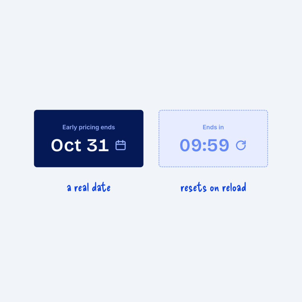
  • Two cards. A solid one reads Early pricing ends Oct 31, labeled a real date. A faded one shows a 09:59 countdown with a reset arrow, labeled resets on reload.

    September 29, 2026
    Urgency can push people to act. A countdown timer or a label that says "only 2 left" gives people a…
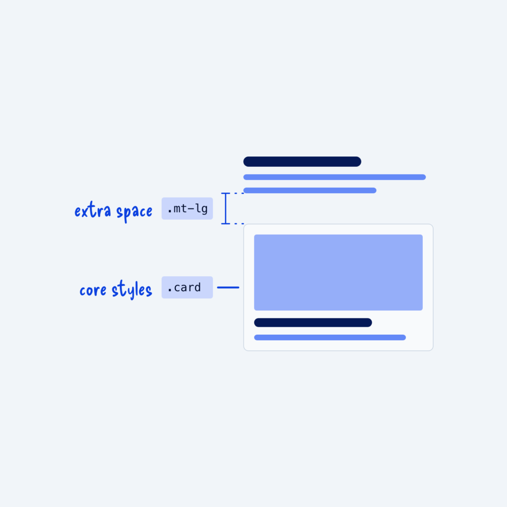
  • A card below a block of text. The .card class is labeled core styles, and a .mt-lg class adds the gap above the card, labeled extra space.

    September 29, 2026
    There are two common kinds of classes. Component classes, like .card, which holds all the core styles that make a…
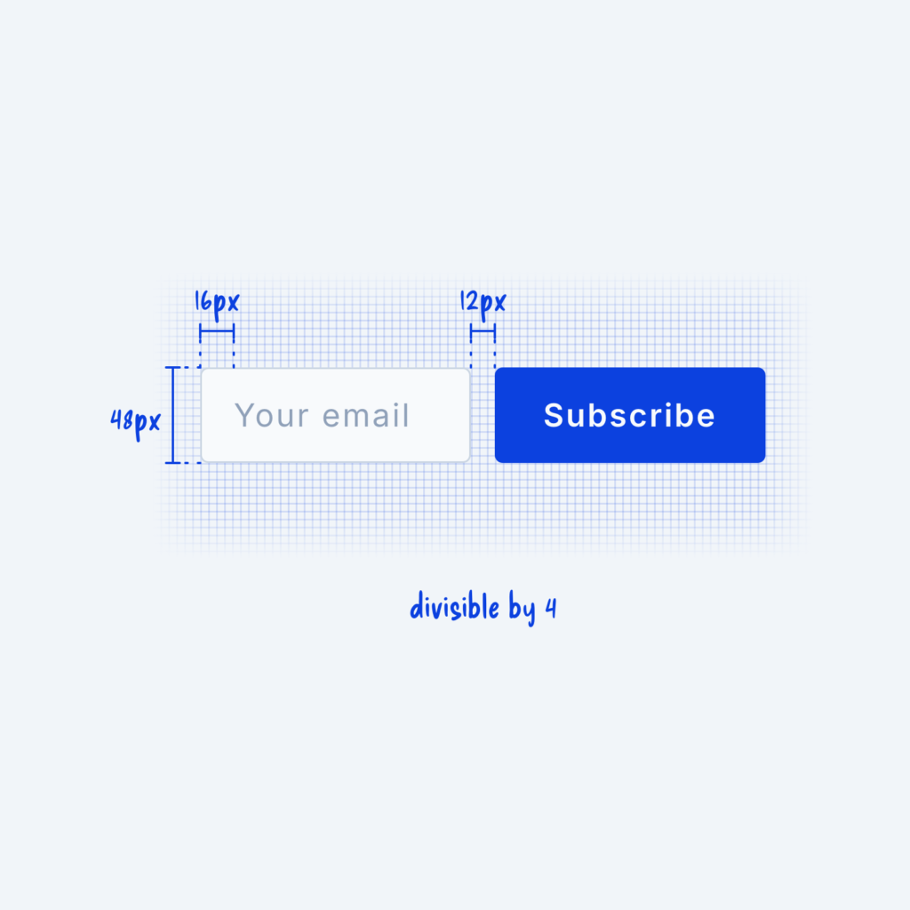
  • An email field and a Subscribe button on a fine grid, measured at 48px tall with 16px padding and a 12px gap, labeled divisible by 4.

    September 29, 2026
    The 4px rule is a simple spacing system that says everything in your design should be divisible by 4px. Every…
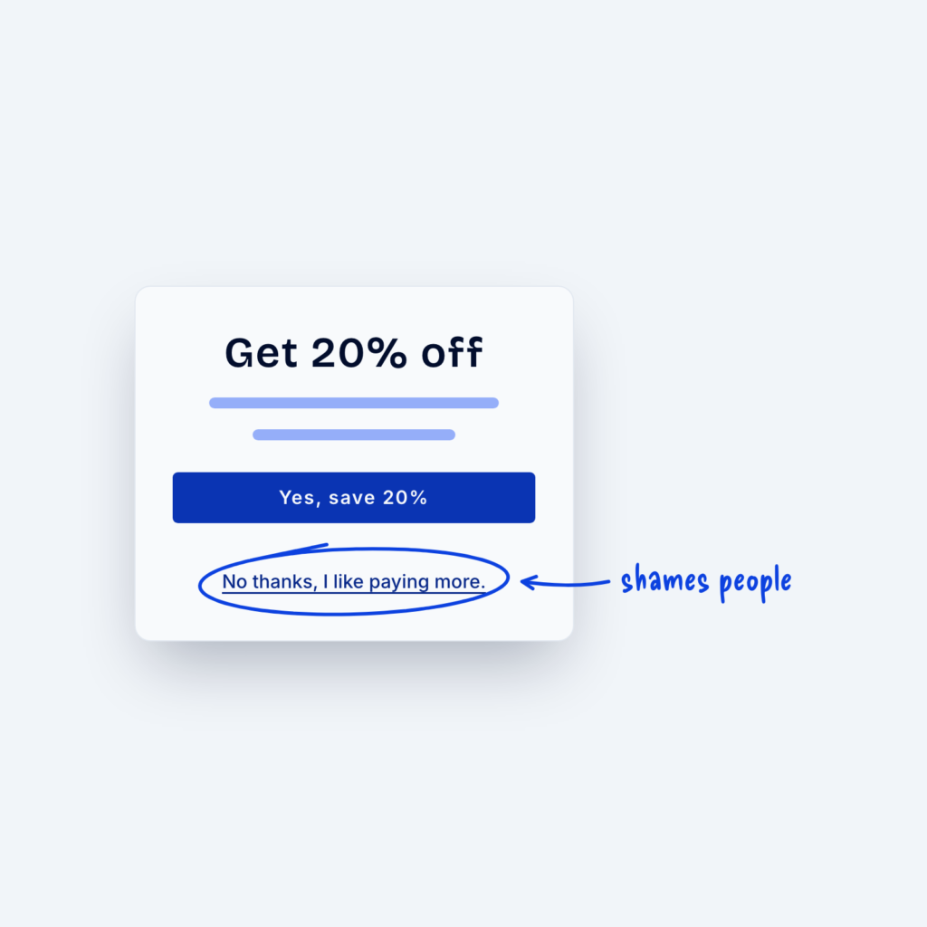
  • A popup with a Yes, save 20% button and a circled link below it that reads No thanks, I like paying more, labeled shames people.

    September 29, 2026
    “Dark patterns” are basically design tricks that lead people to do things they otherwise wouldn’t do. Common examples include pre-checked…
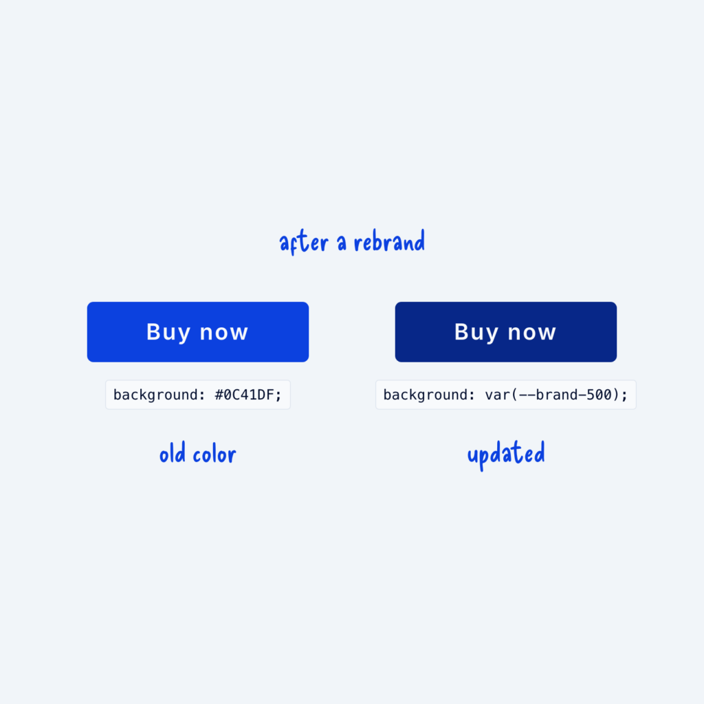
  • Two buttons after a rebrand. The one styled with the hardcoded #0C41DF still shows the old blue. The one styled with var(--brand-500) shows the new brand color.

    September 29, 2026
    A hardcoded value is a color or size typed straight into one element, like #0C41DF on a single button. It…
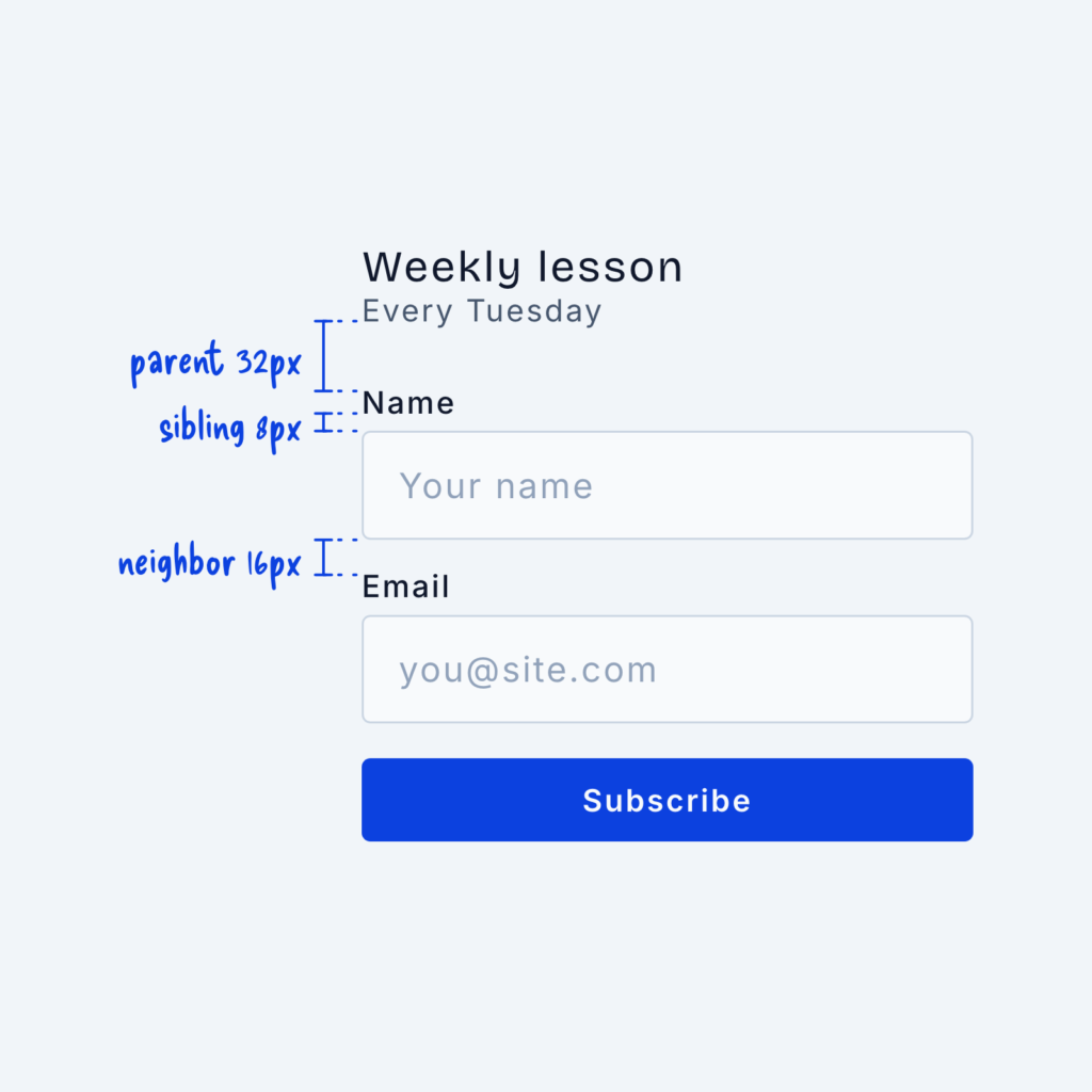
  • A signup form with spacing labels: parent 32px between the heading and the first field, sibling 8px between a label and its input, and neighbor 16px between two fields.

    September 29, 2026
    When you design a website, the spacing between two elements tells the visitor how closely related they are to one…
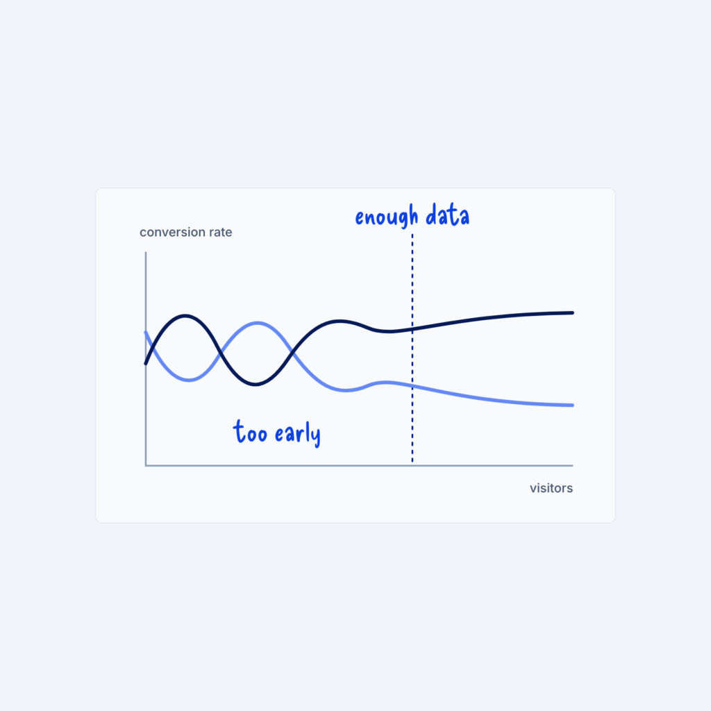
  • A line chart of conversion rate against visitors. Two lines cross back and forth early on, labeled too early, then settle apart after a dotted line labeled enough data.

    September 29, 2026
    In the first few days of an A/B test, where different visitors see two versions of a page, the results…
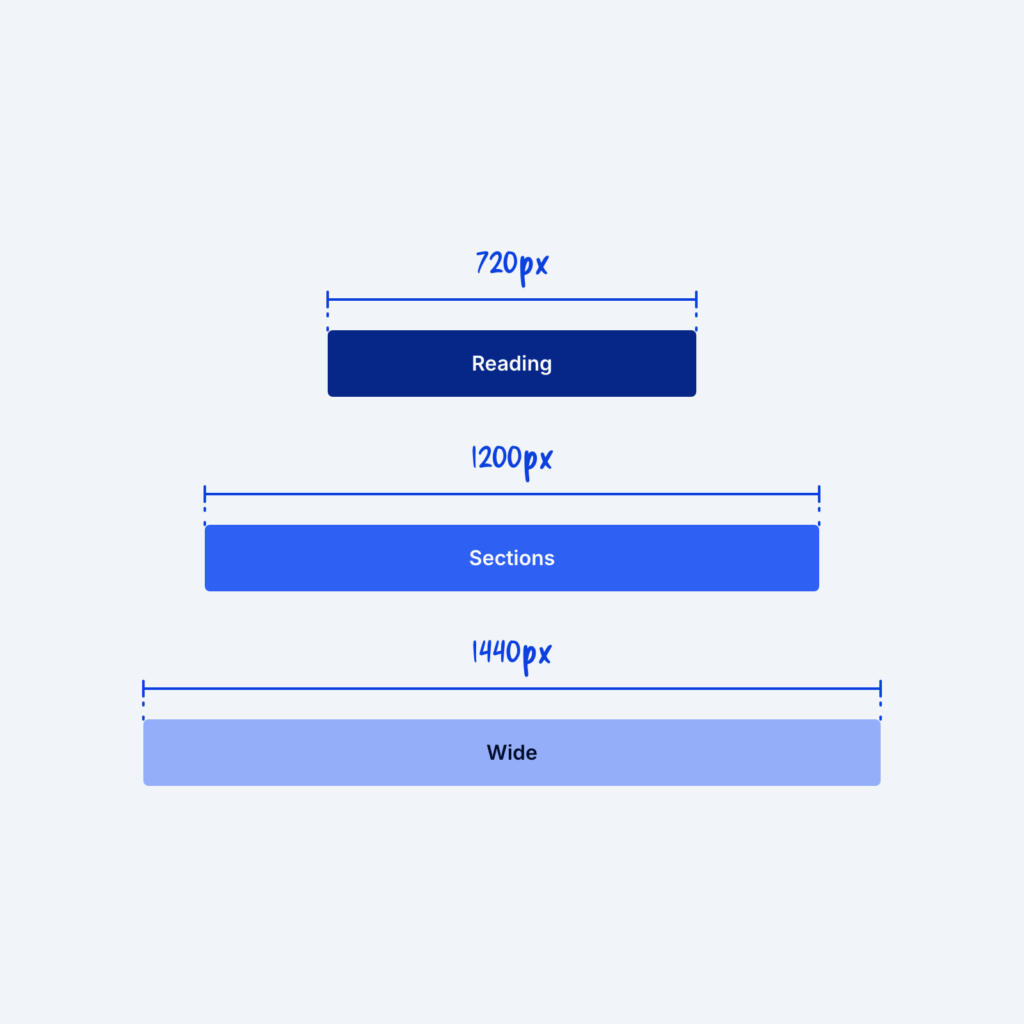
  • Three centered bars of different widths, labeled Reading 720px, Sections 1200px and Wide 1440px.

    September 29, 2026
    A container sets how wide a section's content can get. Different types of content often need different widths to look…
Get Free Design Lessons Every Monday Morning

Three short lessons each Monday on a single design topic. They're written in plain language and give you ideas to use on your next site.

You're in!

Check your inbox for your first email.
Close