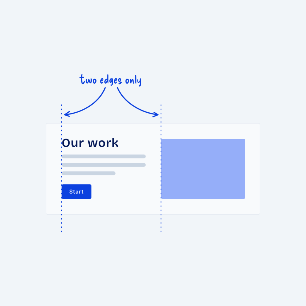
A container sets how wide a section’s content can get. Different types of content often need different widths to look their best. Long text reads best in a narrow column, most sections look good at a standard width, and galleries or dashboards often need some extra room.
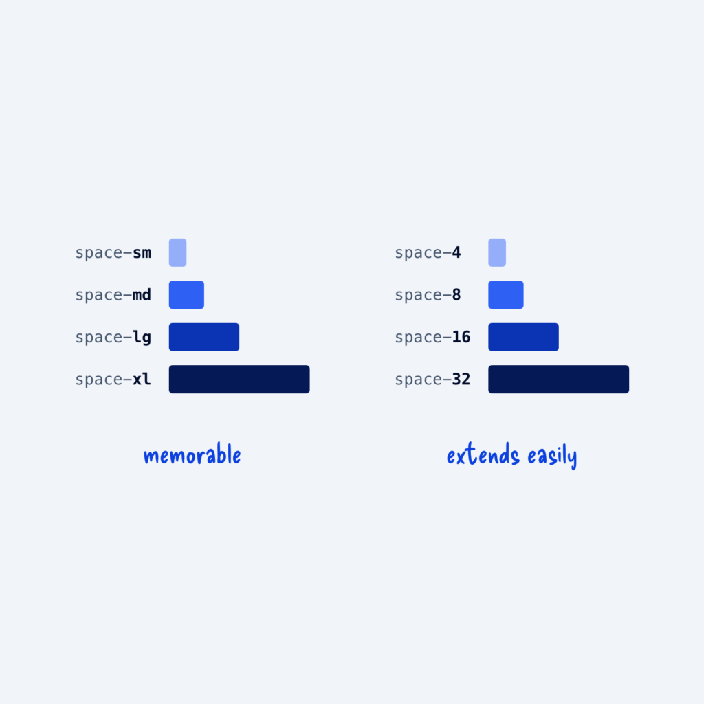
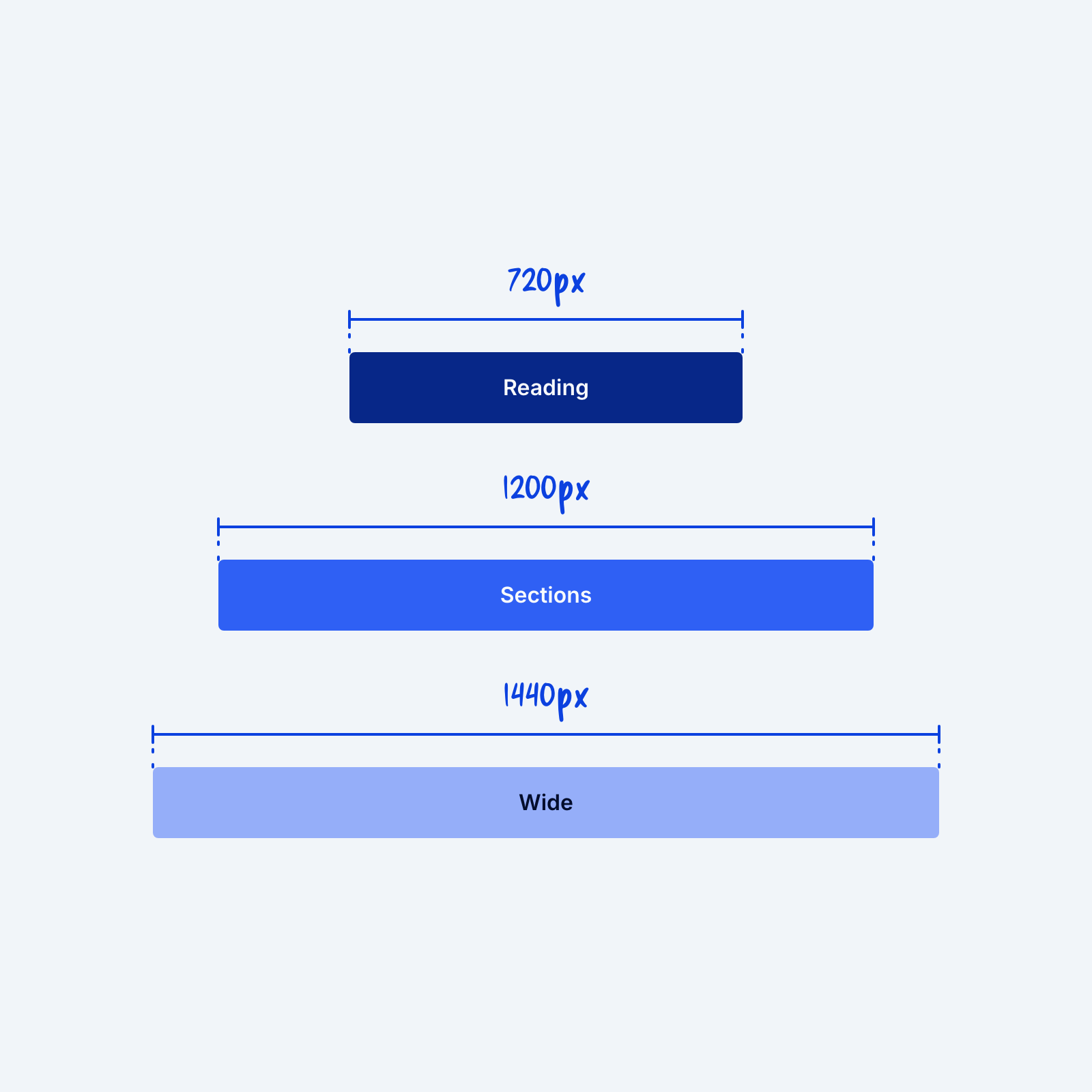
Define three container widths as tokens and use them everywhere. You might use 720px for reading, 1200px for most sections, and 1440px for wide layouts. When every section uses one of these three, content lines up from page to page, and the site can feel more organized, even if visitors can’t exactly tell why.