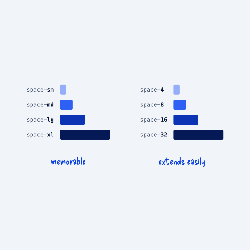
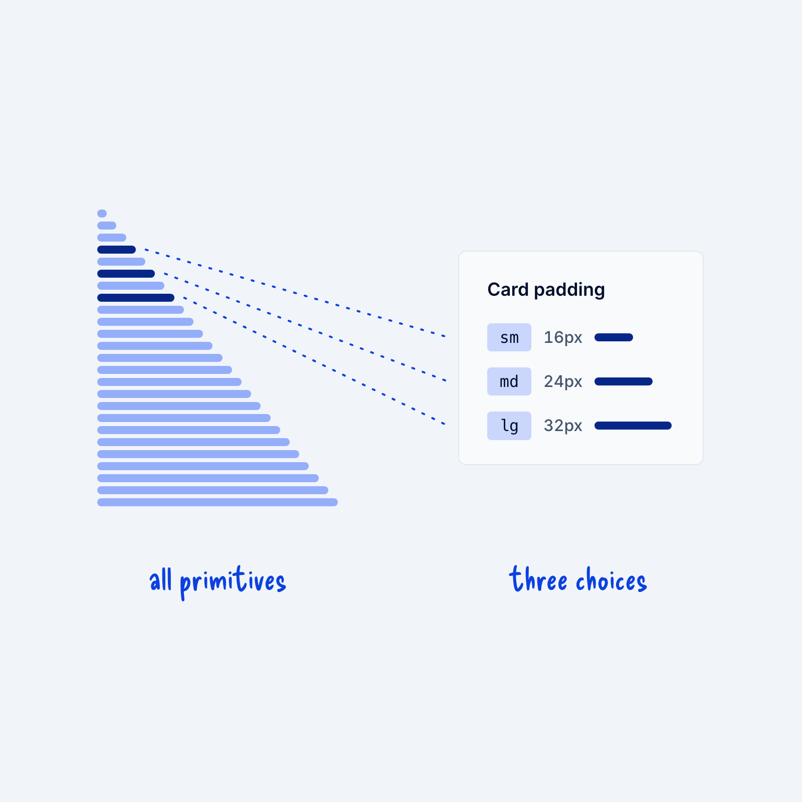
Most design systems start with a long list of raw values, called primitives. Your spacing primitives might run from 4px all the way to 1440px in small steps. That’s fine. A long list gives you room to handle almost any layout you’ll build.
The trouble usually starts when every component can use every one of those values. For example, if card padding can be any of 25 spacing sizes, cards across the site slowly drift apart, and nobody remembers which size is the right one. That’s why it helps to give each component a short list of three or four options, like small, medium and large card padding, with each one pointing to one of your primitives. Experienced designers can sometimes work straight from the full scale, but for most people, a few clear choices per component make pages more consistent.