Opens in a new tab

Category: Design Systems

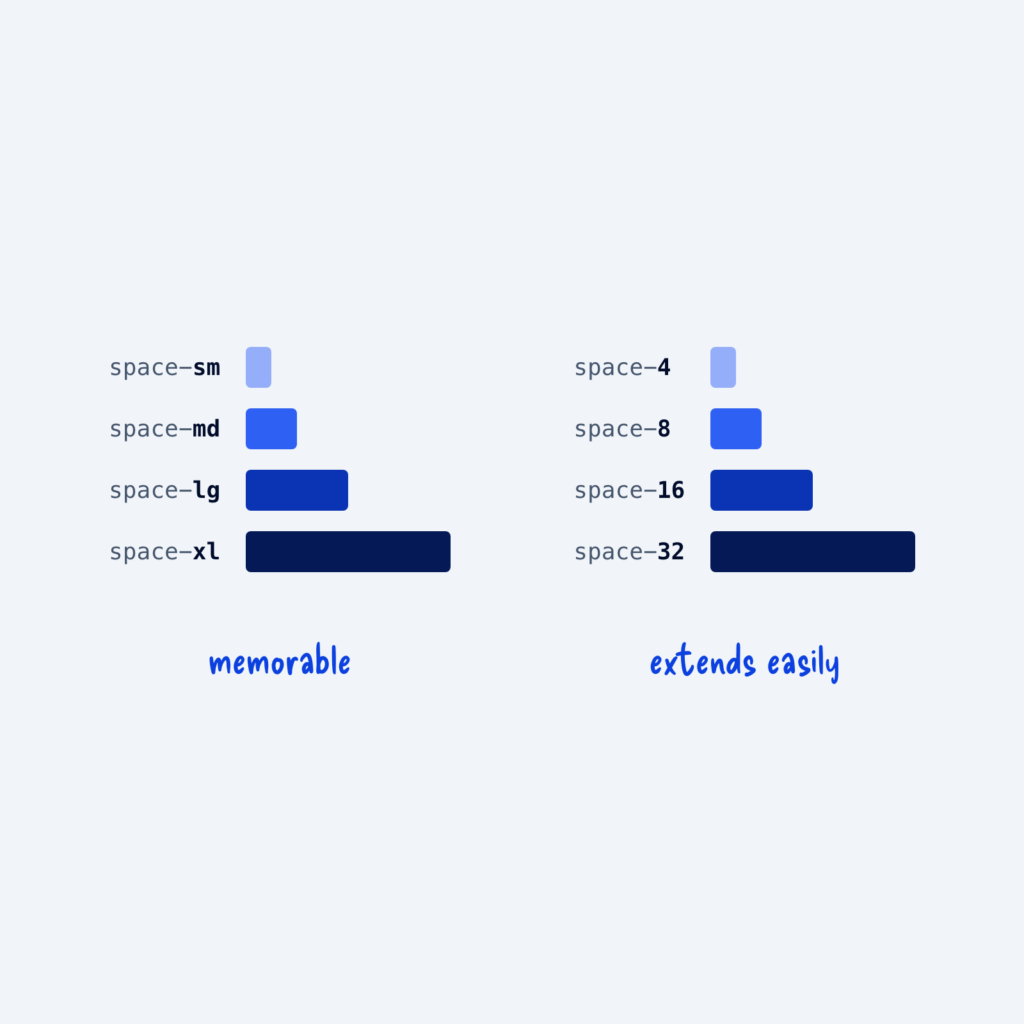
  • Two identical sets of spacing bars. The left set is named space-sm to space-xl, labeled memorable. The right set is named space-4 to space-32, labeled extends easily.

    September 29, 2026
    Tokens are the reusable values in your design system, and each one needs a name. For sizes, there are two…
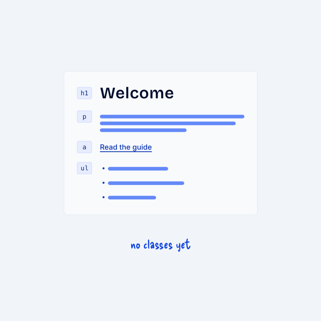
  • A text column with a heading, a paragraph, a link and a list, all styled by default. Each element is marked only with its tag name, like h1 or ul, with the label no classes yet.

    September 29, 2026
    Global styles for body text, headings, links and lists can cover most of a site before you add a single…
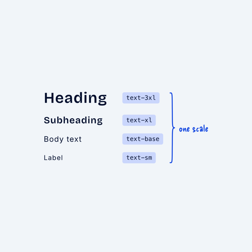
  • Four lines of sample text from large to small, named text-3xl, text-xl, text-base and text-sm, grouped by a brace labeled one scale.

    September 29, 2026
    When font sizes are chosen by eye on each page, they slowly drift apart. One page uses 17px for body…
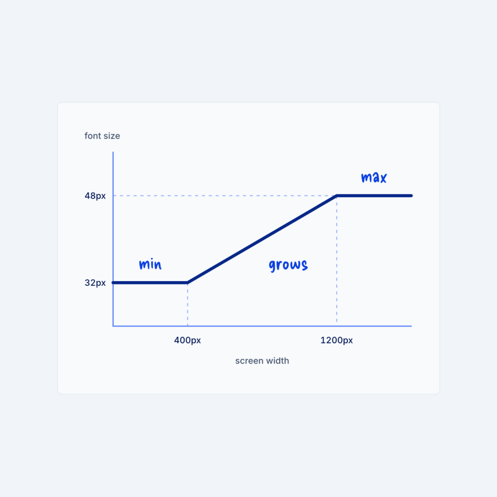
  • A line chart of font size against screen width. The line stays at 32px, grows between 400px and 1200px, then stays at 48px, labeled min, grows and max.

    September 29, 2026
    Most sites change font sizes at a few fixed screen widths, so a heading might jump from 32px to 48px…
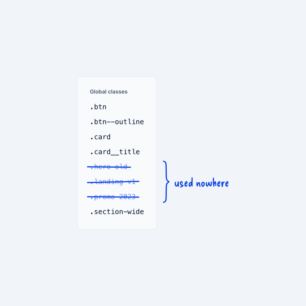
  • A Global classes panel listing eight class names, with three of them crossed out and grouped by a brace labeled used nowhere.

    September 29, 2026
    Over time, classes pile up from old sections, experiments, and pages that no longer exist. Each unused class makes the…
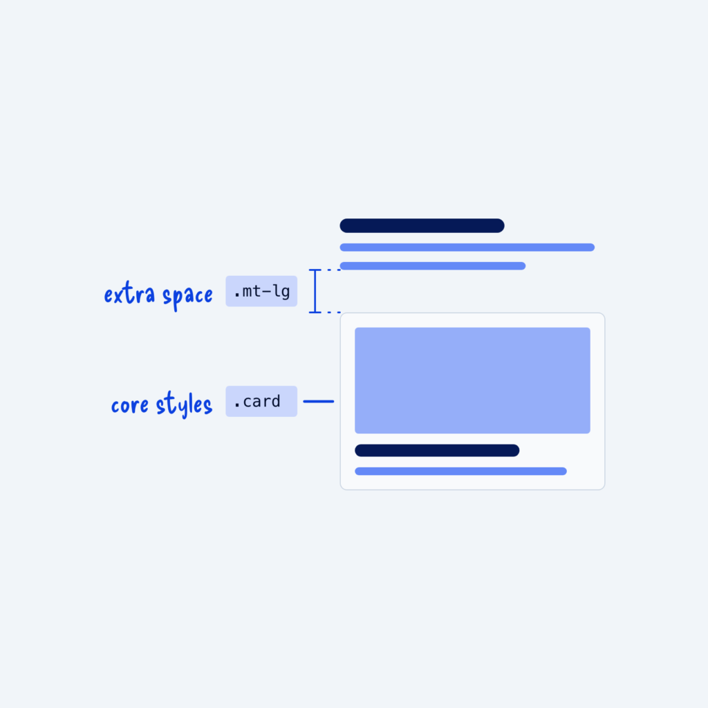
  • A card below a block of text. The .card class is labeled core styles, and a .mt-lg class adds the gap above the card, labeled extra space.

    September 29, 2026
    There are two common kinds of classes. Component classes, like .card, which holds all the core styles that make a…
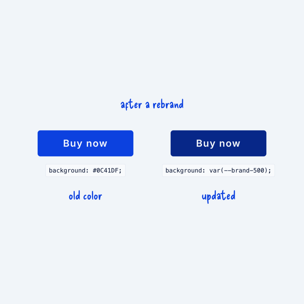
  • Two buttons after a rebrand. The one styled with the hardcoded #0C41DF still shows the old blue. The one styled with var(--brand-500) shows the new brand color.

    September 29, 2026
    A hardcoded value is a color or size typed straight into one element, like #0C41DF on a single button. It…
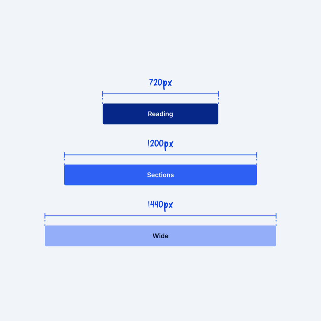
  • Three centered bars of different widths, labeled Reading 720px, Sections 1200px and Wide 1440px.

    September 29, 2026
    A container sets how wide a section's content can get. Different types of content often need different widths to look…
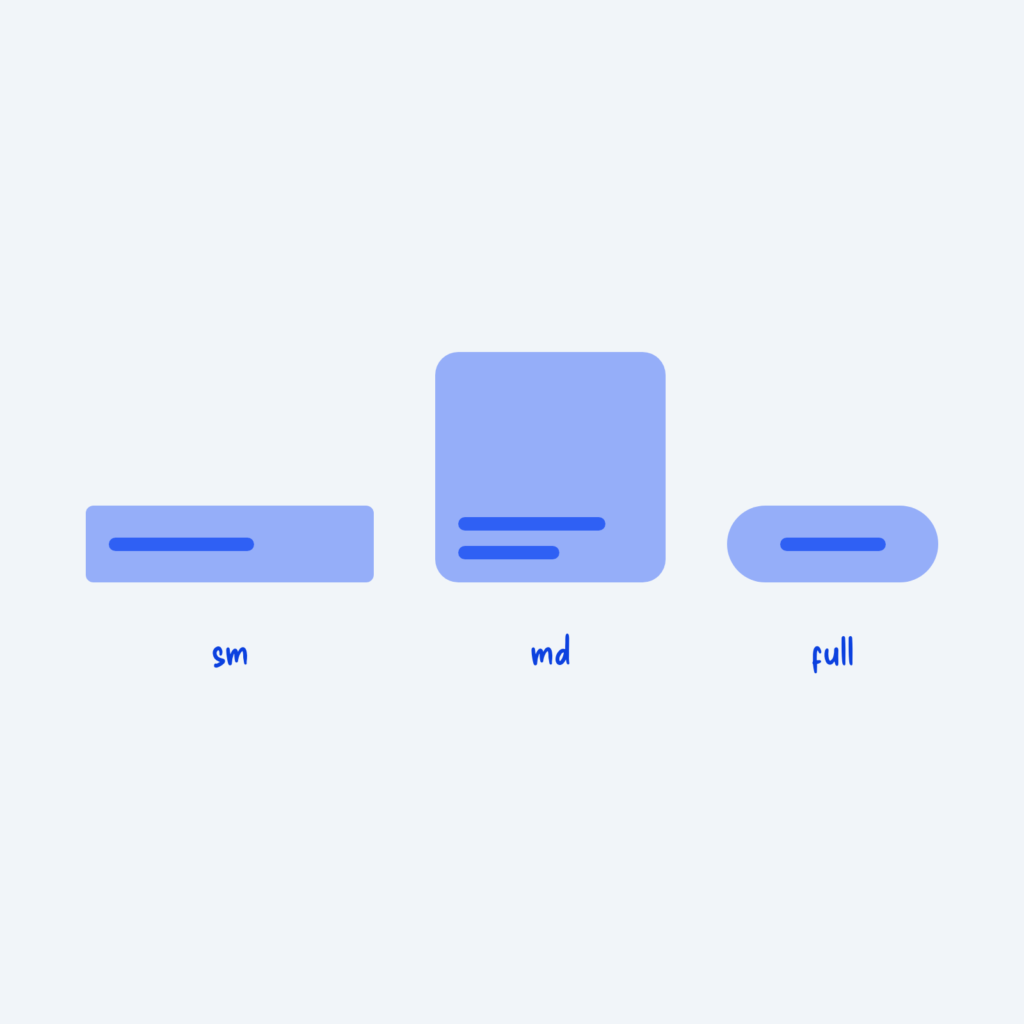
  • An input, a card and a pill button in a row with small, medium and fully rounded corners, labeled sm, md and full.

    September 29, 2026
    Corner radius is how rounded an element's corners are. When every component gets its own value, like 5px on buttons,…
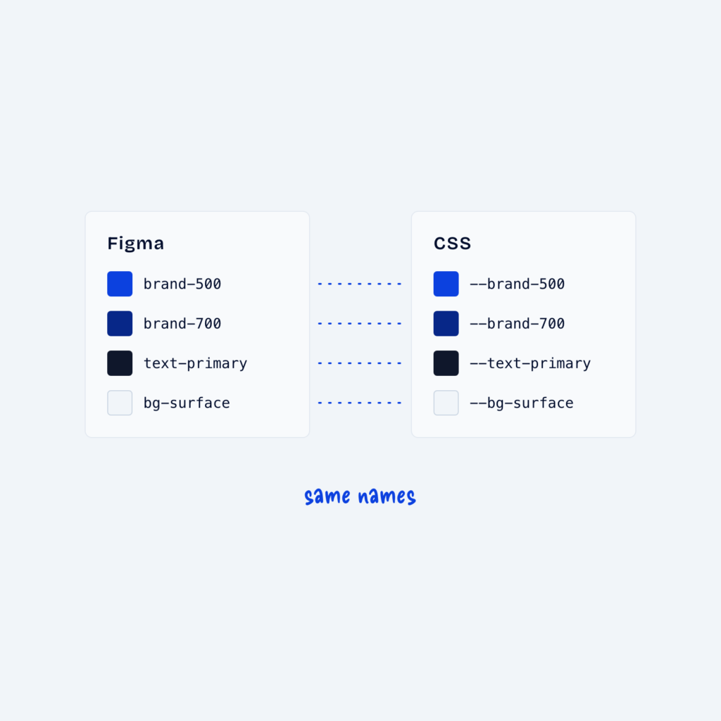
  • Two panels, Figma and CSS, listing the same four token names, with dotted lines joining each matching pair, labeled same names.

    September 29, 2026
    Many designers keep tokens in two places: as variables in a design tool like Figma, and as CSS variables on…
Get Free Design Lessons Every Monday Morning

Three short lessons each Monday on a single design topic. They're written in plain language and give you ideas to use on your next site.

You're in!

Check your inbox for your first email.
Close