Opens in a new tab

Category: Design Systems

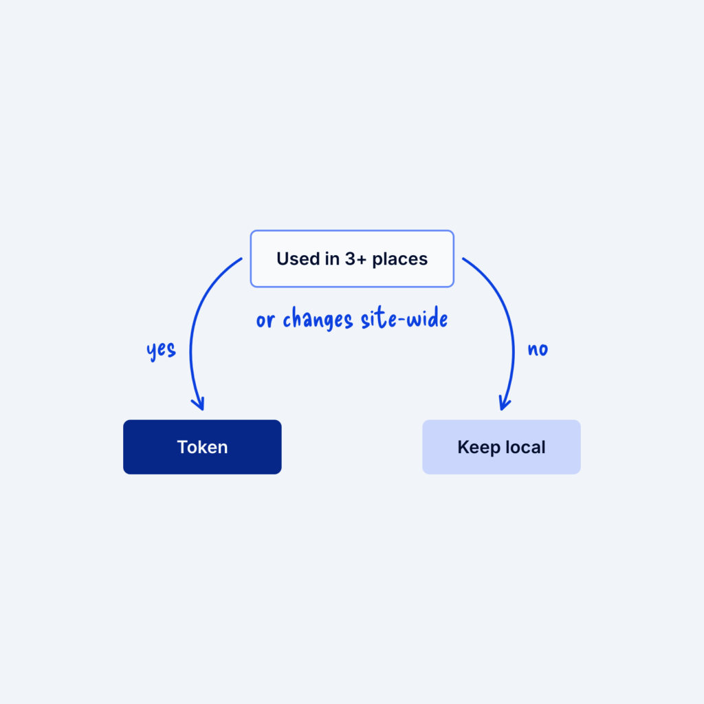
  • A small flowchart that asks whether a value is used in 3+ places or changes site-wide. Yes leads to Token and no leads to Keep local.

    September 29, 2026
    Tokens, the named values in your design system, are useful, but turning every number into one can make a system…
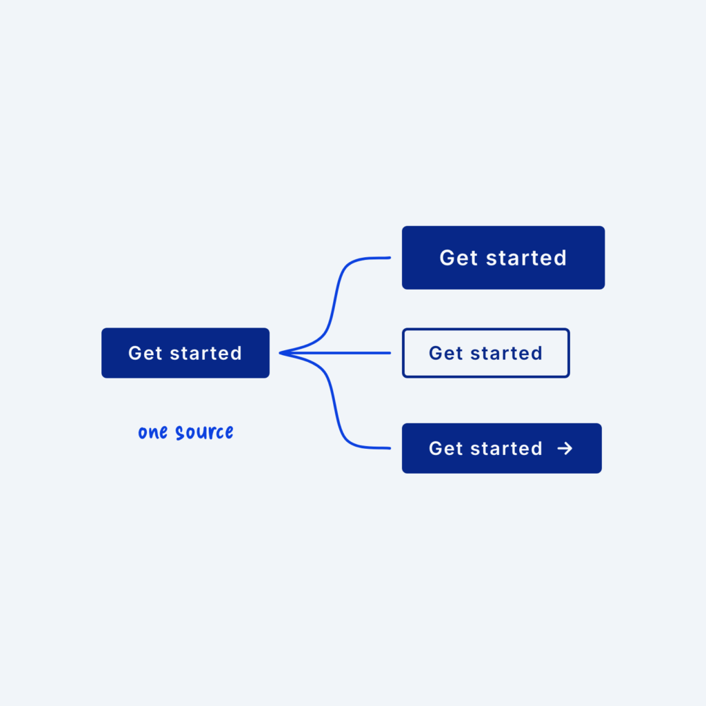
  • One base button with lines branching to three variants that share its label: a large one, an outlined one and one with an icon, labeled one source.

    September 29, 2026
    A button often needs to appear in a few forms, like a large version for the hero section, an outlined…
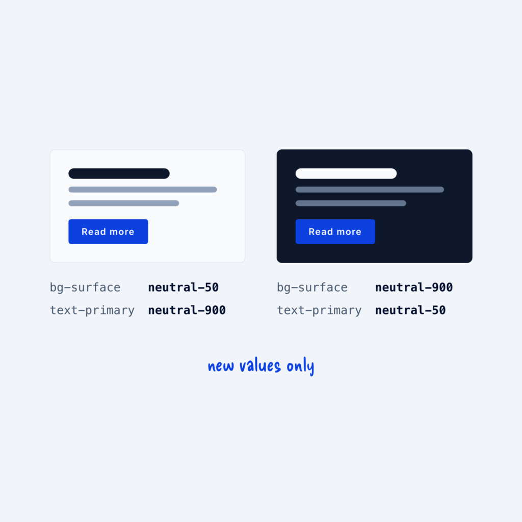
  • The same card in light and dark mode. Under each, the tokens bg-surface and text-primary stay the same while their values swap between neutral-50 and neutral-900.

    September 29, 2026
    Dark mode is much easier to build when your components use semantic tokens. A semantic token is named for its…
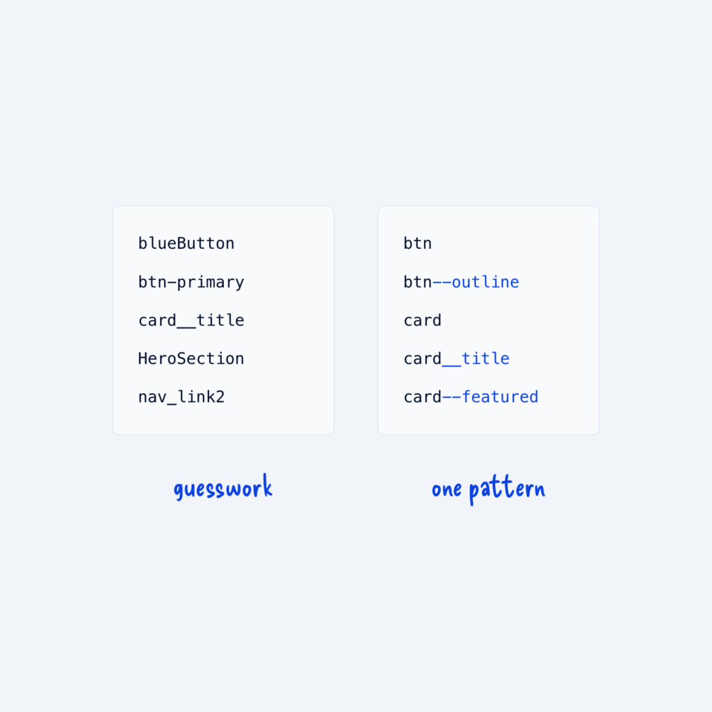
  • Two lists of class names. The left mixes naming styles, labeled guesswork. The right follows one pattern, like card, card__title and card--featured, labeled one pattern.

    September 29, 2026
    When class names like blueButton, btn-primary and card__title all exist on the same site, trying to find the right class…
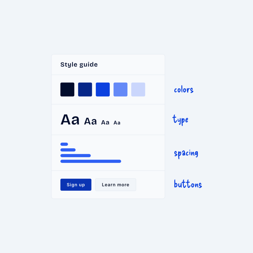
  • A style guide page with four sections: color swatches, type samples, spacing bars and buttons.

    September 29, 2026
    A design system that lives only in your head will break the moment someone else edits the site, or when…
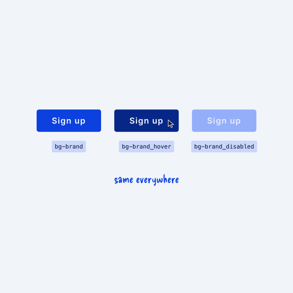
  • One button in three states: default as bg-brand, a darker hover as bg-brand_hover and a pale disabled version as bg-brand_disabled, labeled same everywhere.

    September 29, 2026
    Buttons, links and inputs change when people interact with them. They have hover, active, disabled and error states, and each…
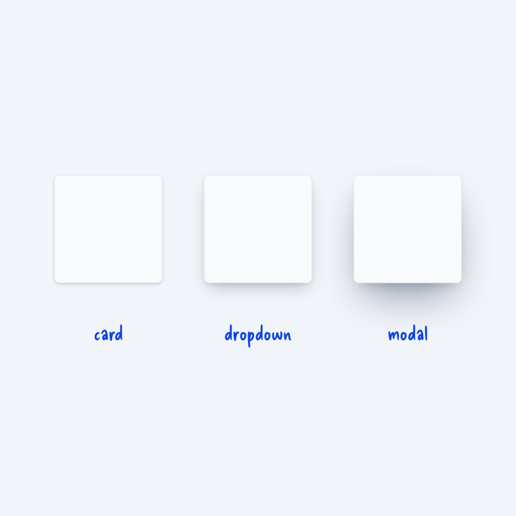
  • Three white cards with shadows that grow from left to right, labeled card, dropdown and modal.

    September 29, 2026
    Shadows show how high an element sits above the page. A card resting on the page needs only a faint…
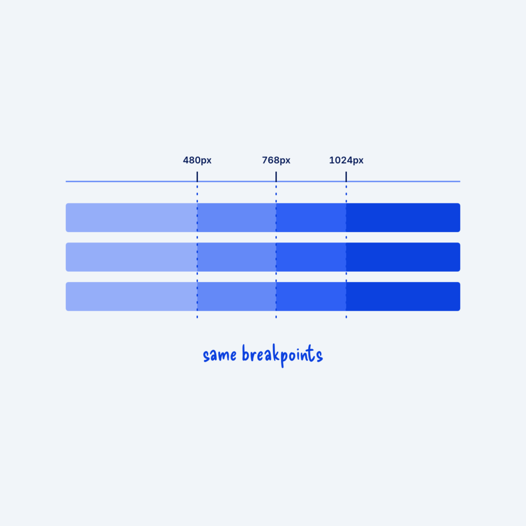
  • A ruler with marks at 480px, 768px and 1024px. Dotted lines drop through three component bars, and every bar changes at the same lines, labeled same breakpoints.

    September 29, 2026
    A breakpoint is the screen width where a layout changes, like a grid dropping from three columns to one. When…
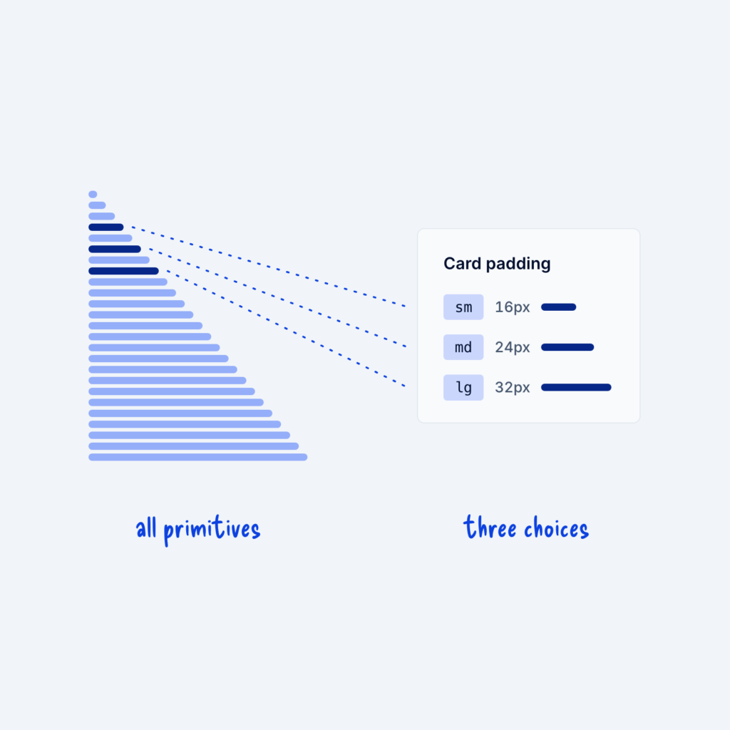
  • A long column of 25 spacing primitives from 4px to 100px. Three are highlighted and lead to a Card padding panel that offers only sm, md and lg.

    September 29, 2026
    Most design systems start with a long list of raw values, called primitives. Your spacing primitives might run from 4px…
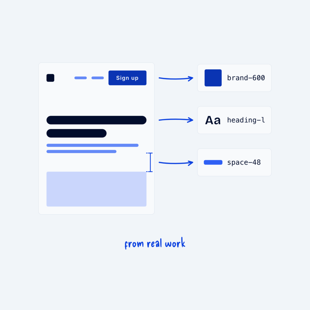
  • A page wireframe with arrows from its button, heading and a gap to three tokens: brand-600, heading-l and space-48, labeled from real work.

    September 29, 2026
    It can be tempting to design a complete system before building any pages, with every color shade, font size and…
Get Free Design Lessons Every Monday Morning

Three short lessons each Monday on a single design topic. They're written in plain language and give you ideas to use on your next site.

You're in!

Check your inbox for your first email.
Close