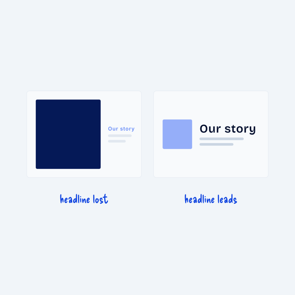
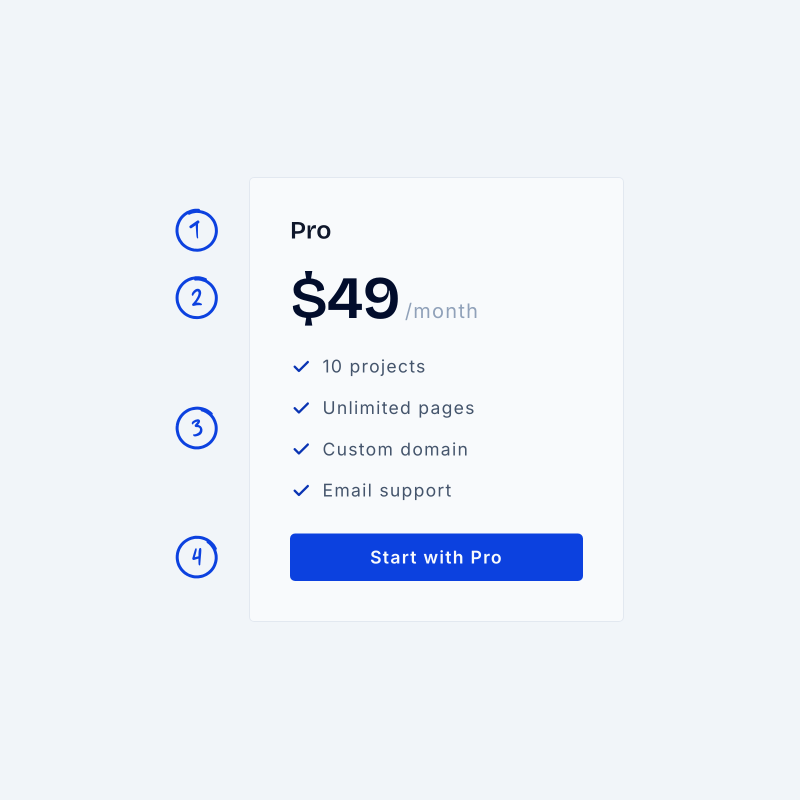
A pricing card has one job, which is to help people quickly see what they get and what it costs. When the plan name, the price and the features all compete for attention, visitors have to work harder to compare plans.
A reliable order is plan name, then price, then what’s included, with the call to action at the bottom. Make the price the largest text on the card, and set the billing period small beside it, like “$49/month.” Keep feature lists short, and write them in the same order and style across every plan, so people can compare cards at a glance.