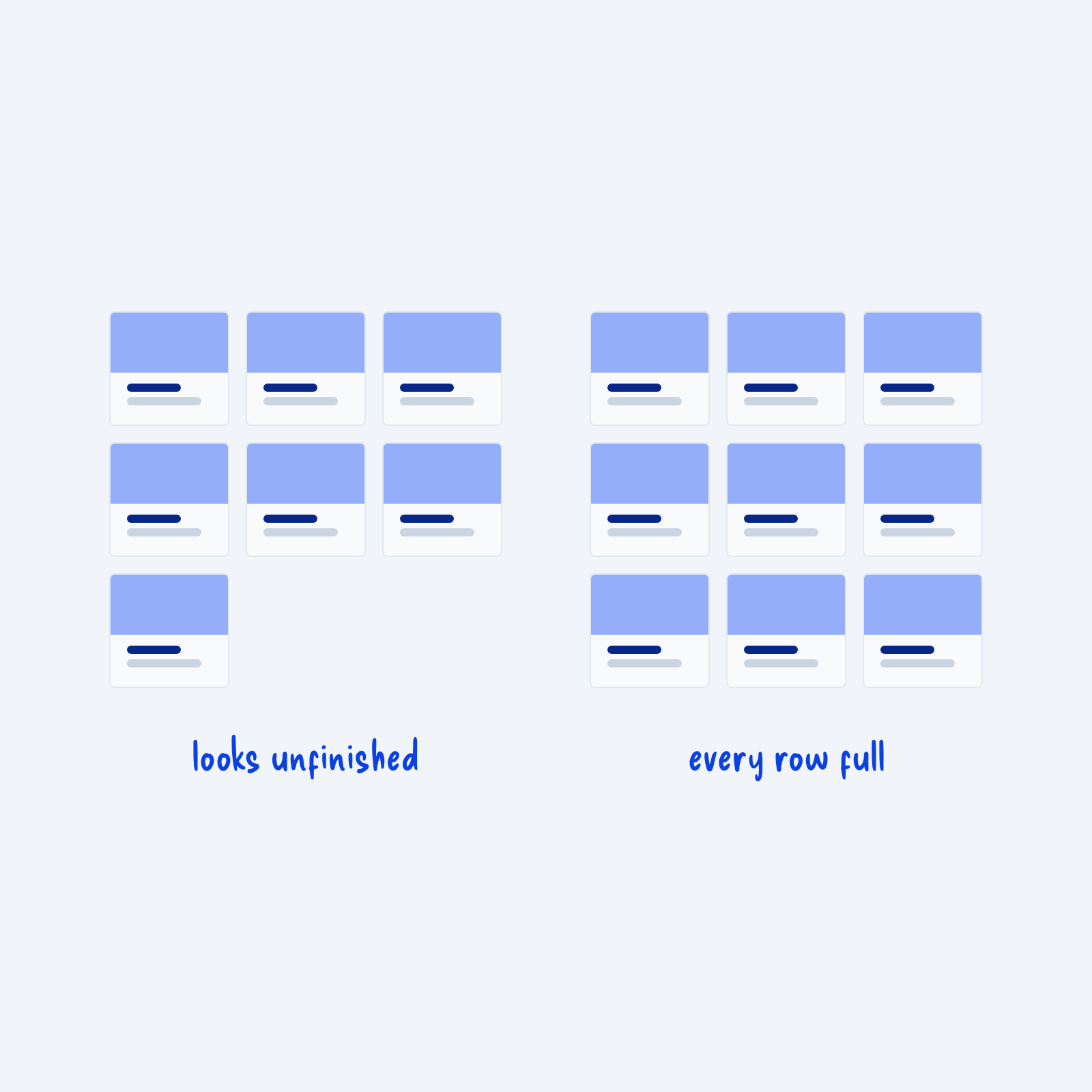
Grids look best when every row is full. Seven cards in a three-column grid leave one card alone on the last row. That last card can add extra space at the end of your section, and it can make the grid look unfinished, as if something failed to load.
For content that doesn’t change, plan your item count around your column count. You can change the number of columns, add or remove an item, or center the cards in the last row.
For grids that change often, like a blog archive, the problem is harder to avoid, but you can pick a posts-per-page number that divides evenly, like 6, 9 or 12 for a three-column grid, and then split the rest across numbered pages. If you use infinite page scrolling however, this is often impossible to avoid but doesn’t read as less clean since visitors aren’t expecting more posts to load.