Most of the time, we stop using our design system because it stops working.
I know I’ve been in situations where I couldn’t change the color of one component without affecting other things in my design. Well, I could, but only by using a raw color instead of a variable.
That means whenever I want to update the component, I have to remember to change the color on every instance. And if I ever want to update my whole brand identity, I have to track down everything else that uses that color too.
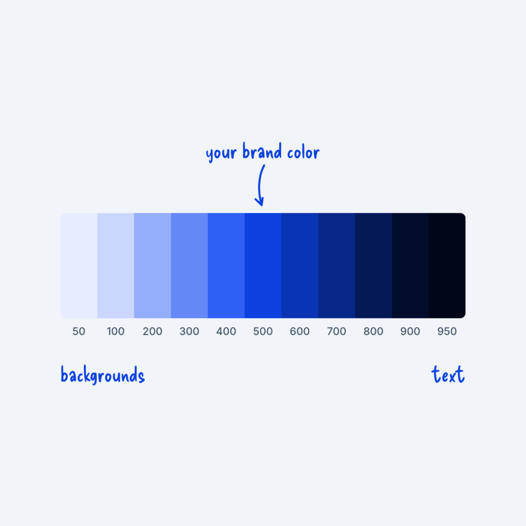
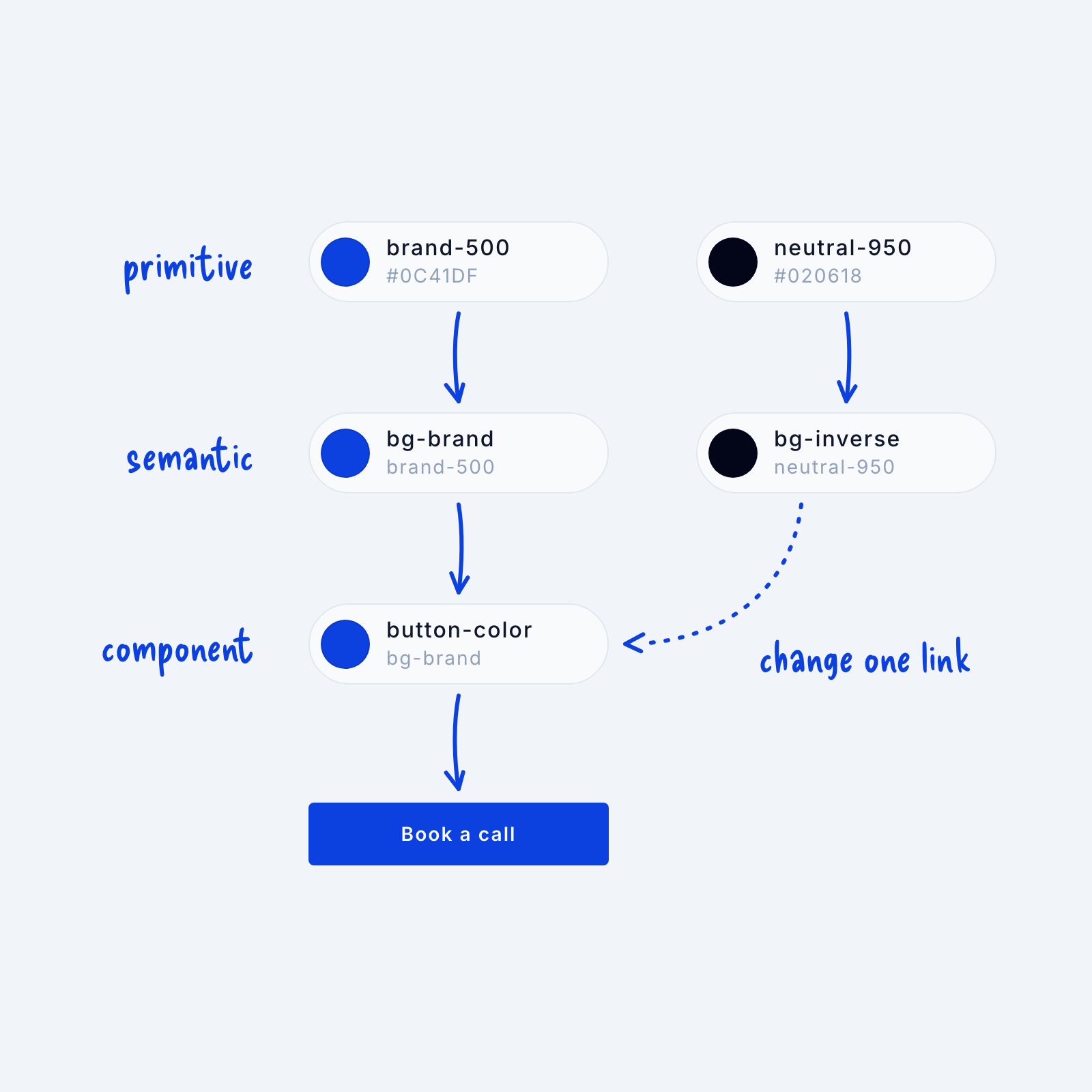
A much easier and more robust way to do it is to create “component colors” for a select few components we use again and again. In our design system, we first create raw colors, known as “primitive tokens.” In this example, let’s use a blue, “#0C41DF,” and a near-black, “#020618,” named “brand-500” and “neutral-950.” Then we map those onto semantic tokens, which describe how a color is used, like “bg-brand” for brand-colored backgrounds and “bg-inverse” for dark ones.
For a few components we use all the time, like buttons, cards or badges, we then create a separate token that points to one of those semantic tokens.
Think of names like “button-color,” “card-border,” and “badge-color.” This gives us the most flexibility. If we want to change our button color, for example, we can simply map it onto a different semantic token, like bg-inverse. If we want to change the color of our brand, we only need to point bg-brand at a new primitive.
Setting up this extra layer gives our design system room to grow, so we don’t end up using custom colors that take more time to update later.