If you’re building a marketing page for a website, chances are you’ll use a two-column layout with text on one side and an image on the other. As designers, we often default to a 50/50 split for these, which can feel a bit generic.
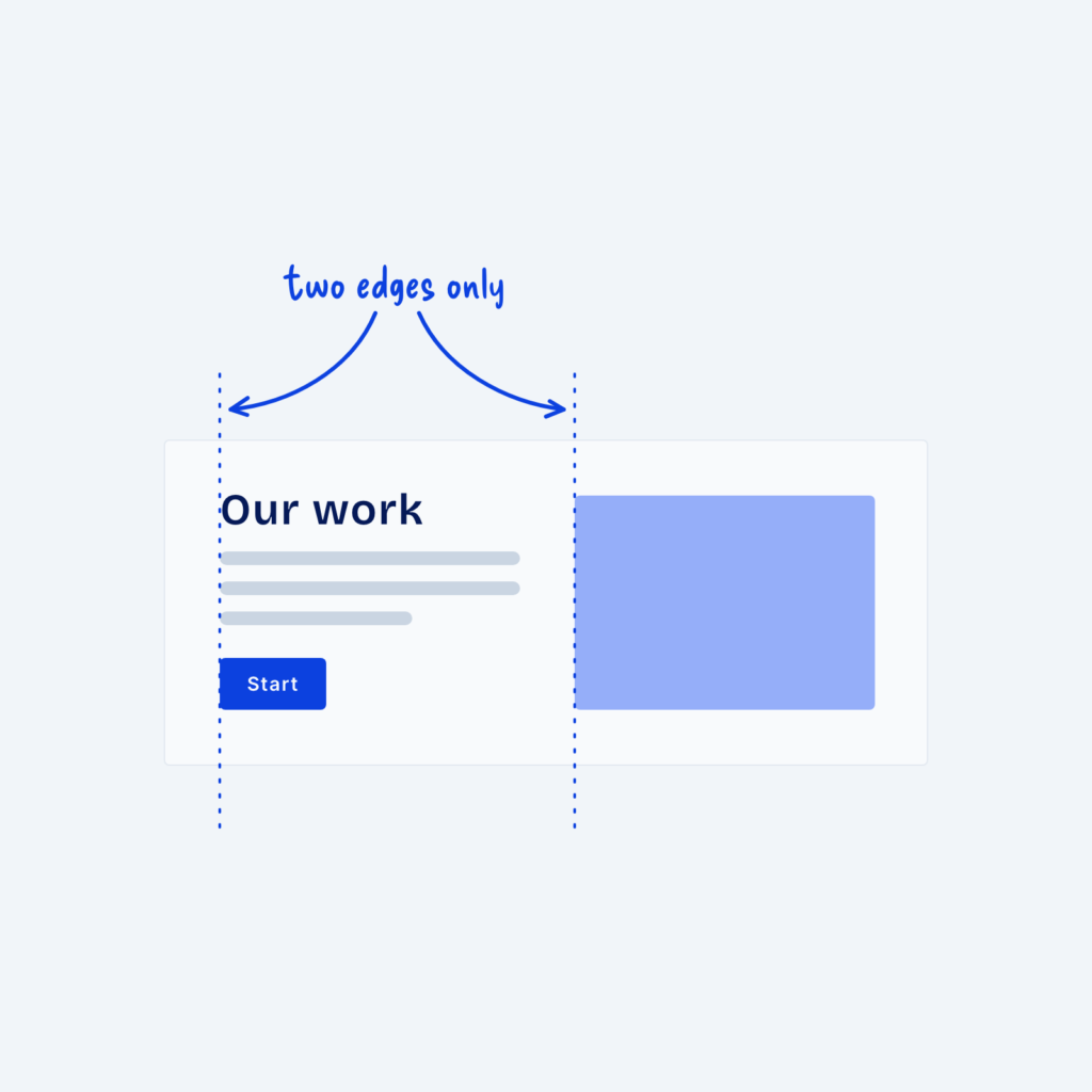
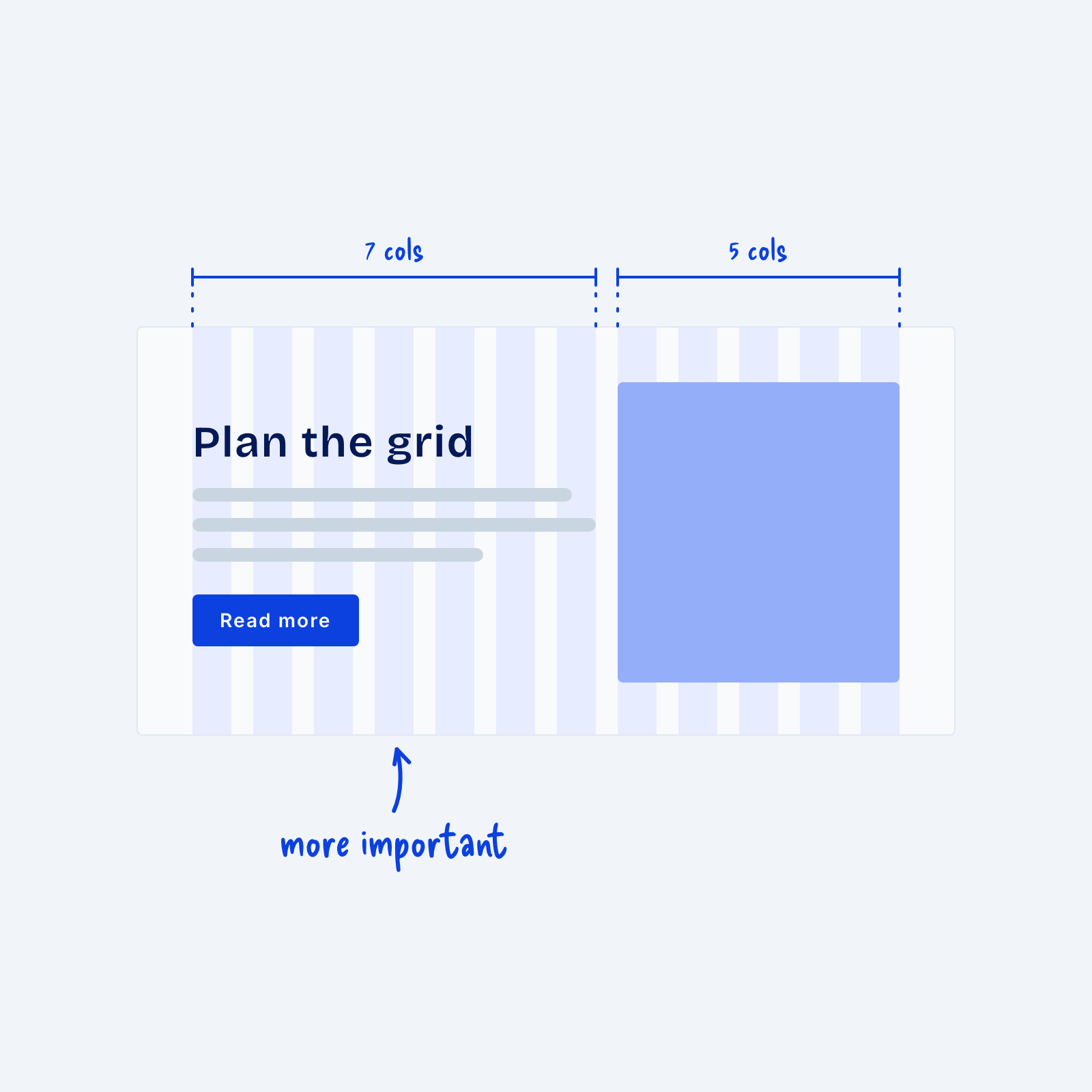
Instead, you can go with an uneven split by dividing the section into more columns, like 12. Then give your text seven of those columns and the image five, which shows visitors which side matters more.
Build the split on a grid so both sides relate to each other and to the rest of the page. A 12-column grid is popular because it divides cleanly into halves, thirds and quarters, and it also allows splits like 7-5 or 8-4. Give the wider side to the content that’s more important, so visitors know what to focus on first.