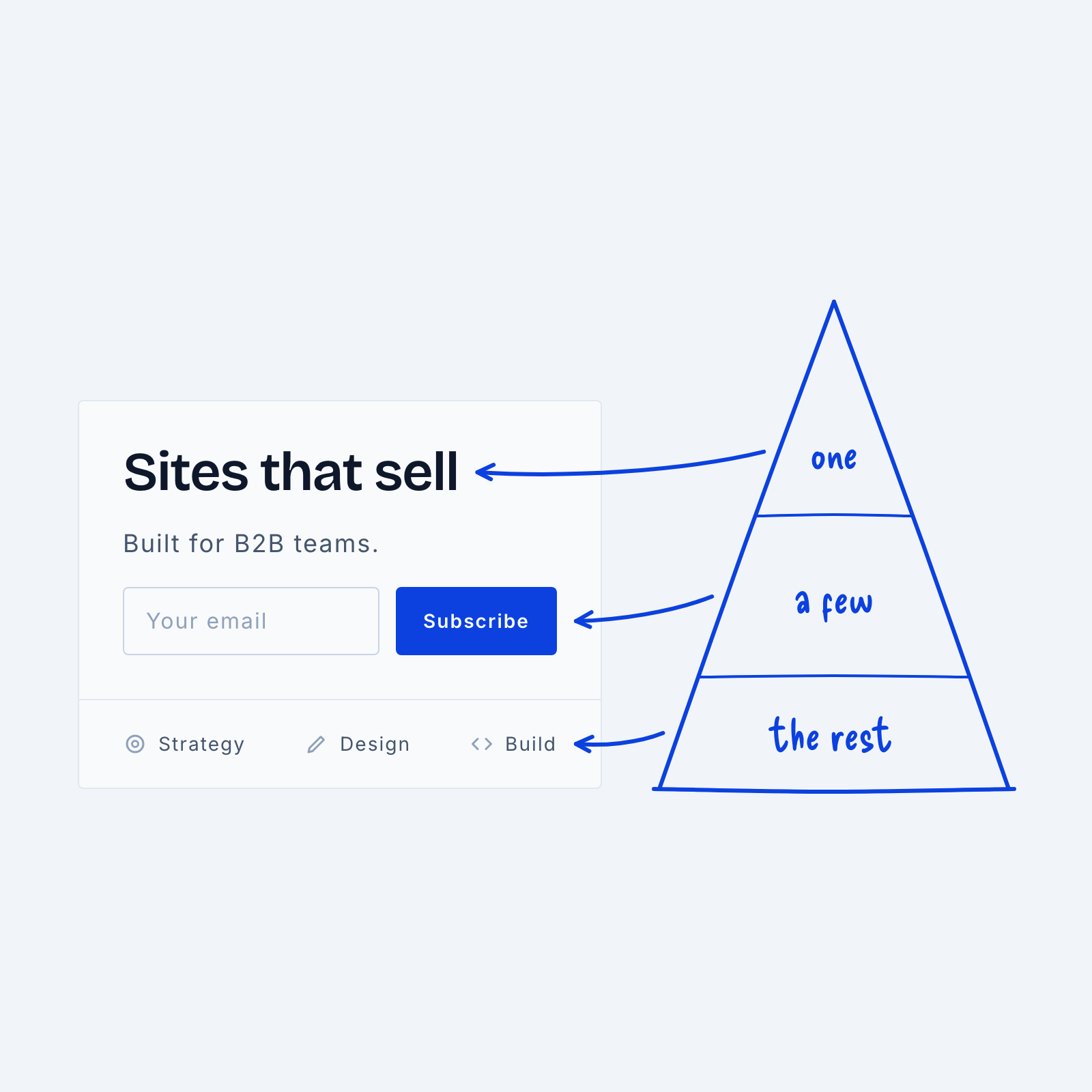
When we talk about hierarchy in design, we often use the analogy of a pyramid. But why? Well, because the more an element stands out, the fewer of them there can be.
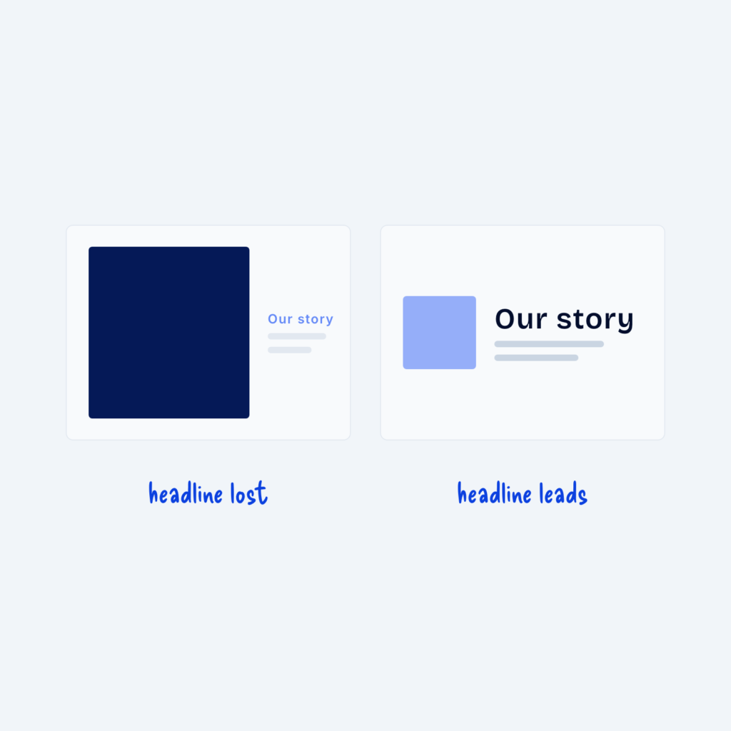
In every design, in every section, on every page, we can really only have one element that stands out. This might be a headline, a graphic, a video, or an animation.
If we try to make everything stand out, visitors don’t know what to focus on. If nothing stands out, again, visitors don’t know what to focus on.
Besides the most important element, we can have a few that really get noticed. This could be a subtitle, a form, a statistic, or a supporting graphic.
Then there’s everything else in the design, which shouldn’t be very loud or noticeable. Instead, it should blend in and give the design cohesion. Think icons, paragraphs, borders, and menu items. If these were designed to look totally different from one another, the design would feel messy.
Remember: one thing can really stand out, a few things can be noticeable, and everything else should blend in with the rest of the design.