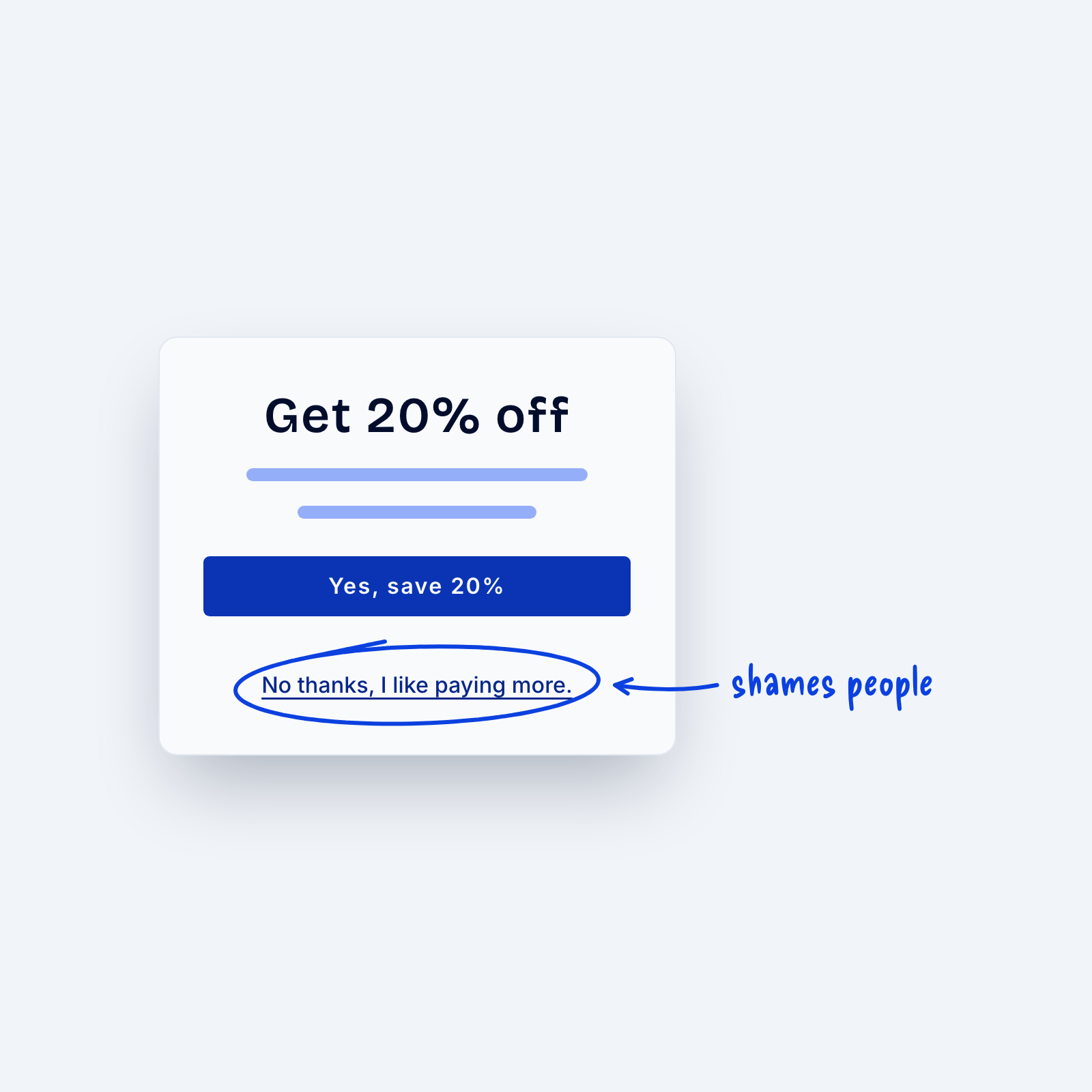
“Dark patterns” are basically design tricks that lead people to do things they otherwise wouldn’t do. Common examples include pre-checked add-ons at checkout, cancel links that are hard to find and “no thanks” links that shame people for declining, like “No thanks, I like paying more.”
They may lift a number for a while, but the cost usually shows up later, in refunds, complaints, cancellations and lost trust. I like to use this simple test when writing my sales copy. If I feel uncomfortable explaining a website section to a prospect in person, then there’s usually some part of it I should change.