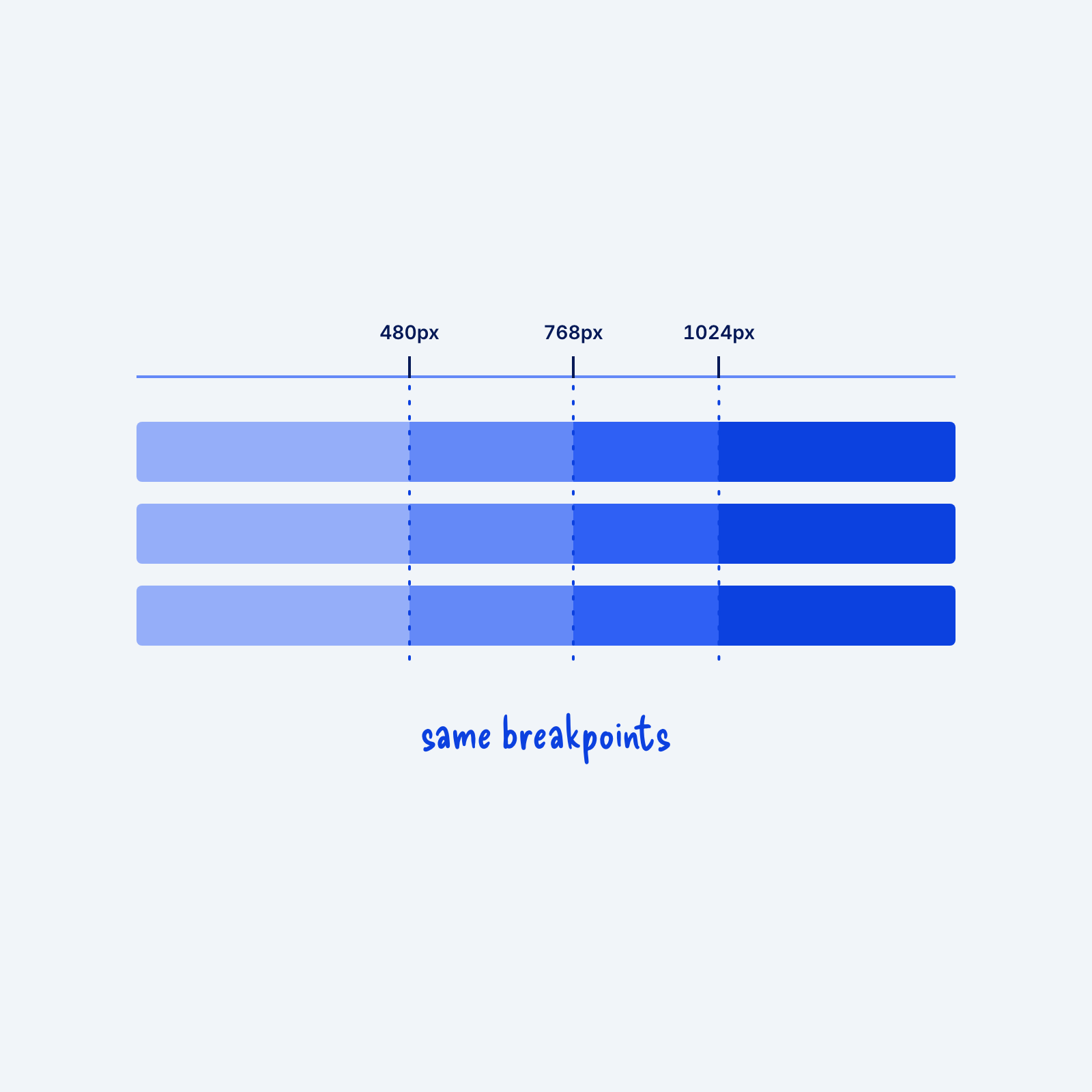
A breakpoint is the screen width where a layout changes, like a grid dropping from three columns to one. When each component uses its own breakpoints, different parts of the page change at slightly different widths. In between, some sections can look broken while others have already adjusted.
Pick a small set of breakpoints and use only those. Many sites use three or four, somewhere around 480px, 768px, 1024px, and 1440px. Set these as the standard breakpoints when building out media queries.