Opens in a new tab

Category: Hierarchy

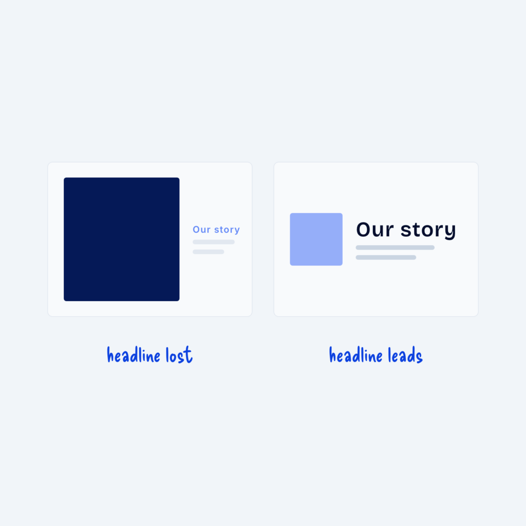
  • Two cards. On the left, a large dark image overpowers a small, pale Our story headline, labeled headline lost. On the right, a small light image sits beside a large, dark headline, labeled headline leads.

    September 29, 2026
    Images carry a lot of visual weight. A large, high-contrast image pulls the eye even when it's only decoration. Next…
  • A sale card with a bold heading, regular body text and a small uppercase line, all in the same font, labeled one font.

    September 29, 2026
    You don't need two typefaces to create contrast. One font family can do all the work through size, weight, letter…
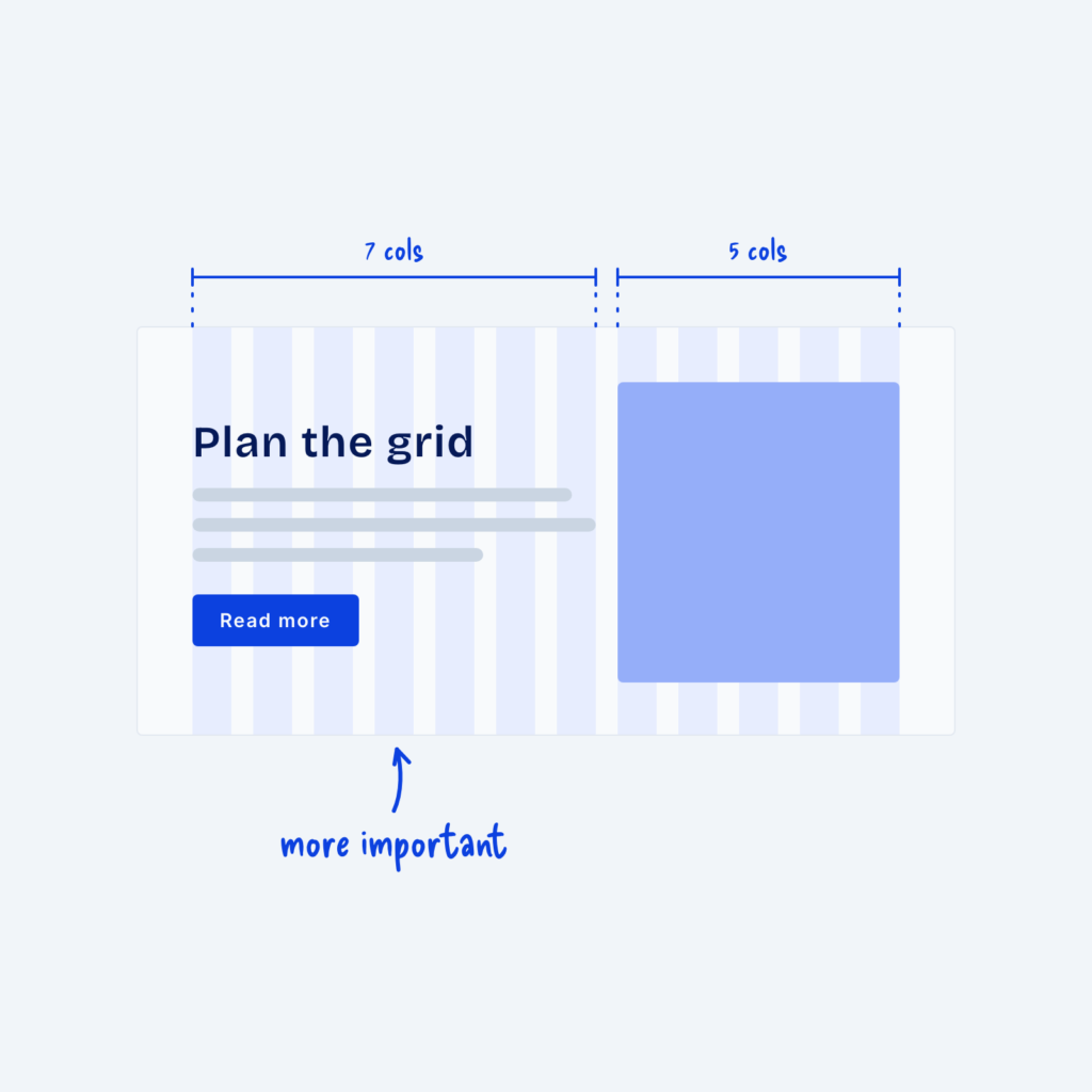
  • A split section on a 12-column grid. The text side spans seven columns, labeled more important, and the image spans five.

    September 29, 2026
    If you’re building a marketing page for a website, chances are you’ll use a two-column layout with text on one…
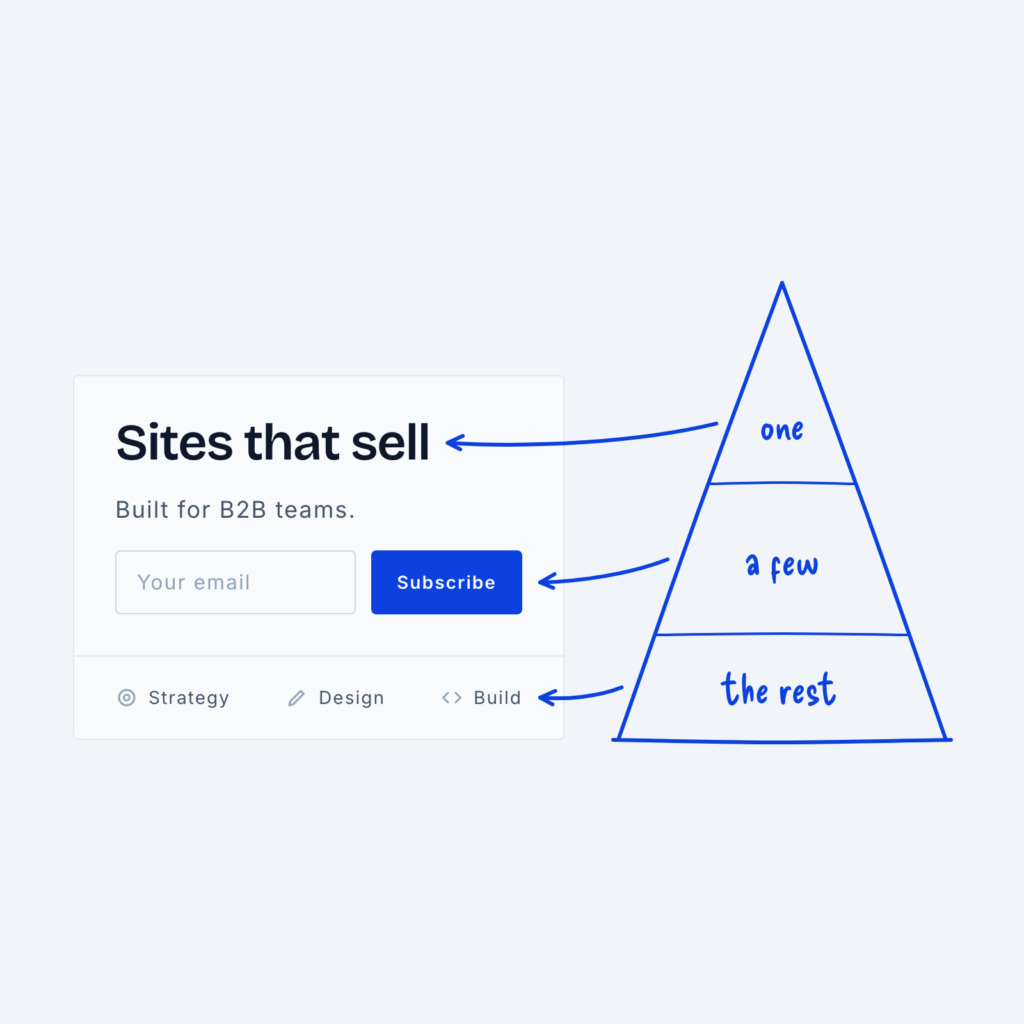
  • A hero section next to a pyramid. The headline points to the top tier labeled one, the signup form to the middle tier labeled a few, and the small menu links to the base labeled the rest.

    September 29, 2026
    When we talk about hierarchy in design, we often use the analogy of a pyramid. But why? Well, because the…

Get Free Design Lessons Every Monday Morning

Three short lessons each Monday on a single design topic. They're written in plain language and give you ideas to use on your next site.

You're in!

Check your inbox for your first email.
Close