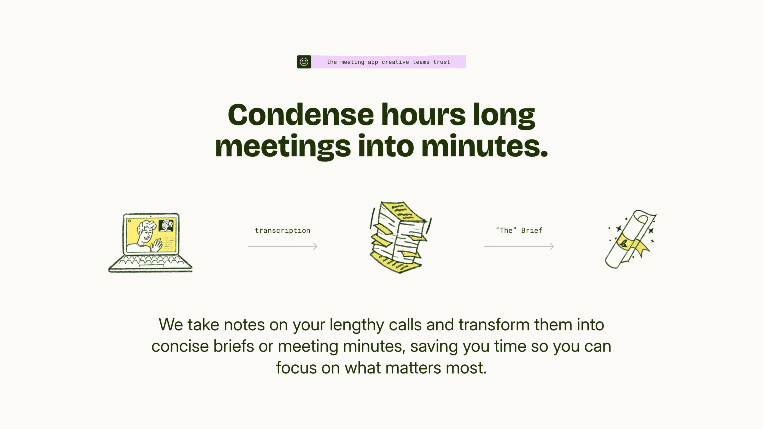
Section Breakdown
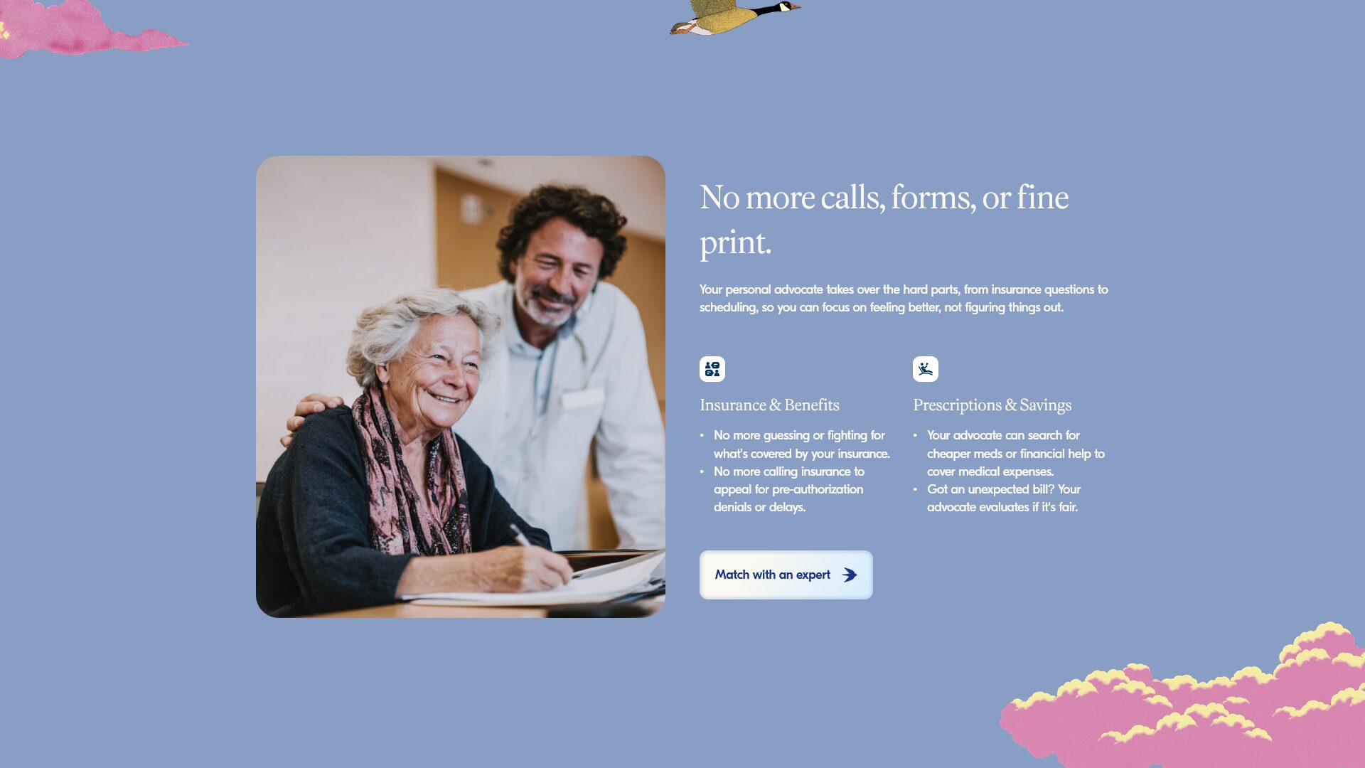
This is a classic two-column section from Baba Care. On the left is an image of an elderly woman with her personal healthcare advocate (the service Baba provides). On the right is this section’s benefit, “No more calls, forms, or fine print” followed by two sub-benefits for insurance and savings.
Why It Works
1) Open, light design: Their main value proposition is making healthcare uncomplicated. They want it to feel easy. Their design aids this by using cool, calm colors and a more open design. Smaller text, simple images, and a dual color scheme make this section easy on the eyes.
2) Imagery and copy reinforce each other: The design trend nowadays is to use lots of abstract animations and graphics. Baba opts for a simple image of a woman being taken care of, reinforcing the copy’s main goal: easy healthcare navigation.
3) Clear Call-To-Action: Further reinforcing the idea of ease, the button says exactly what it does. Instead of “reach out” or “get in touch”, it matches you with an expert. This small change in words likely produces a much higher conversion rate.
Key Takeaway
Every element reinforces each other. The images, copy, and call-to-action all work together. The colors, typography, and layout are easy on the eye and further reinforces the idea of ease. Use design to support the emotional outcomes you’re trying to sell.